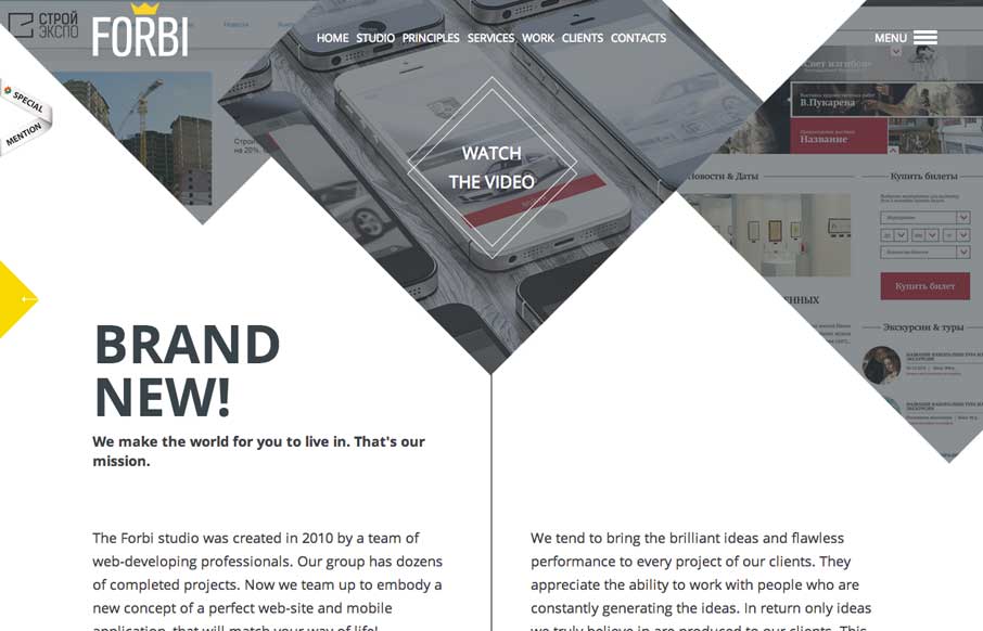
by Aaron Griswold | May 22, 2014 | Gallery
I really like the unconventional way Forbi has their “big pictures” at the top of the site. What follows is very simple and clean, with abstract line drawings as accents, that don’t detract from the content. There are just enough fade ins to give...
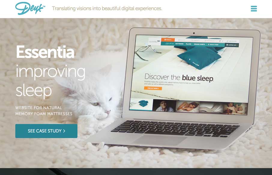
by Aaron Griswold | May 22, 2014 | Gallery
Wow. We were talking to a client yesterday about how they wanted to present images on their website in a way that will wow people, and make them want to read more / interact with the site. Deux’s website does that for me. I actually wanted to click on and see...
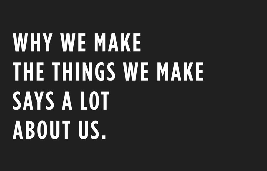
by Gene Crawford | May 21, 2014 | Blog, Gallery
What a beautifully thought out and executed experience the Code & Theory website is. I spent at least 15 minutes just clicking through and scrolling around this site.

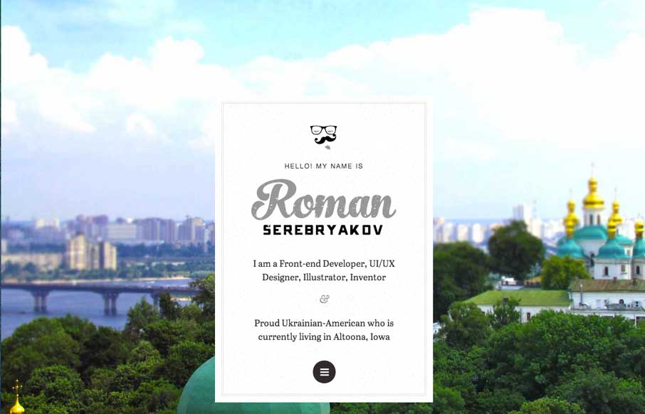
by Gene Crawford | May 20, 2014 | Gallery
Cool interactions and content blocking. I really dig the first time experience when you hit this site. The way the portfolio navigation on the home page is designed is very cool along with the loading animations of the 3 marquee sections.
by Gene Crawford | May 20, 2014 | Gallery
Pretty cool interaction from the home page. I really like the original thought. Otherwise the design is super simple – half of it links elsewhere, which is also smart if you’re truly active in those communities. Really smart design here.