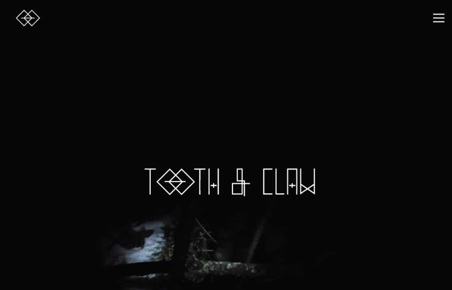
by Gene Crawford | Sep 26, 2014 | Gallery
Very ‘story telling’ centric design with Tooth & Claw. I like this aspect of it, keeping you focused on this aspect seems important for these guys. Some of the nav elements are a little hard to see and get to, but in the end i’m not so sure...
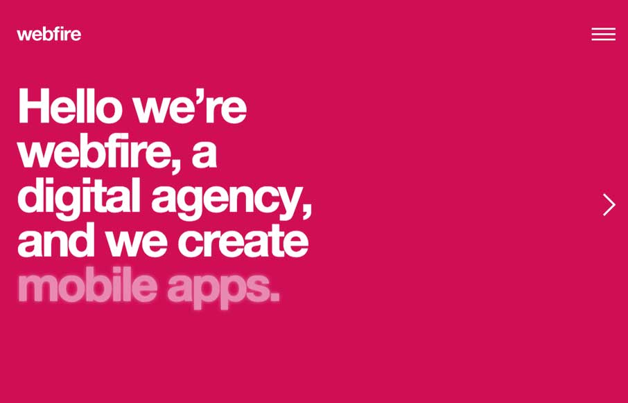
by Gene Crawford | Sep 25, 2014 | Gallery
Nice easy way to deliver a message. I can’t help but reminisce about splash pages when I see site’s that utilize big entry overlay designs like this. Submitted by: Gareth Evans @webfireagency Role: Project Manager We’ve tried to do something...
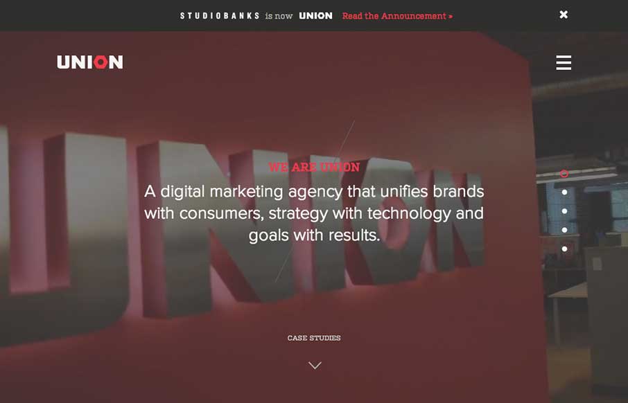
by Gene Crawford | Sep 24, 2014 | Gallery
Here’s a good example of a site pretty much hiding everything except a few links to case studies/work examples under a fly out overlay nav. I gotta assume this is by design. I do like the idea of keeping most people focused on your work like this btw.
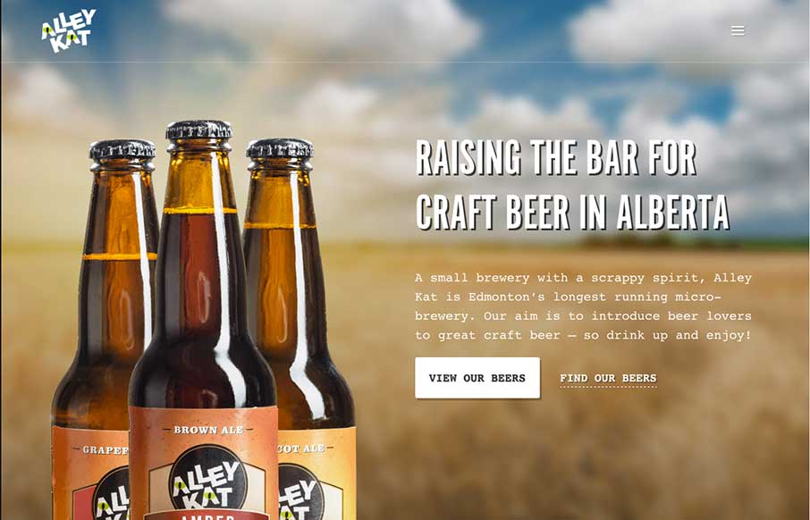
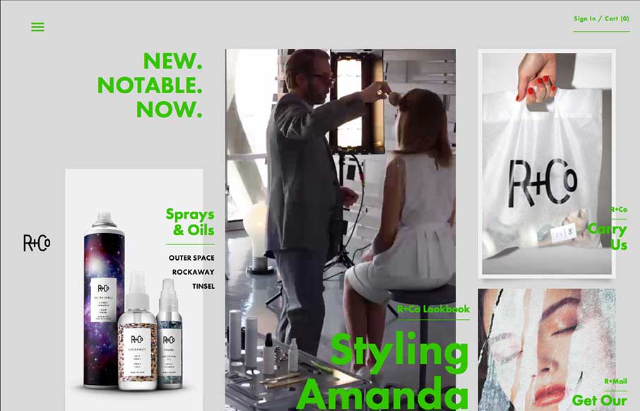
by Gene Crawford | Sep 17, 2014 | Food and Beverage, Gallery
Nice design that feels “crafted” with some hand made looking sections, the type plays into this nicely. The site utilizes a Full Screen Overlay style navigation pattern which seems to fit aesthetically but not functionally too well.
by Gene Crawford | Sep 16, 2014 | Gallery
Another full page overlay style navigation in use. I like how it’s utilized here since you can largely get around the site without using the nav which is a good thing in this case. Otherwise the site is pretty out there visually, which I like 🙂