
by Aaron Griswold | Nov 12, 2014 | Gallery
Like the use of the gray and green to be a canvas for the portfolio area. And like the Matrix pattern behind their server tech. Do wish that it was responsive – think they could do some cool things with that based on their current layout, and could help with...
by Gene Crawford | Oct 31, 2014 | Gallery
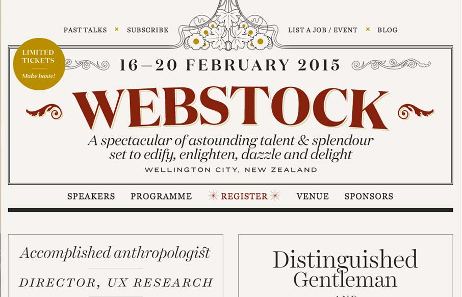
The 2015 Webstock site is gorgeous. I love the typography and responsive treatment across the board on it.