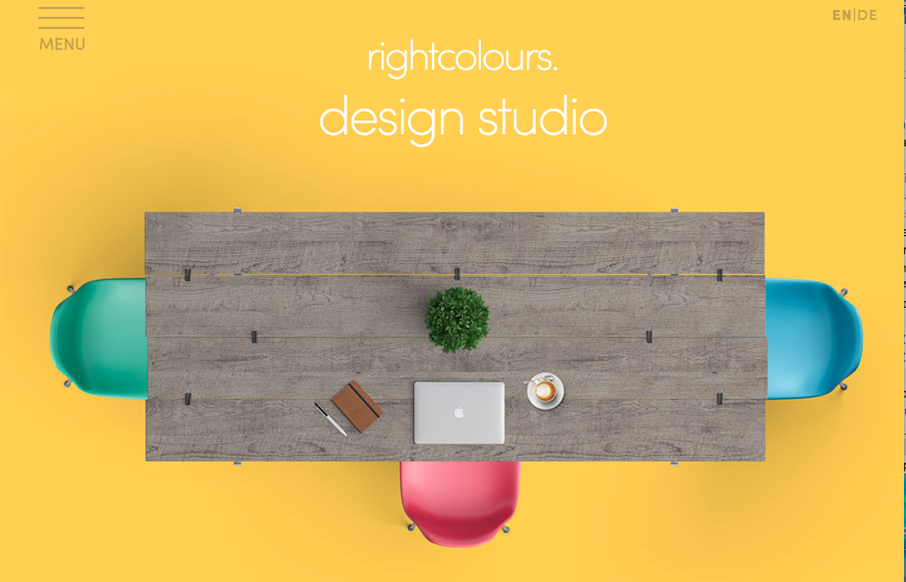
by Gene Crawford | Jul 15, 2016 | Gallery
Clever hero image and I love the bright colors. Very strong and simple visuals help guide you to understand what these guys do, bravo. It’s harder to do than you’d think, right?
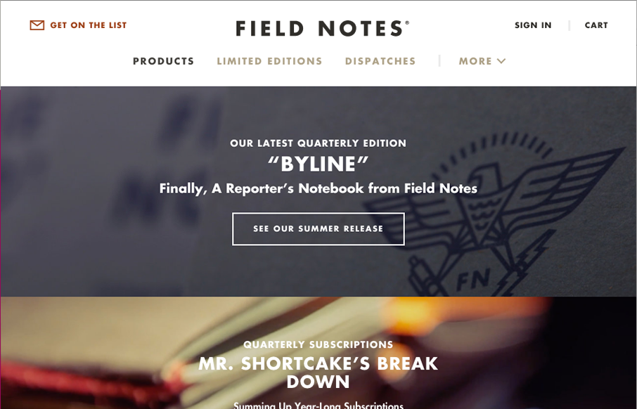
by Gene Crawford | Jul 14, 2016 | Gallery
It’s been a long time coming! New design for Field Notes. Man, I love me some field notes for sure! I really dig the site navigation/architecture. Jamming all that extra stuff under “more” is pretty clever. I also really love the way the “quick...
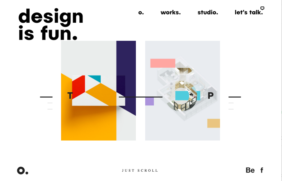
by Gene Crawford | Jul 7, 2016 | Design Firm, Gallery
Pretty unique take on an agency website look. It feels very experimental in it’s approach to relaying content. I love that the most about it. Good effort there to keep it fresh and approachable at the same time. It’s also a nice visual design too. From the...
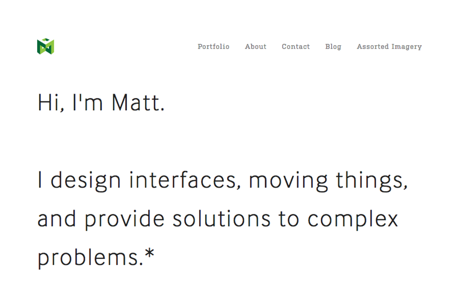
by Gene Crawford | Jul 6, 2016 | Gallery, Portfolio
I love this portfolio site for Matt Welch. “Most complex problems come with an NDA”, amen brother. I love that he just puts that up front for you to know. It’s the truth, if you do any sort of high-level work your public portfolio is going to be...

by Gene Crawford | Jul 5, 2016 | Gallery, Portfolio
Real simple design for Bruk but it also has some really nifty UI details. The left vs. right look is pretty cool and the “X” that stays visible when you check out some of the work is pretty clever too.