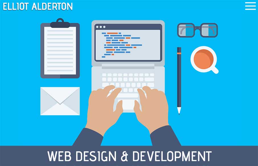
by Gene Crawford | Jan 14, 2015 | Gallery, Portfolio
Some really hot illustration work closes the deal on the look of this website for me. The underlying layout isn’t all too different in the design patterns the site utilizes but man, those illustrations. I also really like how the main one is responsive....
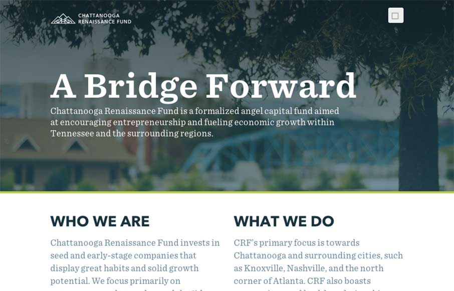
by Aaron Griswold | Jan 9, 2015 | Gallery, Nonprofit
Good way to end the week. The Chattanooga Renaissance Fund’s site has great sweeping full-width shots and video backgrounds of Chattanooga that is fun just to look at from a design perspective. Especially like the footer image. Also like the vertical type on the...
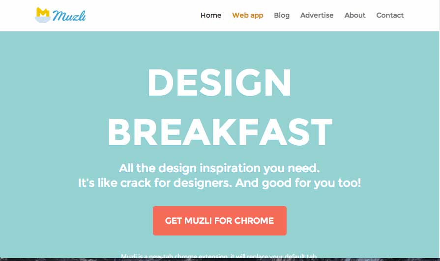
by Gene Crawford | Jan 6, 2015 | Gallery
Looks like a great resource, also looks like a nice site design for a product. I love the colors and fun little illustrations too. Good stuff here. Aaron Edit: Sorry… forgot the image… feel like Jonny from Airplane pulling the plug on the runway...
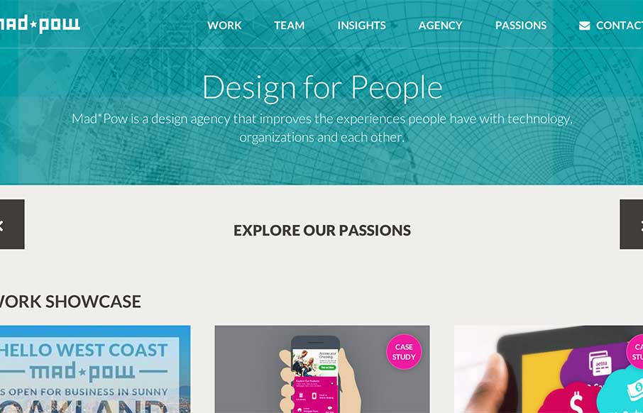
by Aaron Griswold | Jan 6, 2015 | Design Firm, Gallery
I like how Mad*Pow out of Portsmouth, NH has used their slider in a different fashion – less big image, more information. Also like how most of the coloring for the site comes from their examples of work – build a canvas, fill it up!
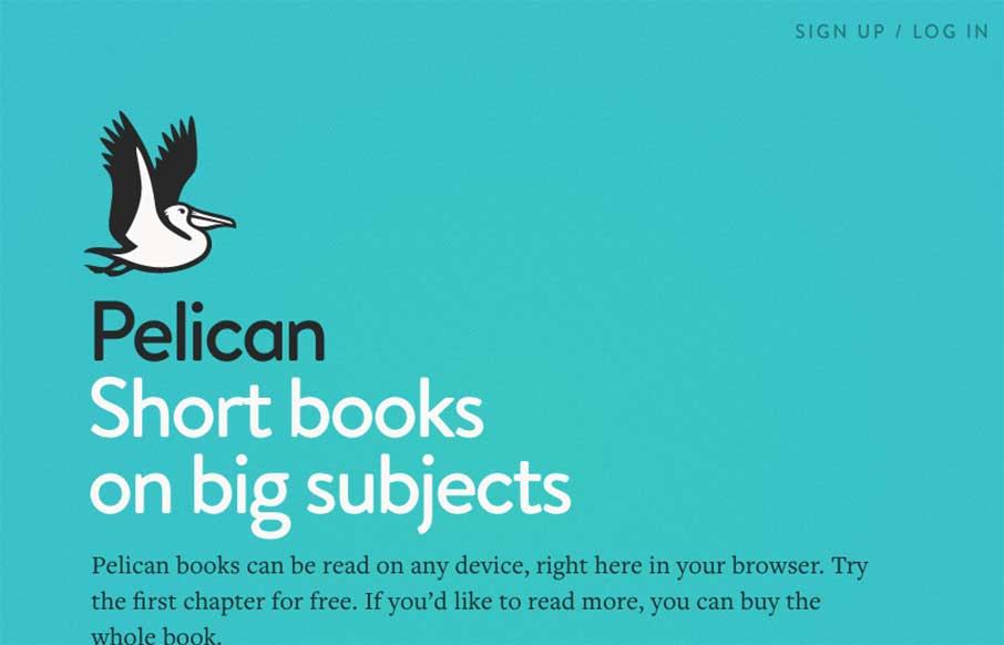
by Aaron Griswold | Jan 5, 2015 | Education, Gallery
Pelican’s site, “an imprint of Penguin Books,” has a very clear path of what they want you to discover and do. It’s clean and classic in how it presents info, and makes me feel like the Pelican “app” will allow for an easier reader...