by Gene Crawford | May 1, 2017 | Gallery
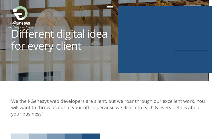
Pretty nifty scroll triggered interactions and movement. I dig how the elements shift around as you downscale the browser window too. Showing off what they can do. Some clever layout and illustrations really seal the deal on this design. i-Genesys is a creative agency...
by Gene Crawford | May 1, 2017 | Gallery, Portfolio
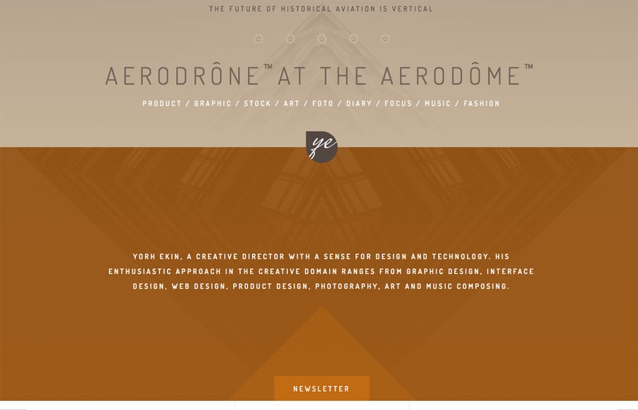
I like the subtle blend of colors and the slight movement of the graphic behind the main intro text as you scroll. The display of work is straight forward and fun enough to keep you scrolling. Yorh Ekin, a creative director with a sense for design and technology. His...
by Gene Crawford | Apr 27, 2017 | Design Firm, Gallery
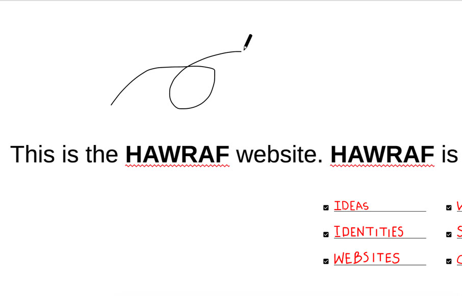
Pretty dang crazy website. I kinda dig it though. It’s highly confusing form a standard set of expectations, but it ends up working just fine. I actually called someone over to my desk and asked them to figure out how to do something on the site and they did no...

by Gene Crawford | Apr 24, 2017 | Gallery, Portfolio
Great portfolio website design for Ariel Beninca. I love the simplicity which makes you really notice the way the work is presented as you scroll down the page. There’s a very clean aesthetic here but just enough movement and fun to show off some skill....
by Gene Crawford | Nov 3, 2016 | Gallery, Portfolio
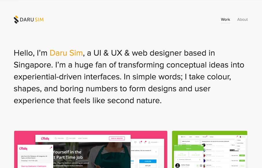
Simple and effective. You can beat a one – two punch like that. This website embody’s that in every way. From the Designer: It’s almost the end of 2016 and I thought that its time to revamp my personal website (v3.0) and yay, I’ve done again...