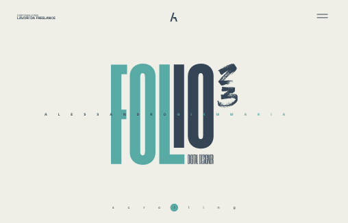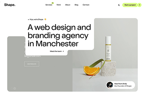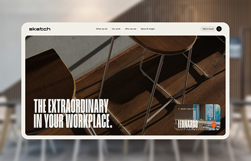
Cool, image heavy site. I really like the hero image style video and then how the navigation comes up under that as you scroll and then sticks as the header. The remainder of the page is nicely organized and continues with the great imagery. From the Designer: Oxen is...
Rytter & Rytter
Pretty clever single page layout for Rytter & Rytter. I like the way the sections are laid out as you scroll down, the flow feels nice. My favorite section is the pictures of their work, the way they're cataloged and displayed is just clever.
CapRadio Raffle
Nice work with this heavy grid layout, lots of sections of content to get on the page. Sometimes, boy do I know, it's hard to work with all sorts of content that a client might give you and this design just screams this to me. I really like how it's all balanced and...
Think with Google
What a beautiful yet simple layout for Think with Google. I love this, material design in play as well here. Well balanced sections and plenty of space between elements make this easy to scan, read and remember.
Justin Bartlett
Pretty cool, the first site i've seen using the ".guru" domain. Also I like how he asks for your first name before you go deeper into the site, then rolls you right into case studies. Pretty clean and smooth experience overall too. From the Designer: A minimalist...
Atlanta Tech Village
Really nice and clean layout for the Atlanta Tech Village website. I like the way they are showing you people in the space, with photos and video background, etc... the home page keeps you streamlined and puts what people would want to know most up front. This...
Skeleton
Clear layout and hip colors and type make the Skeleton website stand out. I like the focus on the case studies first - after all it's what you want people to check out. I dig that you get a bevy of info after you make your way past those 3 project sections. Also the...
Alex + Vivi Wedding
Nice use of images and supporting graphical elements. The flowers and website element colors match up with the photography really well, that's not easy to get done. I like the way it scrolls rhythm wise as well as slight parallax scroll on the header image/area.
University of Vermont
Great example of a responsive site for a university. Aside from the great responsive work here, I also love the main nav and search area. It's a mega-dropdown style but the entire page sort of slides down. The search box works the same way but it has everything you...
Newsweek
I'm not sure how long this responsive version of Newsweek has been live but I really dig it. I like the balance between screen width targets, they've handled the in between very well too. The large images on the main stories are balanced well over the older stories,...
Radar #110
In this week's 110th Radar: Mat Marquis – The Past, Present, and Future of Responsive Images When to Wordmark? A Future-Friendly Approach to Experience Design The Colors Of An App Icon Going Adobe-free Drag and Drop Newsletter Builder using jQuery The future of layout...
Episcopal School of Knoxville
What a beautiful website. I love just about everything about this site design. The nav is pretty standard and easy to get into. I LOVE the illustration work at the center of the page then the footer area is quite nicely setup and laid out it's great.
Postbox
The Postbox website is in many ways a very typical product website design. But in other ways it's far superior. It uses the normal patterns of showing off a product in a clean and simple way but has some really great deeply detailed sections that show how the app...
Cole Townsend
Nice minimal site design. I like the blocks of content and how they keep you focused as you review the home page. I'm not huge on the way they handle when you scale down for mobile screen widths, but overall it's smooth and works great across whatever device.
Parcel
I love the way the illustrations and typography meld together. It's a perfect mix of things. I also really love the signup form design a great deal. Clever use of making it simple looking and unique and interaction enough to help the user get it quickly.
Pizza Dough Pretzel Page
It's not the entire website that i'm wanting in the gallery here but this Pizza Dough Pretzel Page in particular. I love the typography work here and how it all interplays with the photos. Super smart layout choices that mimic print pretty well too. Love this page!
Nice Vice
I love the simplicity and straight forwardness of the Nice Vice website design. It's simple and to the point which is nice. I also dig the nav/logo transformation that happens as you scroll down the page, that's a nice touch for the site design.
London Housing
The London Housing site is very simple in concept - I just like the typewriter movement of it, along with using real shapes to make the font / lettering. Here's a little more about the site: "This project is a compilation of recent media articles about the housing...
Frontend In Wonderland
Love the artwork in this year's From The Front conference out of Italy: Frontend in Wonderland. We're always happy to see other conference series pushing hard with design boundaries.
Briefing
Black and White and Re(a)d All Over.... Ok, I looked in the CSS, and there is no #ff0000, but I liked the joke. Love the simplicity of Briefi.ng - both in the design, and the stories - great for someone like me with ADD.
3 Horizon Interactive
Some pretty crazy interactions going on here. I dig it though. The colors and type that are paired together give it a rather open yet heavy feeling. I'm a fan of the navigation design too, see, what's the harm in just showing the nav at all times?
88and90lex.com
Nice single page scrolling design for 8and90lex.com. It's a smooth experience overall, you can just scroll or navigate by the header section too. The illustrations hit at the right times and look great.
Homer Hudson
Never too early in the morning to think about ice cream... mmmm... ice cream... Homer Hudson's site out of Oz is bright and different. Looks like one page with a few modals - compact, with all emphasis on the product. It's a little bit of UX risk with the scroll left...
Radar #109
In this week's 109th Radar: Apple Event Roundup Responsive Upscaling: Large-Screen E-Commerce Design Making the switch from graphic to UX/UI design Using Graph Theory to Build a Simple Recommendation Engine in JavaScript CSS vs SVG: Styling Checkboxes and Radio...
Void By Hi-Res
I didn't even attempt to see what was under the hood on this site - didn't care - was having too much fun with it. Void was done by Hi-Res out of London. Not sure why they did it - but who cares - pretty darn awesome - happy Friday!
Torpedov
Pretty solid graphics on the home page, I dig that left or right choice. I also like how he's used the hamburger menu thing in the logo look as well. It helps tie it together for people. Nice use of slight animations in the case study imagery as well. From the...
Adam Crigger
Well, damn. Adam Criggger - well done. He's made his portfolio / resume site look unique, subtle and clean. And the fact that he has a seemingly out of place Biggie Smalls quote and video hanging out on the site, with the star field background floating through......
EPL – Most Valuable Kits
Love this way ESPN has made this interactive infographic for the English Premier League's "most valuable kits" this year. Great work on the kit illustrations and the overlay work to see home and away kits. Like the marketing aspect of it too - links to Dick's Sports...
Wove
Well - we're back to a "me want" product. I live on my iPhone and FitBit - something tells me Wove may be a pretty cool symbiosis of the two. The site is minimal, but has a lot going on. Starts with a cool intro - that goes into a "static" page with minor animations...
Grab House
Pretty utilitarian design for Grab House, but somehow they've made it look appealing visually. I dig the search box area and then as you scroll down there are timed info blocks that load pretty smoothly.