by Gene Crawford | May 24, 2012 | Gallery
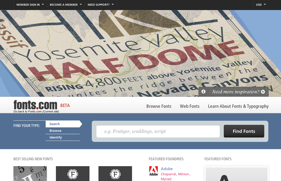
Looks as if Happy Cog just rolled out a new design for fonts.com. Here’s a super detailed blog post about it. I like a lot of this new design. My particular favorite is the main image slideshow and how the main site colors change out as you experience it. Good...
by Gene Crawford | May 22, 2012 | Entertainment, Gallery
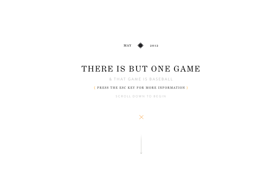
Holy wow, Eephus League Magazine: eephusleague.com/magazine/(via this @dribbble drbl.in/ecEd)— Dan Cederholm (@simplebits) May 21, 2012 Re: the previous tweet, now that’s how you publish a magazine on the web. Embrace the vertical scroll (which is the...

by Gene Crawford | May 22, 2012 | Education, Gallery
Lore previously known as coursekit (this subsite is a beautiful experience in it’s own right – check it.) is a simple looking layout, but is very well balanced and packs a punch impact wise. It’s both subtle and complex at the same time wich just...
by Gene Crawford | May 21, 2012 | Gallery, Photography
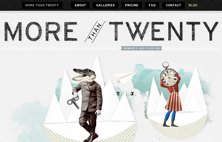
Submitted by: Paul Mosig @r_a_c_k_e_t Role: Designer & Developer Very simple website execution, the fixed header/navigation bar does give it a level of interest interaction wise, as well does the FAQ section. It’s the illustration work that sets this site...
by Gene Crawford | May 18, 2012 | Gallery
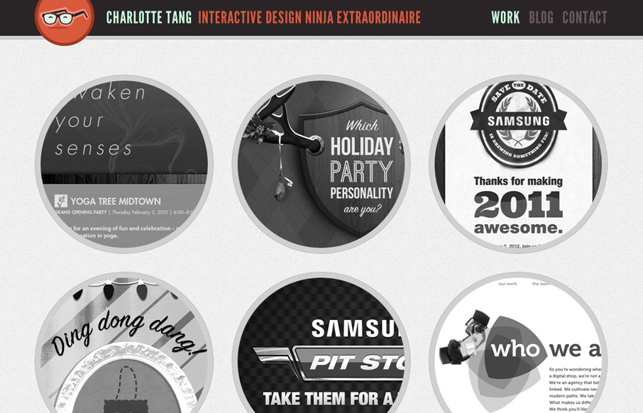
Wonderfully bold and yet delicate feeling site design. The circles add a lot to keeping it looking/feeling accessible and the type choice gives it that bold edge. I love the glasses logo/icon too.
