by Gene Crawford | Apr 17, 2012 | Gallery
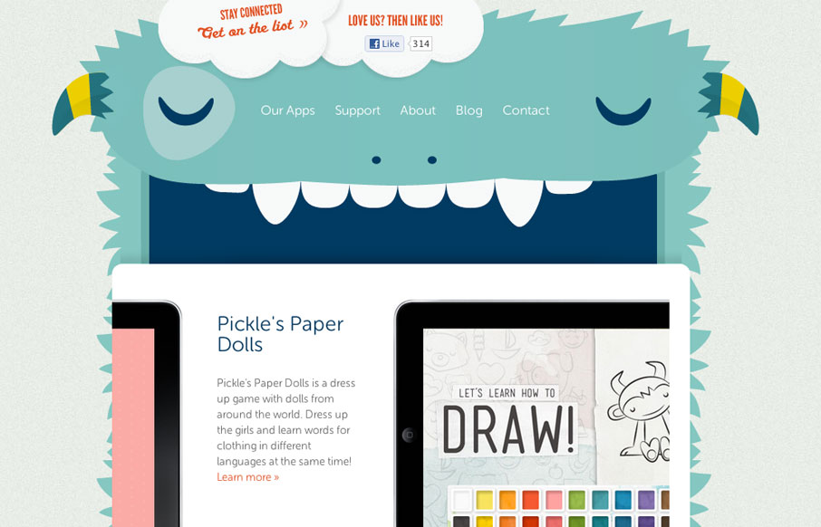
The Playtend website is just pain fun. I love the monster and how it all ties in with the name. Taking a look at it in our screen cast review Giovanni and I spell out how much we enjoy this website.
by Gene Crawford | Apr 13, 2012 | Blog, Gallery
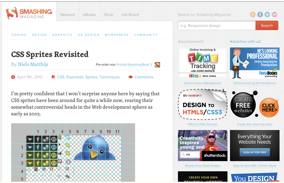
Smashing Magazine is one of those industry staple websites right? Like Facebook, you mess with it people either love it or hate it. Giovanni and I explore the responsive design decisions in some detail (kinda) in our screen cast review. Overall we do really dig the...
by Gene Crawford | Apr 12, 2012 | Gallery
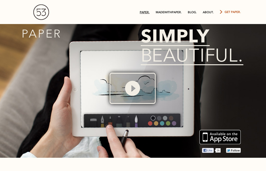
The Paper app home page is actually a sub page of the FiftyThree website. It’s gorgeously clean and simple though. I absolutely love how the images and copy flow down the page being strongly gridded out but yet almost asymmetrical at the same time.
by Gene Crawford | Apr 12, 2012 | Design Firm, Gallery
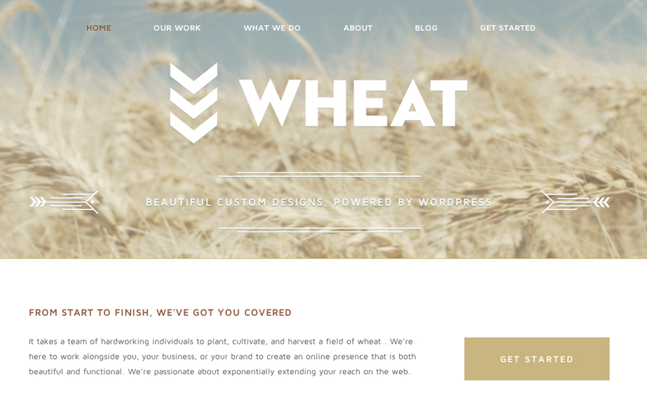
Just a beautiful design, simple as that. I love the big bold image of the wheat and the large WHEAT set on top of it. Subtle yet not at all. The rest of the site is a display of restraint by the designer, which shows maturity to me. Love it.
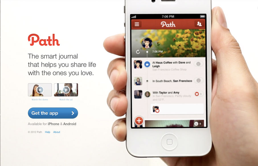
by Gene Crawford | Apr 11, 2012 | Gallery, Screencast Review
The path.com website is a simple/minimal thing of beauty. The background of the site is a demo video that auto-plays in a very unobtrusive way. It’s brilliant really, showing off the app like that – since that’s what will make you fall in love with...