
by Gene Crawford | Jan 28, 2014 | Gallery, Shopping
The Jewelry Wise website is a great example to study if you’re considering one of those mega-navs. This design utilizes it quite well on both the desktop and mobile versions of the design. The page also has good rhythm and leads you down the page in a succinct...
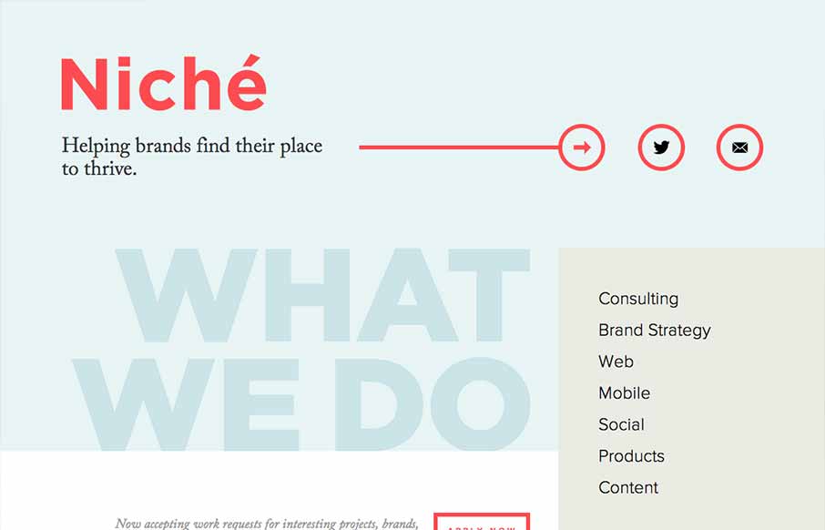
by Giovanni DiFeterici | Jan 9, 2014 | Gallery
Niche Creative is ultra minimal. It’s minimal design, minimal interaction, and minimal content. You can’t get more minimal than that, and yet, the site feels complete and useful. The beautifully soft colors are wonderful. If their list of services looks...
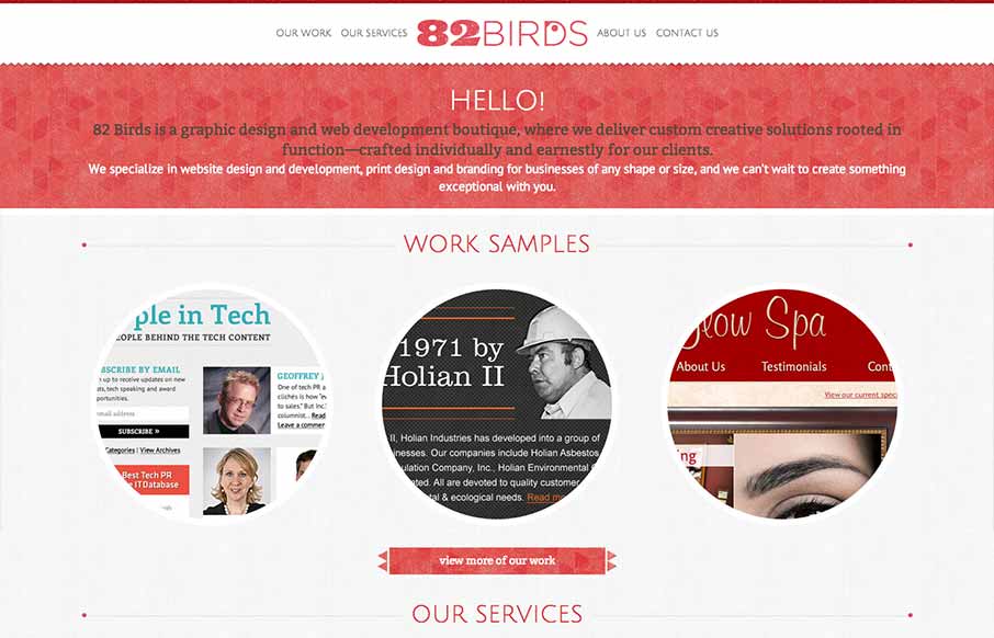
by Giovanni DiFeterici | Jan 6, 2014 | Gallery
82birds has a lovely handicraft feel that pairs well with the company’s brand. The typography is nicely balanced by the textural elements peppered throughout the site. I especially like the thin line dividers that bookend page titles.

by Giovanni DiFeterici | Dec 17, 2013 | Gallery, Screencast Review
Colgraphix this is a nice site with a mix of interesting animations, textures, imagery and media. One interesting detail is the loading screen, which manages the function well, but doesn’t feel like a loading screen. It’s a nice detail that makes the site...
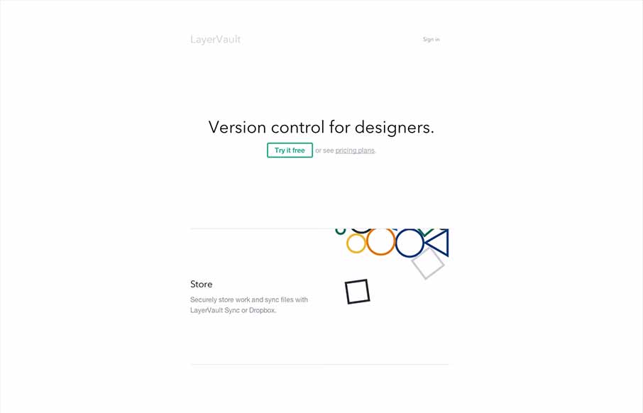
by Giovanni DiFeterici | Dec 16, 2013 | Gallery
Layervault has some crazy awesome animations. I love how each of the animations intuitively relates to the idea that they are trying to convey. It’s visually minimal, but conceptually complex. So simple and so effective. Nicely done.