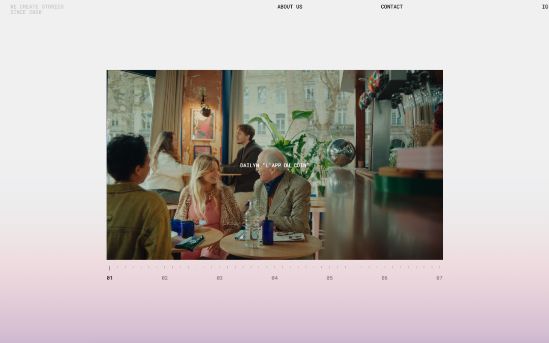
by Gene Crawford | Mar 26, 2025 | Gallery, Portfolio
Some really intriguing design here. I really like the video player and how it changes shape as you scroll with it. Super cool. Then the sub page layout and approach is also interesting. Makes you want to look at it all again. Nice job.
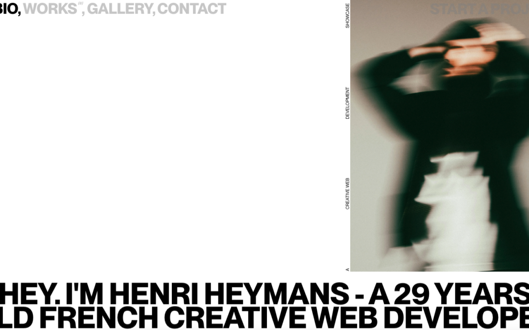
by Gene Crawford | Mar 25, 2025 | Gallery, Portfolio
Nice brutalist inspired design. I love the expression involved with this style, but I always wonder about it’s effectiveness.
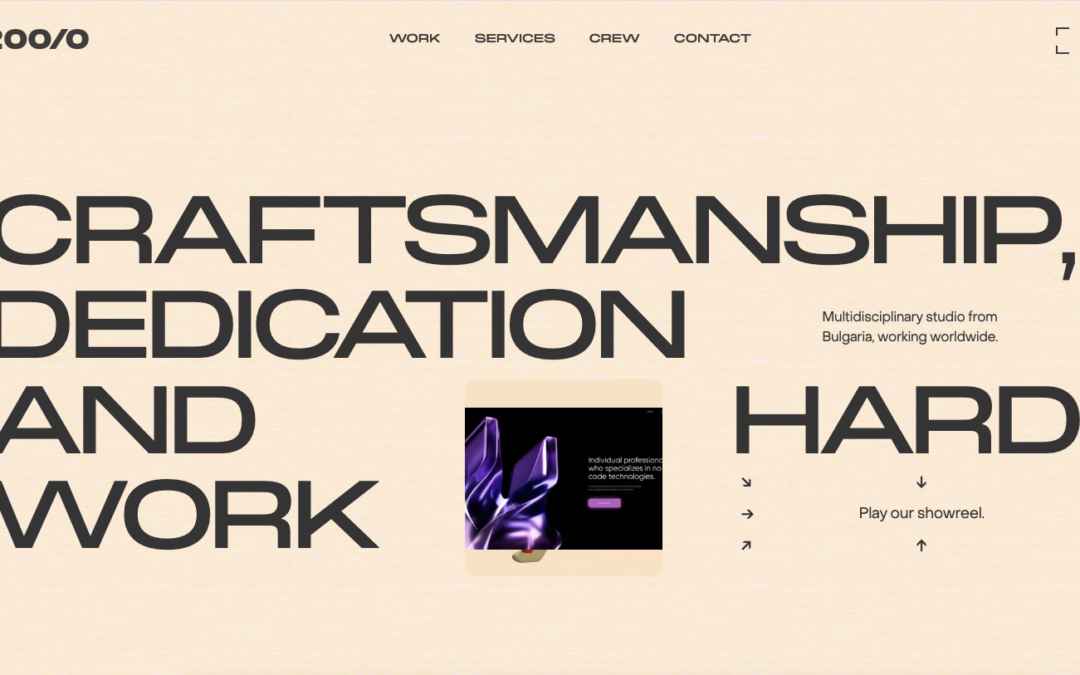
by Gene Crawford | Mar 24, 2025 | Design Firm, Gallery
Love almost everything about this. I haven’t seen that typeface used in a while and I LOVE it. It’s retro but not totally. I love the colors as well. Bravo.
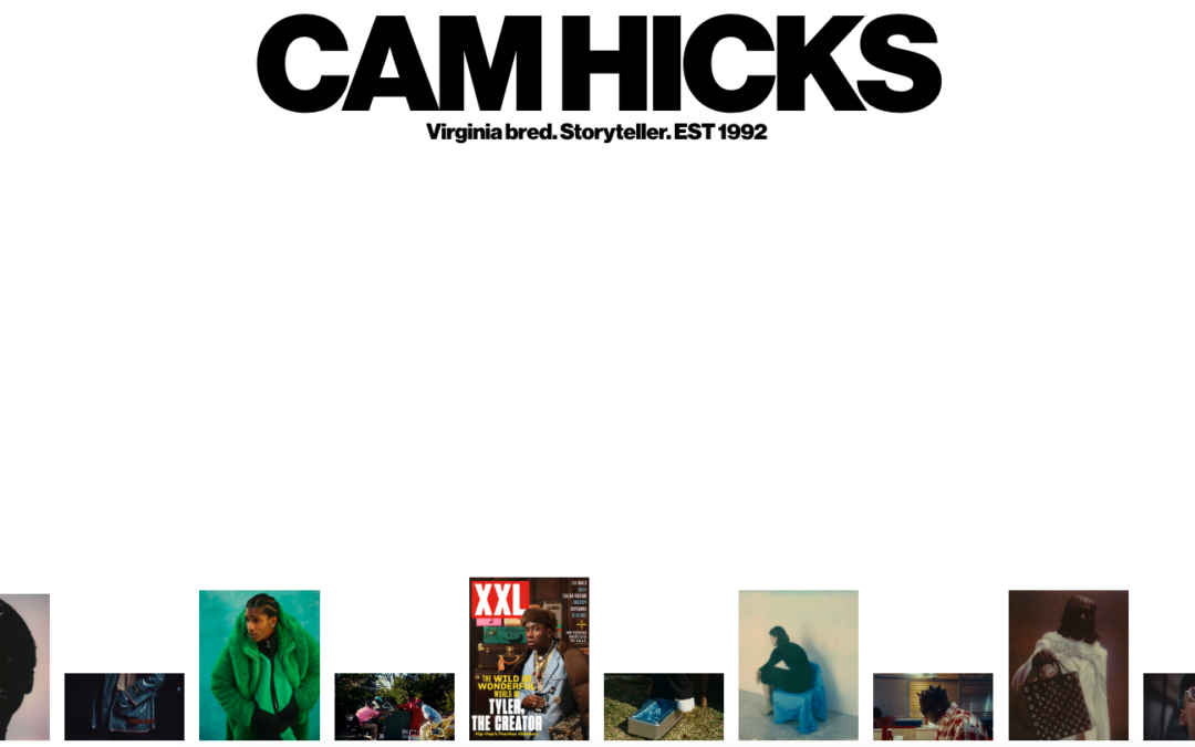
by Gene Crawford | Mar 19, 2025 | Gallery, Portfolio
Really simple portfolio layout/presentation. It’s very clever though. I love minimalist design, maybe too much. 🙂
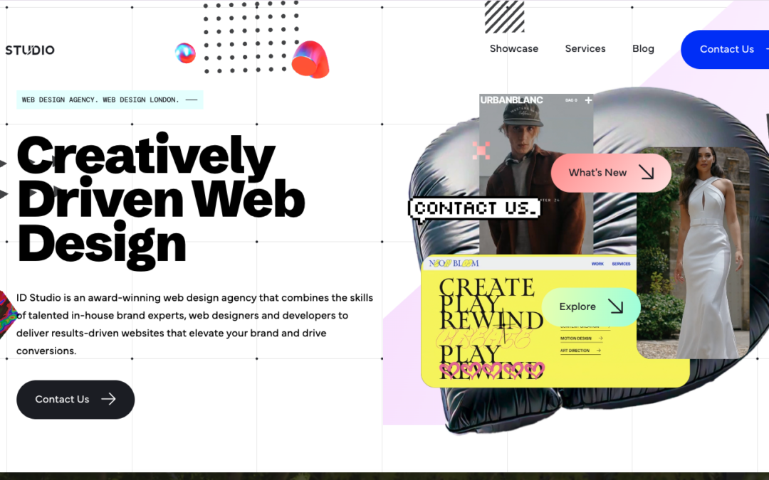
by Gene Crawford | Mar 13, 2025 | Design Firm, Gallery
This website is the company portfolio of ID Studio Web Agency a London-based web agency. The core objectives are to present our showcase and services to impress and attract new clients.