by Aaron Griswold | Apr 15, 2014 | Gallery
Little details make the site. I like the little movement the down arrow has, just to let you know it’s there. Then the little paper airplane on the contact button is nice.

by Aaron Griswold | Apr 15, 2014 | Design Firm, Gallery
Similar design patter at work, with the big hero area and the sliding into place main navigation. I like the slight transparency to that main nav on this site and the icon work is beautiful.

by Aaron Griswold | Apr 14, 2014 | Gallery, Portfolio
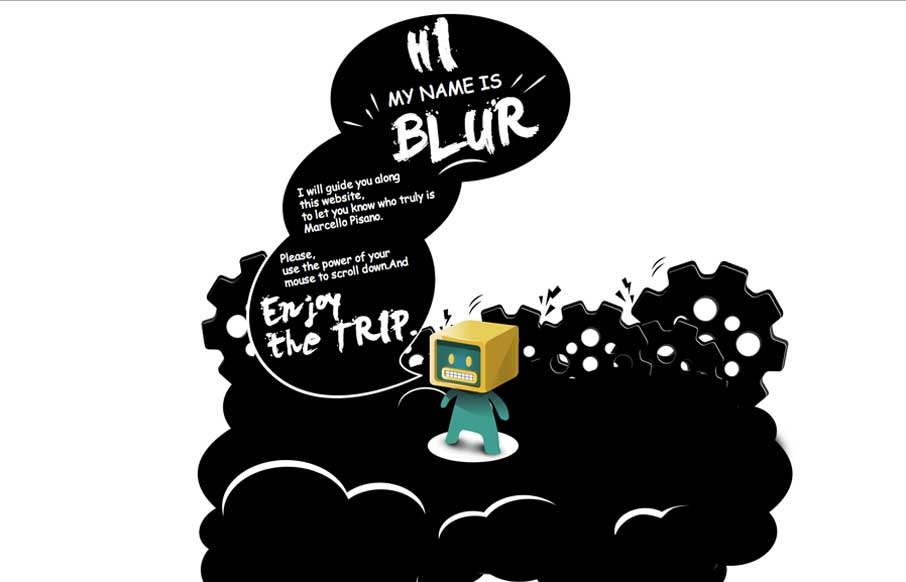
Nifty portfolio site for the illustrator Marcello Pisano. The illustrations are cute and the site is designed to show off the guy’s skill like it’s supposed to. The timed faded in pieces are a nice touch as well.

by Aaron Griswold | Apr 14, 2014 | Gallery
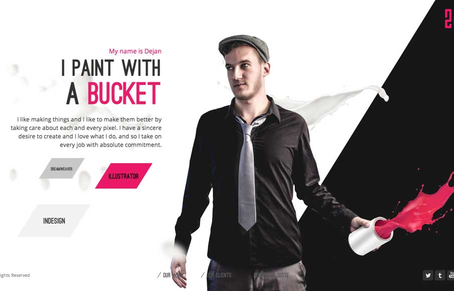
Sometimes you’re presented with something completely different, like in the case of the 2che website. When you start to scroll you go right to left and there’s a sort of horizontal parallax (which is the original direction right?) going on. It’s not...

by Aaron Griswold | Apr 11, 2014 | Gallery
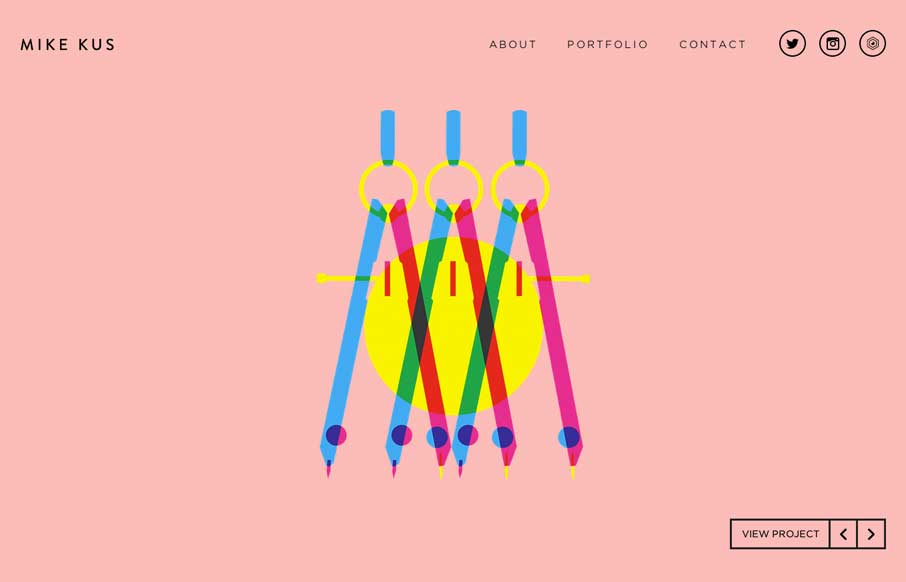
There’s nothing quite like a simple beautifully designed website. Mike Kus nailed it.


