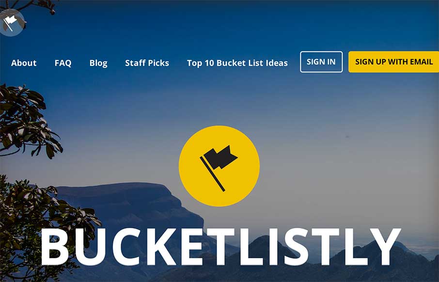
by Aaron Griswold | Dec 5, 2014 | Gallery, Travel
Dude… where was this site when my wife and I were living and traveling in Australia, South East Asia, and Europe – sans kids? This is awesome visual representation of peoples “bucket lists” – from skydiving to climbing Mount Kinabalu in...
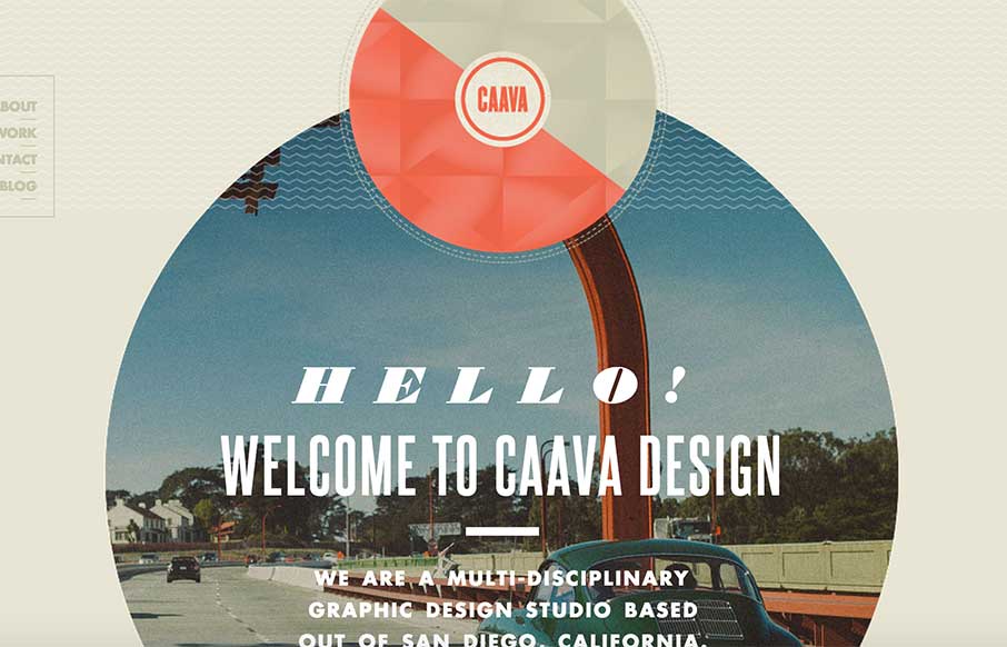
by Aaron Griswold | Dec 5, 2014 | Gallery
Great single page agency site from Caava Design out of San Diego, California. While I wish it were responsive, I love the layout and coloring – an neat trick with the arrow coming down on scroll to highlight the Featured Work area.

by Aaron Griswold | Dec 4, 2014 | Gallery
Great looking site from Amazee Labs out of Switzerland. Like how they carried the tape pieces theme through out the site – all the way to making new social media icons in the same theme (from their team detail pages). Plus – I accidentally found their 404...

by Aaron Griswold | Dec 3, 2014 | Gallery
Solid looking portfolio site from Ash Stallard-Phillips out of Southampton, UK. Has cool flat illustrations and fly-ins that give the light site some depth… (yeah, I just said the flat illustrations give depth…)
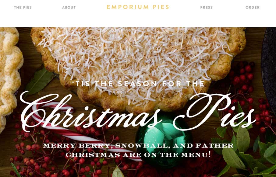
by Aaron Griswold | Dec 3, 2014 | Food and Beverage, Gallery
My co-worker and I have been staring at this site for a few minutes going “mmmmm…. pie” as if we were two Slingblades sitting in a hipster office staring at pies… I know – sad visual… but the Emporium Pies site is a very good...