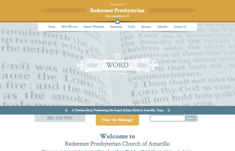
by Aaron Griswold | May 7, 2014 | Gallery, Nonprofit
A nice easy going design for the Redeemer Presbyterian here. I’d love for it to be responsive but you can’t always get what you want, eh? I do really dig the header area’s design a great deal.
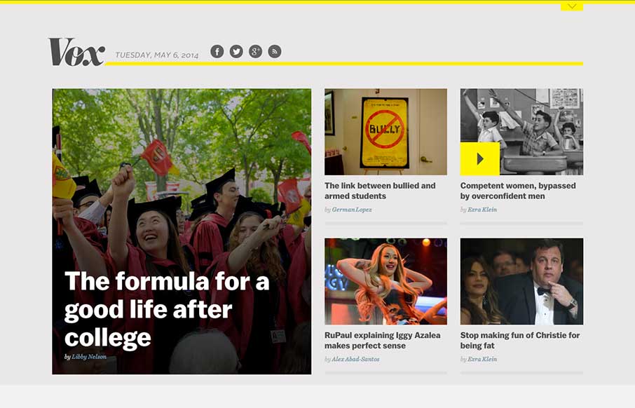
by Aaron Griswold | May 6, 2014 | Blog, Gallery
Nice example of a responsive approach to a new site/blog. It’s always great to study how designers approach these same screen size transitions with sites that handle a lot of content.
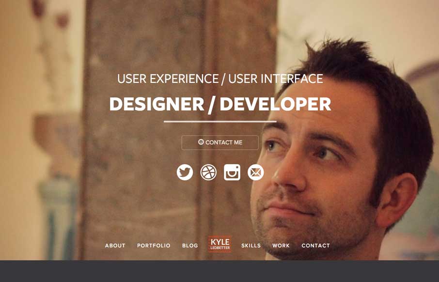
by Aaron Griswold | May 5, 2014 | Gallery, Portfolio
Very nice portfolio site design. Chock full of detail work and what you’d expect from a UX designer. Lovely colors and visual pairings as you make your way through the content and skills section.
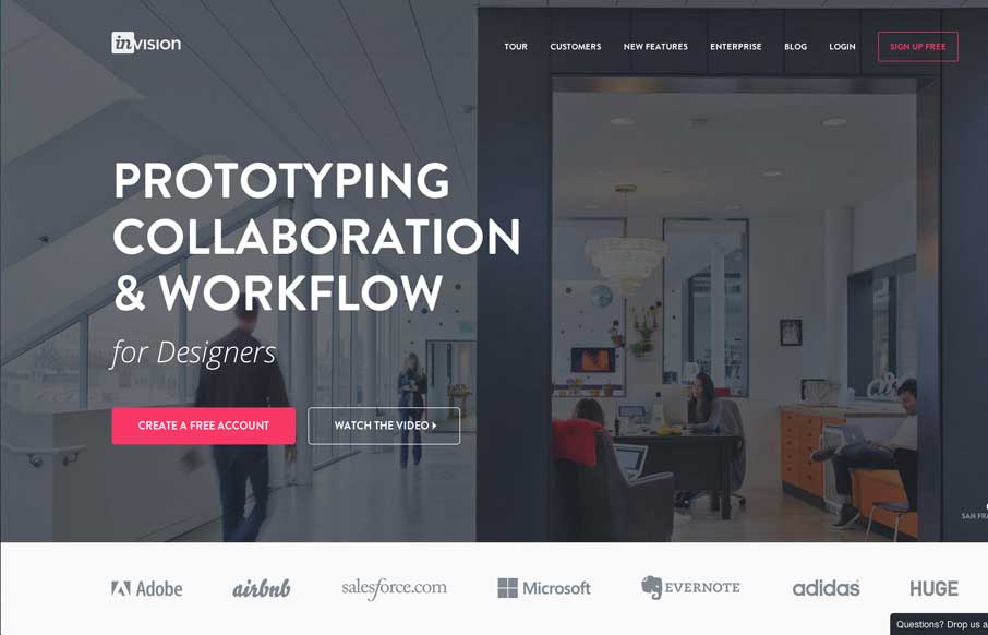
by Gene Crawford | May 5, 2014 | Gallery
Nice redesign of the Invision website. I dig the embedded videos down the page. I also think the way they’ve used the “stories” to display other brands is pretty smart too. Great stuff here.

by Gene Crawford | May 2, 2014 | Gallery
Man this site is stacked with cool graphics and interaction stuff. I love the color combo and how it’s put together. The “menu” link that opens up more nav options while sticking the main two out beside it is so smart. Really beautiful website.