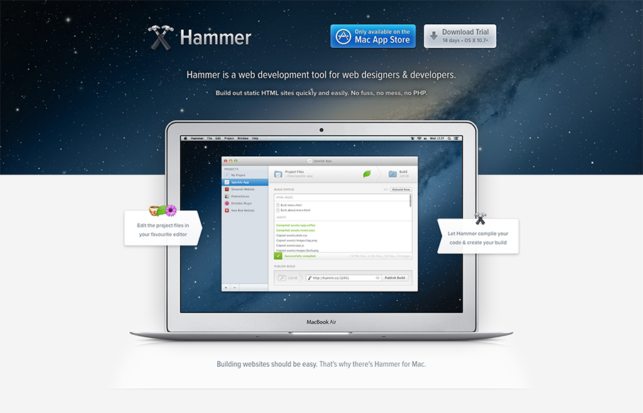
by Gene Crawford | Dec 13, 2012 | Gallery, Software
Beautiful website for Hammer. I love the airy-ness of the way the content is designed and balanced with colors. The slideshow (not sure that’s quite the name for it) is masterful. I love the zoom in to see the detail of the screens and the interactions overall...

by Gene Crawford | Dec 12, 2012 | Gallery
Nice clean and sleek looking new design for the Skype website. It’s responsive too which is super smart for them to not miss this type of user since Skype is not available on most mobile platforms. I love the big call to action in green almost in the center of...
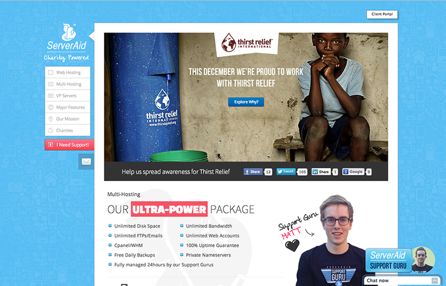
by Gene Crawford | Dec 11, 2012 | Gallery
Cool fixed nav on the left side of the site. I like the non-traditional feel of this layout. It makes it stand out pretty well. They’ve managed to pretty thoroughly explain what it is they do and also humanize who they are with the design as well. Smartly...
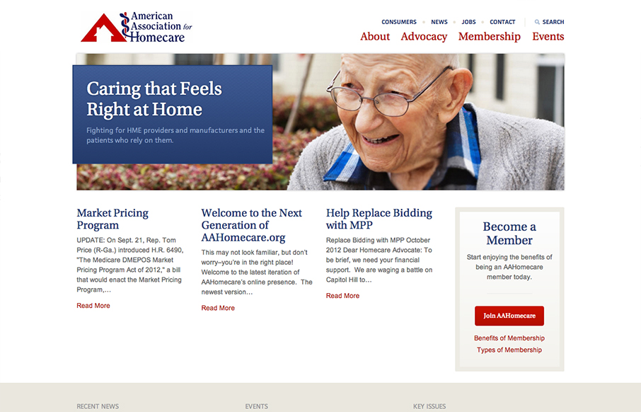
by Gene Crawford | Dec 11, 2012 | Gallery, Nonprofit
I like the changes in the way the main nav and “tools” nav are handled in the transition between screen widths. Nice simple clean design makes it easy to get in and out of the content.

by Gene Crawford | Dec 6, 2012 | Gallery
What a richly packed layout we have here. It’s simple and open yet very dense visually at the same time. That’s very hard to achieve and Mobilla does it very well. I especially like the main hero image that’s responsive and static almost with the...