
by Gene Crawford | Feb 29, 2016 | Gallery, Nonprofit
Very simple color palette, and good typography from the TSE Foundation out of Hong Kong. I first saw it in a smaller screen – but it really opens up on a desktop and looks great, because it’s simple.
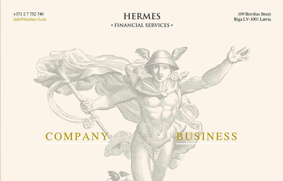
by Gene Crawford | Feb 29, 2016 | Gallery
This Latvian site for Hermes Financial Services is extremely minimal… but we like it because of that. Very simple and to the point, but also has a good look to the site – from the Hermes illustration, to the coloring and fonts.
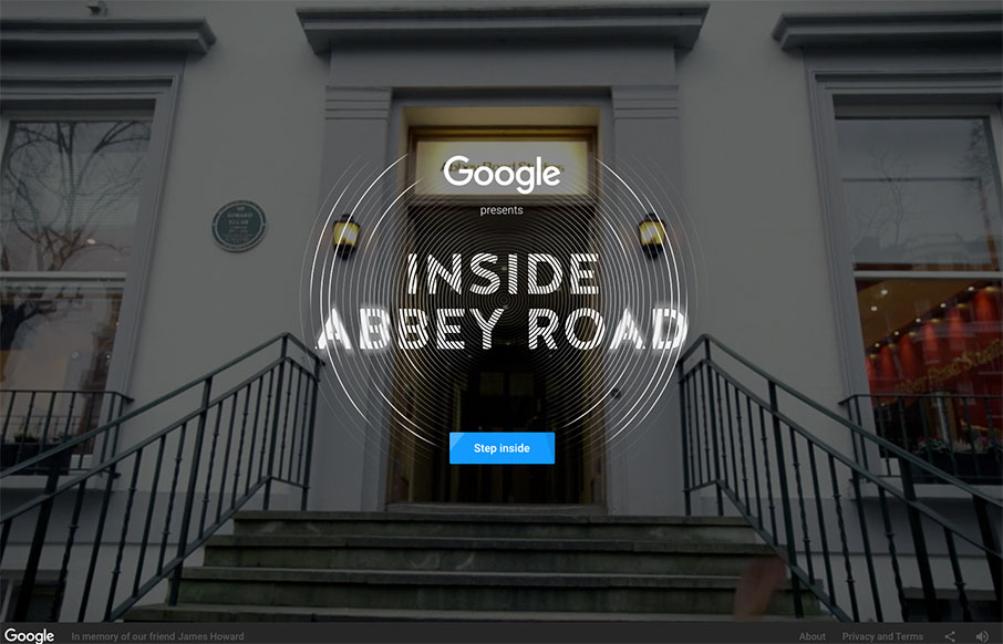
by Aaron Griswold | Feb 25, 2016 | Gallery, Music
Man, I love this virtual tour of Abbey Road Studios done in collaboration with Google and their indoor mapping / 3d imaging / video / webgl work. It all combines into an incredibly cool, immersive experience, complete with quadrophonic sound (if you’re using...
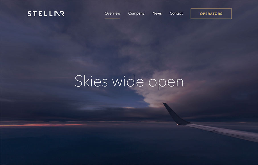
by Aaron Griswold | Feb 24, 2016 | Gallery, Travel
I think this is a cool site – Stellare.aero out of Palo Alto – a digital marketplace for private aviation. Very clean and airy with cool animation and video. Also really like the color combination / palette and animated icons on the Operator page.

by Aaron Griswold | Feb 23, 2016 | Design Firm, Gallery
Bold site from Henrik and Sofia out of Sweden. I like the “cheekiness” of the design of the Selected Work as you go down the page. Good work on the portfolio / work detail pages too.