
by Aaron Griswold | May 5, 2014 | Gallery, Portfolio
Very nice portfolio site design. Chock full of detail work and what you’d expect from a UX designer. Lovely colors and visual pairings as you make your way through the content and skills section.
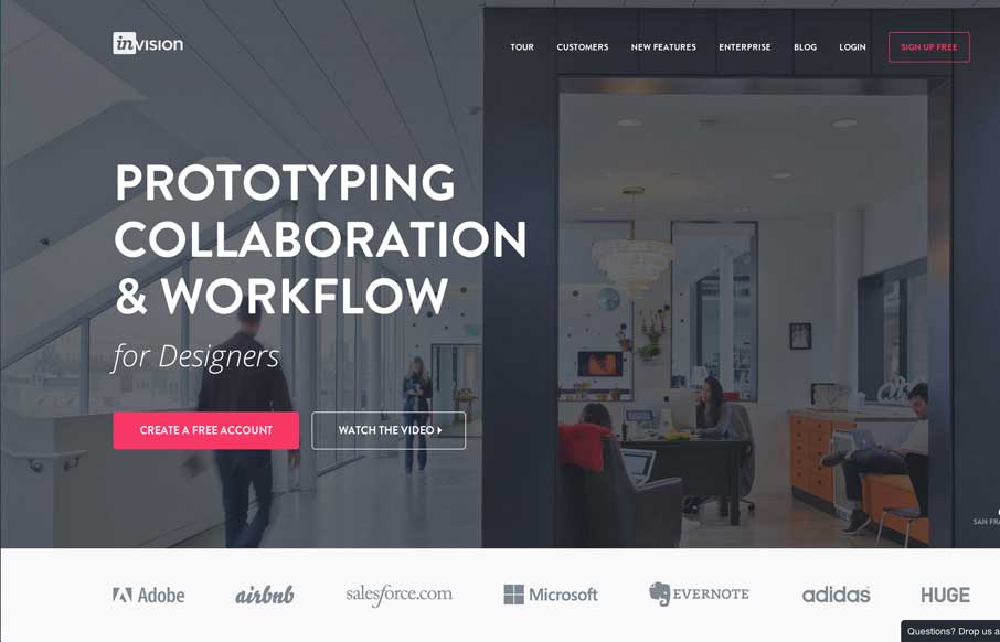
by Gene Crawford | May 5, 2014 | Gallery
Nice redesign of the Invision website. I dig the embedded videos down the page. I also think the way they’ve used the “stories” to display other brands is pretty smart too. Great stuff here.

by Gene Crawford | May 2, 2014 | Gallery
Man this site is stacked with cool graphics and interaction stuff. I love the color combo and how it’s put together. The “menu” link that opens up more nav options while sticking the main two out beside it is so smart. Really beautiful website.

by Gene Crawford | May 1, 2014 | Gallery
Cool vibe to this site. I like using it. The use of the “hamburger” icon to show the names of the pages/sections instead of only relying on the icons is a good idea. I love the yellow and black with the B&W imagery to boot.
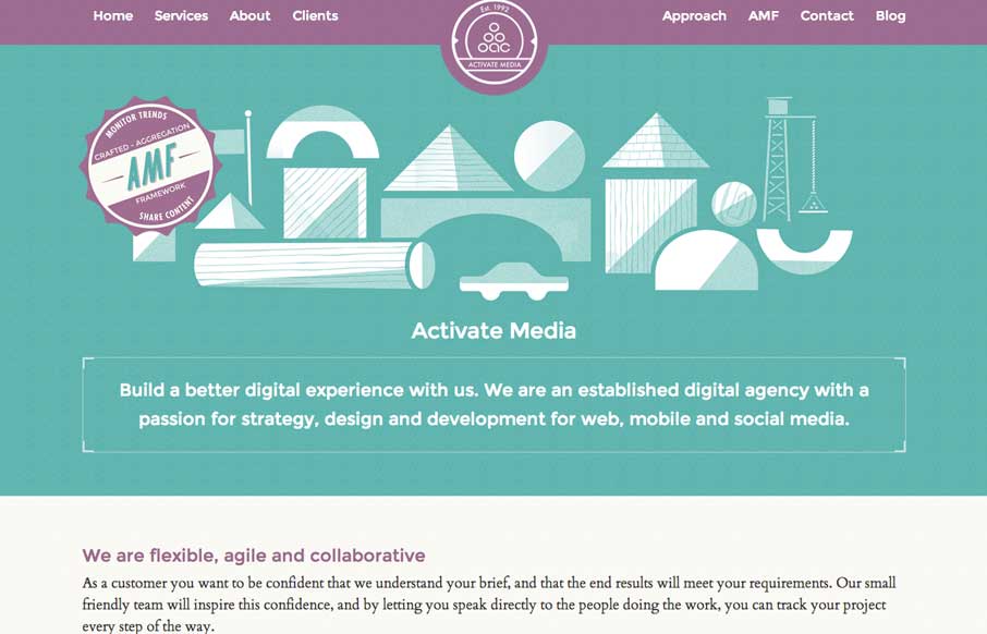
by Gene Crawford | Apr 28, 2014 | Gallery
Really cool look & feel + vibe to this site. I love the green and purple and how it works together here with the white lines. Beautiful and clever illustrations help seal the deal on this site.