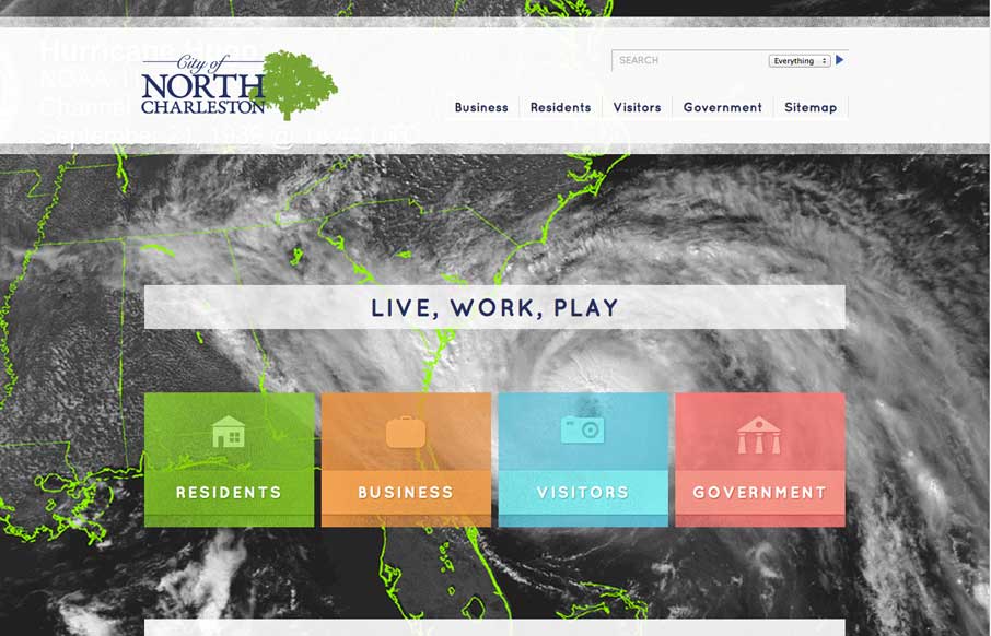
by Gene Crawford | May 30, 2014 | Gallery, Travel
Nice layout here. I really like the detail work in how the page simplifies when you scale the browser down for the various screen sizes. Smart stuff. Also the detail in the search box ux. Check it out.
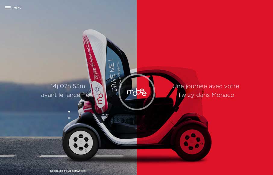
by Aaron Griswold | May 28, 2014 | Design Firm, Gallery
I had fun with this site. Translate from French (if you want), and scroll down. The experience isn’t overpowering, but it conveys the right mix of playful and cool – which is perfect when you’re essentially selling a lifestyle service. Since it...
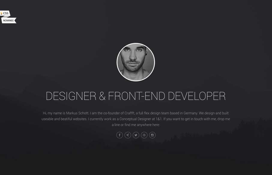
by Gene Crawford | May 27, 2014 | Gallery
Pretty fun layout for Markus Schott’s page. I like the life stats and graphs section. Gotta work on those dance skills though dude. 🙂
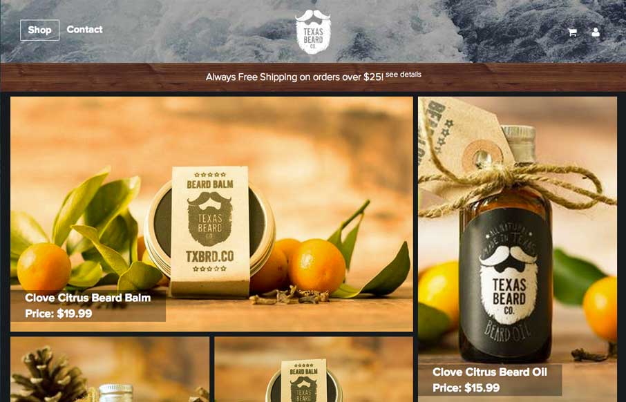
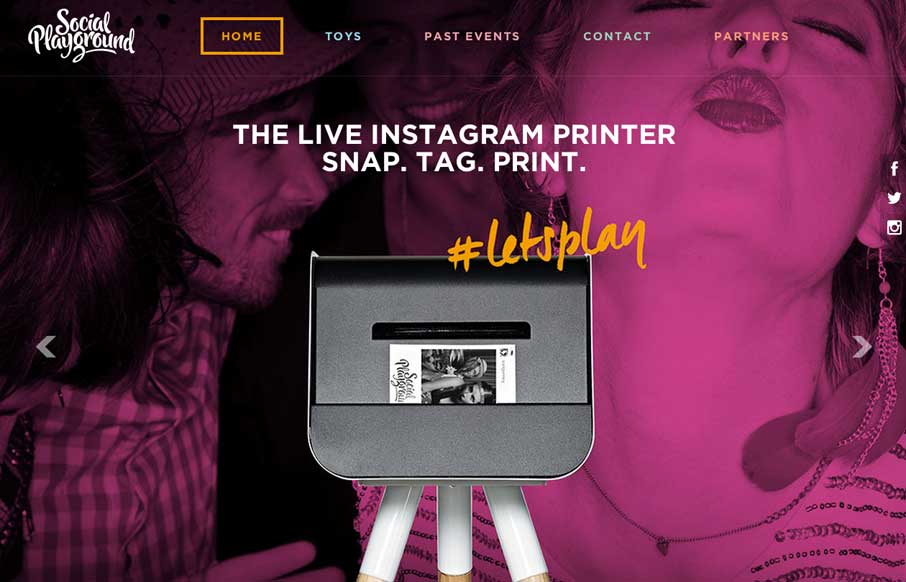
by Gene Crawford | May 27, 2014 | Gallery
Very nice, very simple site design. Good photos and a super awesome brand. I just smiled checking this site out.
by Aaron Griswold | May 23, 2014 | Gallery
Leave it to the Aussies! Said with love for a group of people that I got to spend a year with so many years ago. From experience, I can tell you that they love to have a good time! This site further accentuates that fact. I first like the concept of bringing the...