by Aaron Griswold | Aug 6, 2014 | Gallery
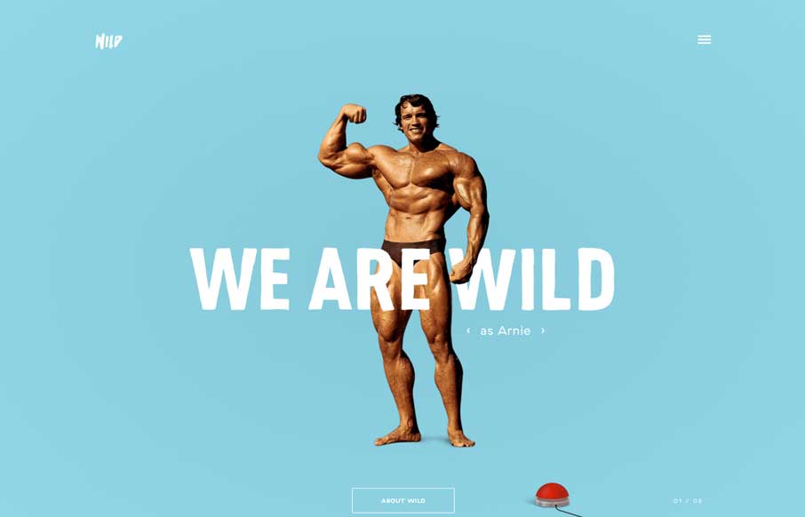
Um… yeah… where to start? Astronauts rotating around text? Parallax of a boxer being counted out? Wild navigation scheme that makes it fun to move around the site? Hamburger icon that animates into an X? Or the easter egg of all easter eggs – Arnie,...
by Aaron Griswold | Aug 4, 2014 | Design Firm, Gallery
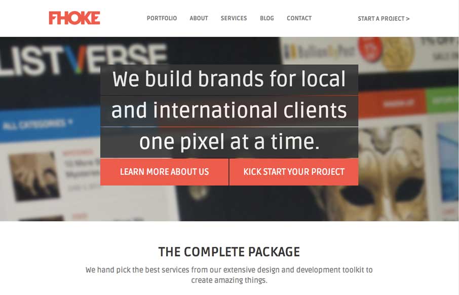
We’ve reviewed some of FHoke’s work before (i.e., Judgement Day) so cool that we get a look at their agency site. Really like the interaction of the jQuery masonry on the Portfolio page (we did this for a client recently – not as easy as it looks to...
by Gene Crawford | Jul 29, 2014 | Food and Beverage, Gallery
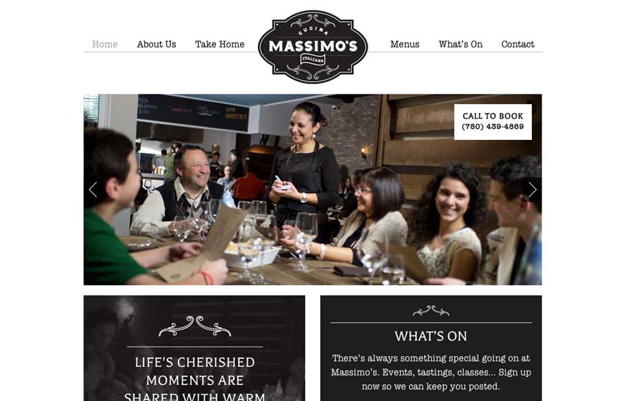
We love websites that make great use of fonts, and Massimo’s Cucina Italiana uses a couple of different fonts, accent illustrations, vibrant pictures, and black, white, and gray to tell the story of their restaurant. Simple, and effective. Submitted by: Landon...
by Aaron Griswold | Jul 28, 2014 | Gallery, Travel
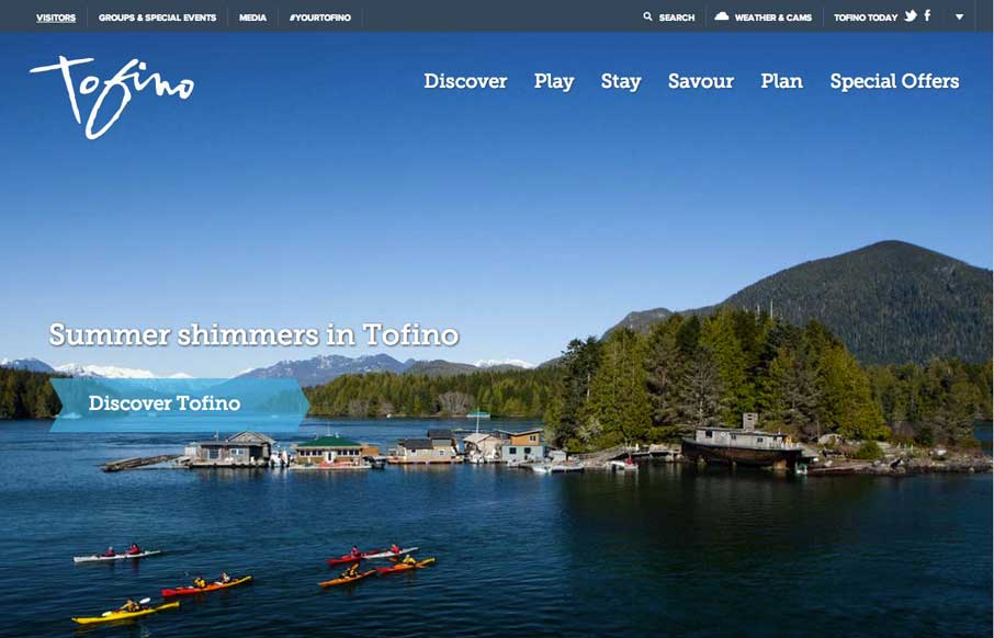
Cool use of different elements and shapes to give clear section delineations on the home / single page design. Also like the only drop-down in the top right corner (arrow) that works as a dashboard for the site. Submitted by: Jim Morris @ventureweb Role:...
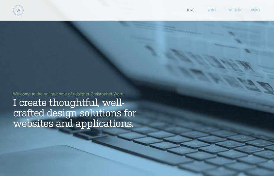
by Gene Crawford | Jul 25, 2014 | Gallery
Just a really clean and nicely subdued site design for a designer. I like it much. Submitted by: Christopher Ware @christopherware Role: Designer & Developer
