by Gene Crawford | Sep 24, 2014 | Gallery
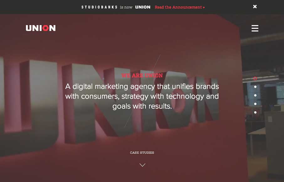
Here’s a good example of a site pretty much hiding everything except a few links to case studies/work examples under a fly out overlay nav. I gotta assume this is by design. I do like the idea of keeping most people focused on your work like this btw.
by Gene Crawford | Sep 17, 2014 | Food and Beverage, Gallery
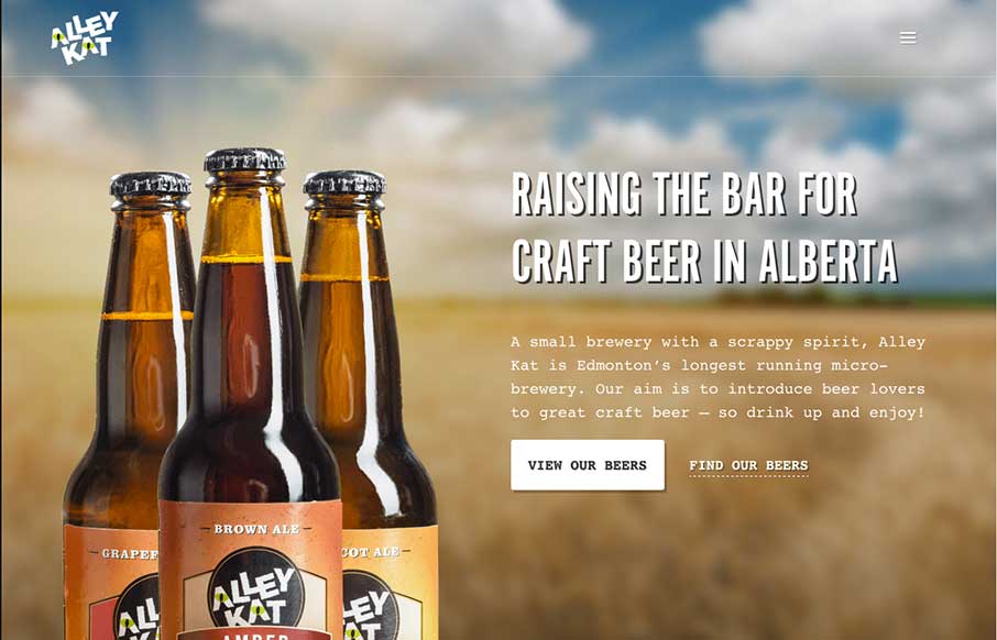
Nice design that feels “crafted” with some hand made looking sections, the type plays into this nicely. The site utilizes a Full Screen Overlay style navigation pattern which seems to fit aesthetically but not functionally too well.
by Gene Crawford | Sep 12, 2014 | Food and Beverage, Gallery
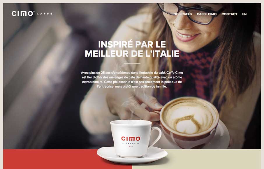
Really nice use of contrast. I’m not just talking about colors, but the way they contrast the photos and real imagery of coffee bags with flat areas of color and blocky bold type and icons. Really gives this page a nice rich visual feel. Love it, now for some...
by Gene Crawford | Sep 11, 2014 | Gallery
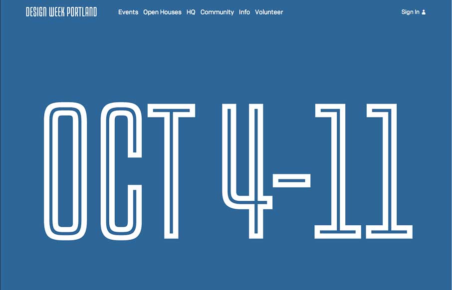
Simplicity and achieving marketing goals can indeed go hand in hand despite what your client will try to tell you (that’s a joke…) The Design Week Portland is simple and beautiful and get’s the job done while at the same time communicating something...
by Gene Crawford | Aug 29, 2014 | Gallery
Fun, it’s that simple. Great visuals and great execution. I just like to sit here and scroll the page. It’s like cats, i’ll watch it again and again.
