
by Aaron Griswold | May 5, 2014 | Gallery
What a fun website. I love the illustrations and the atmosphere they work to set. Beautifully done simple storytelling with just visuals that get you hooked.

by Gene Crawford | May 2, 2014 | Gallery, Travel
Oooh, what a nice site to check out. I luuurve the illustrations and how they’re used to tell a story. Beautiful stuff.
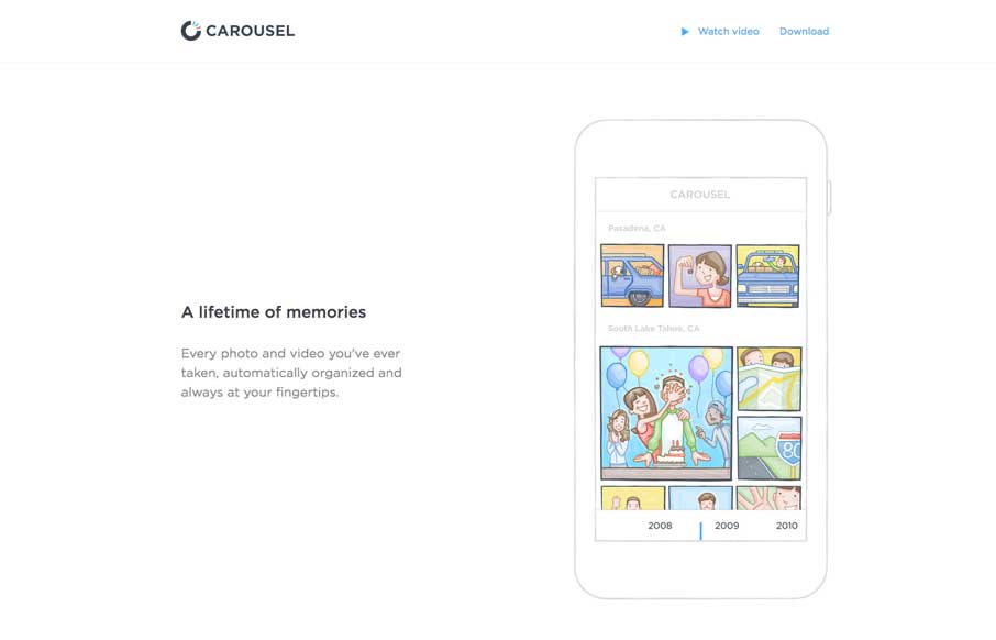
by Gene Crawford | Apr 30, 2014 | Gallery
Nifty one pager for the Carousel app from Dropbox. Just kinda tells the story and that’s all it needs to do.

by Aaron Griswold | Apr 30, 2014 | Gallery
As one-page websites become more prevalent, you start looking at them a little differently than when they first started popping up onto the interwebs. I like how clean and minimal the site is which makes it quicker to get to the information they think is important to...
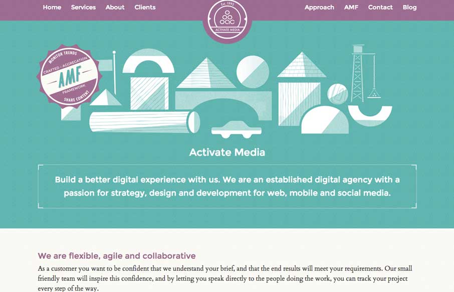
by Gene Crawford | Apr 28, 2014 | Gallery
Really cool look & feel + vibe to this site. I love the green and purple and how it works together here with the white lines. Beautiful and clever illustrations help seal the deal on this site.