
by Gene Crawford | Jun 20, 2014 | Gallery
Lots of good design queues in this site. Narrative and good visuals to support it. When that’s done well that’s all you need folks. 🙂 Submitted by: Ben De Rienzo @derienzo777 Role: Designer
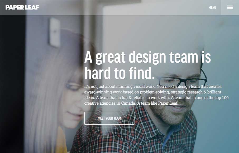
by Gene Crawford | Jun 19, 2014 | Gallery
Really nice clean design for Paper Leaf. I like the side menu design as well as the overall type treatment – slightly drop outlined or something. Quite nice. Highly detailed, responsive website built on Bootstrap and powered by WordPress. Key elements: CSS...
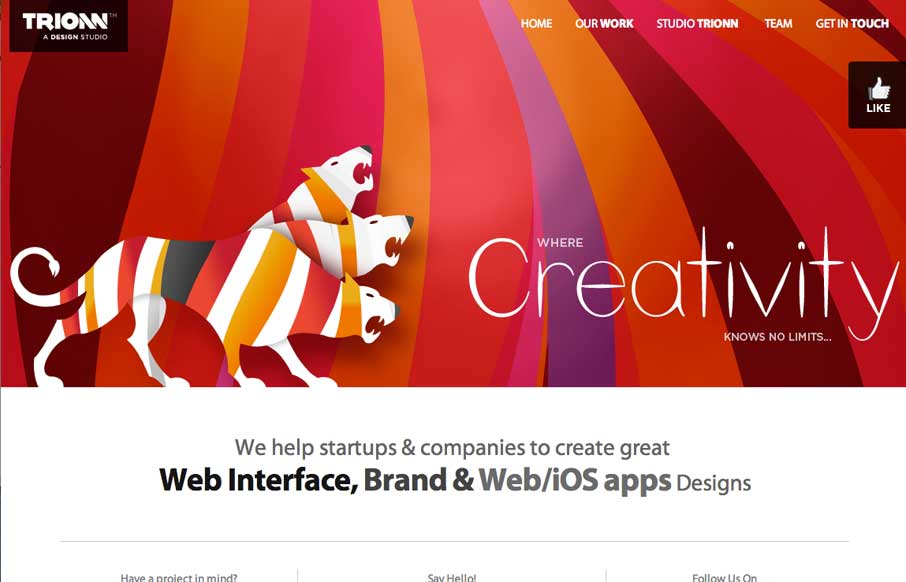
by Gene Crawford | Jun 17, 2014 | Gallery
Some neat graphics here. The three headed lion monster is pretty badass. I like the bold colors, but some of it is over the top. That said however, why not? Submitted by Sunny Rathod @trionn_design
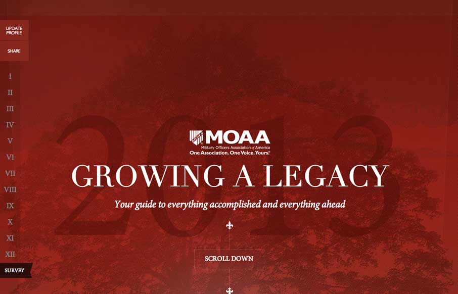
by Gene Crawford | Jun 17, 2014 | Gallery
Beautifully designed page. I love these type of websites, annual reports or whatever. They are a chance to stretch a website design’s limits sometimes. Submitted by LMO Advertising @lmoadv
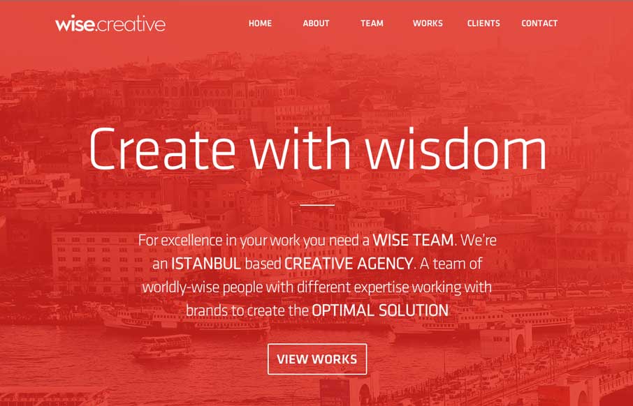
by Gene Crawford | Jun 17, 2014 | Gallery
I always like to see how people handle the fixed nav animation as you scroll design piece. Wise Creative is one of my favs too. I like the overall clean layout of the site as well. Classic color combo red, black and white too.