by Gene Crawford | Apr 14, 2016 | Gallery
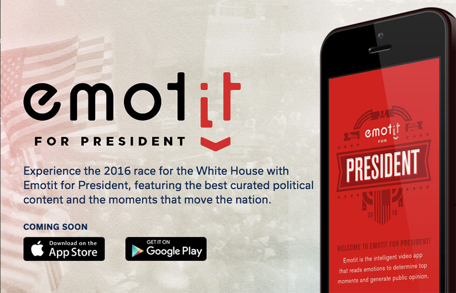
Real real solid product website here. I dig the overall concept of the way the app is presented. Also the detail work of the slight parallax in the bigger hero views really makes the site sing. The app itself looks beautiful and so the website pulling in some of that...
by Gene Crawford | Apr 7, 2016 | Food and Beverage, Gallery
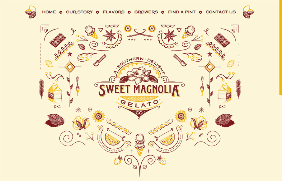
A lot of fun for this website for Sweet Magnolia gelato. The illustration is top-notch and made extra fun with the animation. The execution might leave something on the table but I don’t care. GELATO! From the Designer: Sweet Magnolia Gelato Co. makes gourmet...
by Aaron Griswold | Mar 29, 2016 | Gallery
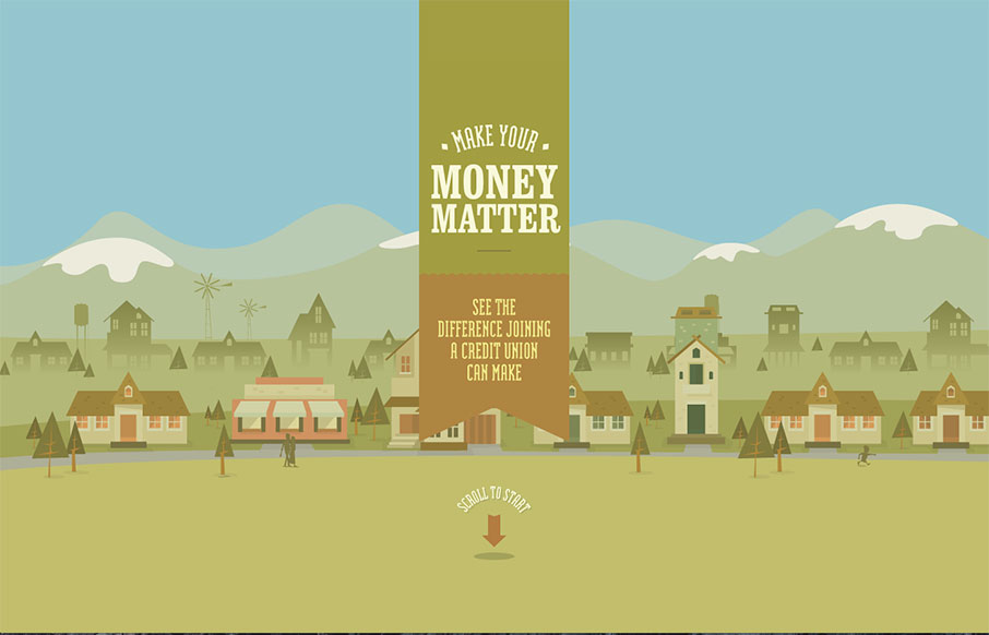
Excellent story-driven intro to the Make Your Money Matter site – a “brochure” site for using credit unions over banks. The flat illustrations are great as you scroll through the intro – and the final resting part of the site is very smartly...
by Aaron Griswold | Mar 23, 2016 | Blog, Gallery
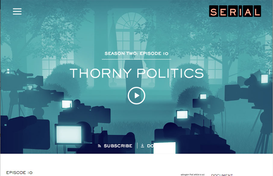
Yes – I know, I’m late to the party on Serial – I’m still in Season One, and I’m hooked! As far as the design – what first pulled me to this site was actually the podcast player – I’ve spent a lot of time on podcasts of...
by Gene Crawford | Mar 16, 2016 | Food and Beverage, Gallery
Pretty cool aesthetic to this site. I feels like it perfectly matches what they do in it’s visual vibe. It’s also kind of interesting with the scrolling and the main links in the top right and left like that. Simple and effective. Love it.
