
by Gene Crawford | Jul 9, 2012 | Design Firm, Gallery, Screencast Review
Submitted by: Jan Sovitsky Role: Designer & Developer Both Giovanni and I dig this design. It’s chock full of great illustration work and details. In general it’s a nice tight design that’s all kind of impressive visually. We had a few things to...
by Gene Crawford | Jul 9, 2012 | Gallery
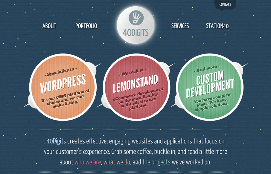
Website of 40Digits, a development-centric agency based in Springfield, MO. 40Digits collaborates with other agencies and clients from all over the country on UX, web design, UI, XHTML/CSS, WordPress, Lemonstand and custom web development. The site was designed with...

by Gene Crawford | Jul 6, 2012 | Church/Religious, Gallery
Submitted by: John Anderson @elevationsarge Role: Developer At Elevation Church, we don’t struggle with trying to find things to celebrate, we struggle with taking the time to celebrate them well. This year, instead of producing our Annual Report in...
by Gene Crawford | Jul 6, 2012 | Gallery, Screencast Review
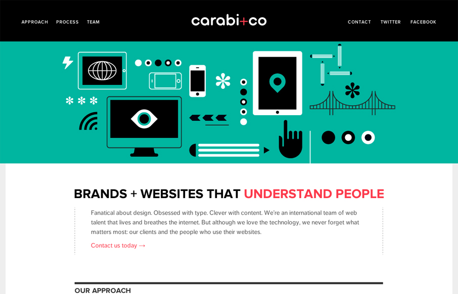
Nice use of illustrations to help tell the story of what you do. Nice limited color palette of black, green & a little red. It keeps it simple overall while still having some slightly busy illustrations. I especially like the header, the fixed header that gets a...
by Gene Crawford | Jul 5, 2012 | Gallery
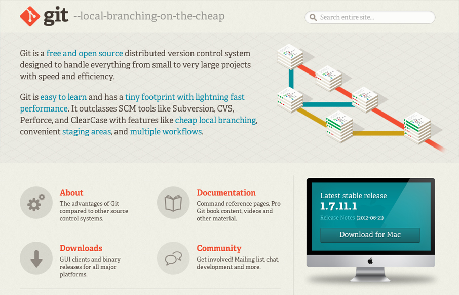
The Git website is another great example of good design helping to sell an open source project. The great illustration of how it works really sells the concept visually and the solid design of the rest of the page gives Git the visual brand it needs for you to trust...