by Giovanni DiFeterici | Mar 20, 2014 | Food and Beverage, Gallery
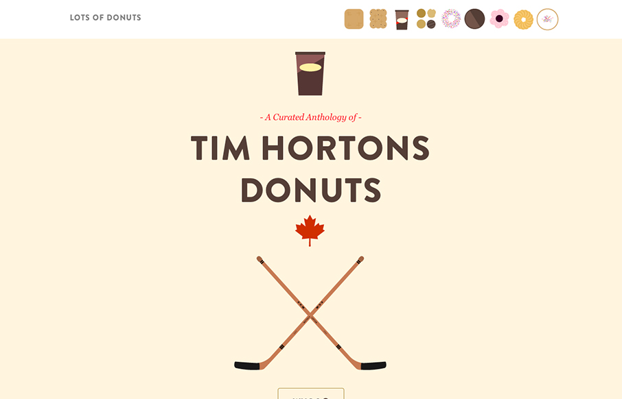
Lots of Donuts is fun as hell. It’s beautiful and simple, which I love. The parallax effect has gotten a lot of play in the last few years, but it’s cool and fits the tone of the site. The art is great, too. Now, I just want donuts…

by Gene Crawford | Mar 19, 2014 | Gallery
Beautifully designed product site here for Kin HR. I like the bold nature of the layout with all the screen/interaction displays down the page. I also dig how the nav slides up with you and fixes into place. That little bit of movement makes it really obvious to the...

by Giovanni DiFeterici | Mar 19, 2014 | Gallery
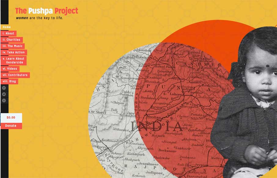
The Pushpa Project is a narrative site that seems to draw strongly from print design. The minimal color does a great job of focusing the reader’s attention on the text. I really enjoy the site’s primary navigation, which does a great job of reenforcing the...

by Gene Crawford | Mar 18, 2014 | Gallery, Portfolio
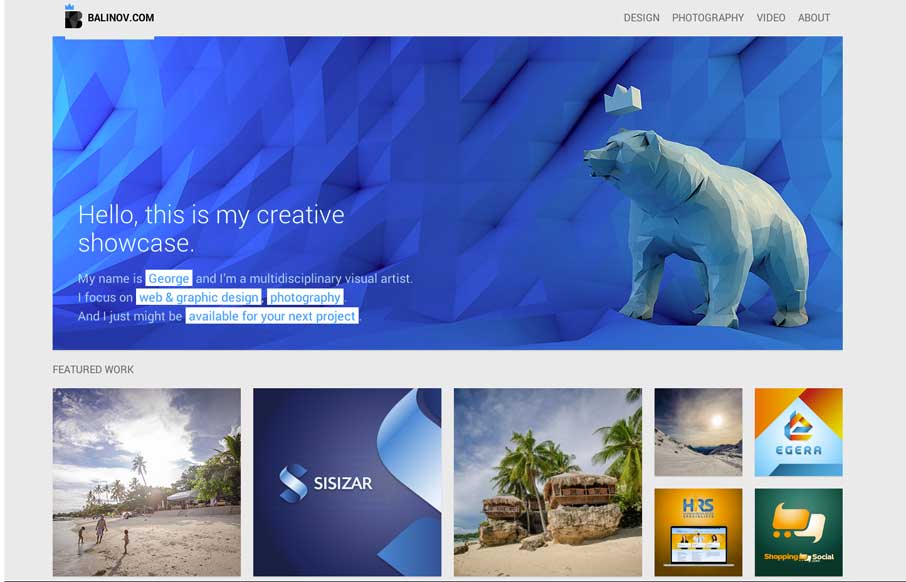
Clever looking design. I like the Isotope interface piece and how it’s used, in that the design isn’t just based on using it. Beautiful work too.

by Gene Crawford | Mar 18, 2014 | Gallery
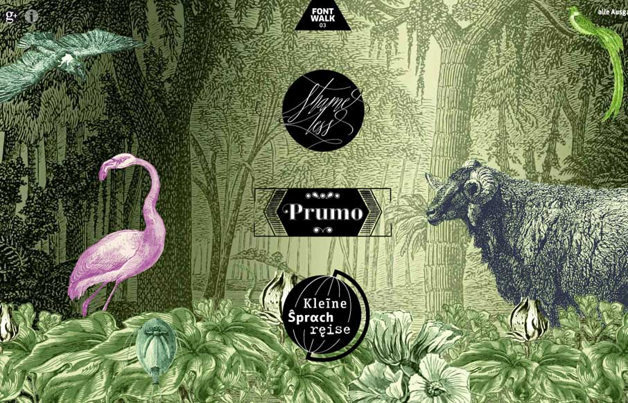
Really cool way to show off the fonts. It is almost indeed like taking a walk or a tour. Lovely.
