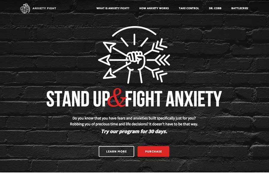
by Gene Crawford | Apr 8, 2014 | Gallery, Medical
Strong visual language backs up a nice solid design and layout. Sometimes you can see there’s good content that the designer has to work on, this site is a good example of that. Good content backed up with good design.
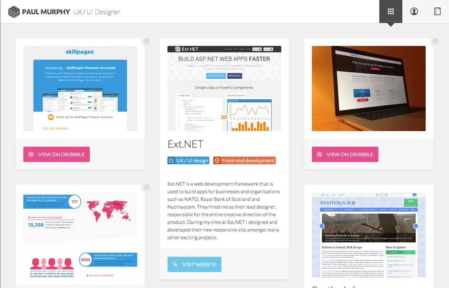
by Gene Crawford | Apr 8, 2014 | Gallery
Really dig the masonry like layout utilized here. It’s well done. I also like the light touch to the design so that the site itself doesn’t overpower the work displayed. That’s a hard line to walk.
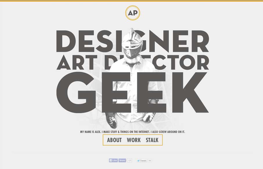
by Gene Crawford | Apr 7, 2014 | Gallery
I love it when a person’s personality comes through in their design. Now this is a personal portfolio site for Alex Pierce and yeah, his personality should show through. Boy does it. In the specific words and phrases and most of all there’s a shot on the...
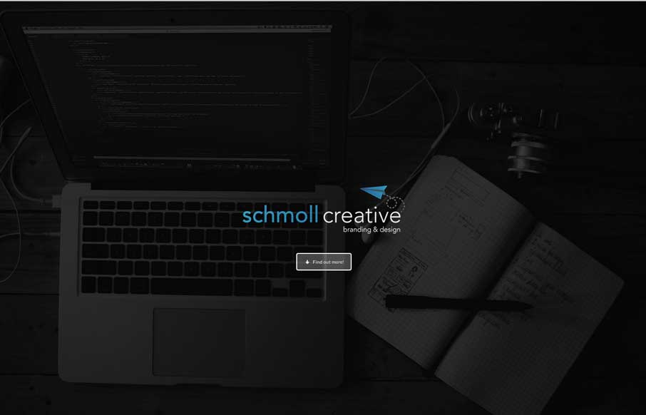
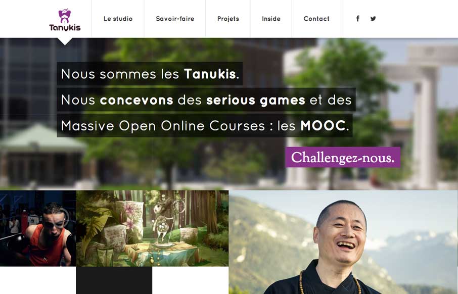
by Gene Crawford | Apr 7, 2014 | Gallery
Love the minimal color palette. Smooth transition between the topmost section and the main nav load too. Then plenty of little visual interaction pieces across the page as you scroll to keep things interesting. Lovely site.
by Gene Crawford | Apr 7, 2014 | Design Firm, Gallery
I really like this new pattern that’s emerging where the main nav changes slightly once you move past the initial page load. I do also dig the interactions placed with each of the main images on the home page too, very smart use of animations.