
by Gene Crawford | May 22, 2012 | Gallery
The pulpfingers.com site is simple gorgeous. I love the orange/red and brown/black coloring, it’s unique looking and along with the stark graphic illustrations gives it a nice sense of rememberability. There are some neat little visuals here and there on this...
by Gene Crawford | May 22, 2012 | Entertainment, Gallery
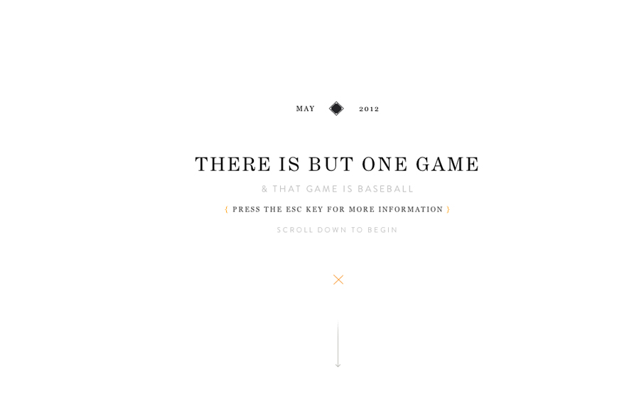
Holy wow, Eephus League Magazine: eephusleague.com/magazine/(via this @dribbble drbl.in/ecEd)— Dan Cederholm (@simplebits) May 21, 2012 Re: the previous tweet, now that’s how you publish a magazine on the web. Embrace the vertical scroll (which is the...

by Gene Crawford | May 22, 2012 | Education, Gallery
Lore previously known as coursekit (this subsite is a beautiful experience in it’s own right – check it.) is a simple looking layout, but is very well balanced and packs a punch impact wise. It’s both subtle and complex at the same time wich just...

by Gene Crawford | May 21, 2012 | Gallery
Nice clean portfolio site design. I like the minimal approach that really focuses on the work and interactions. The main nav bar flips out from white to black when you scroll or click a link, it’s not much but with the overall design approach it really has an...
by Gene Crawford | May 21, 2012 | Gallery
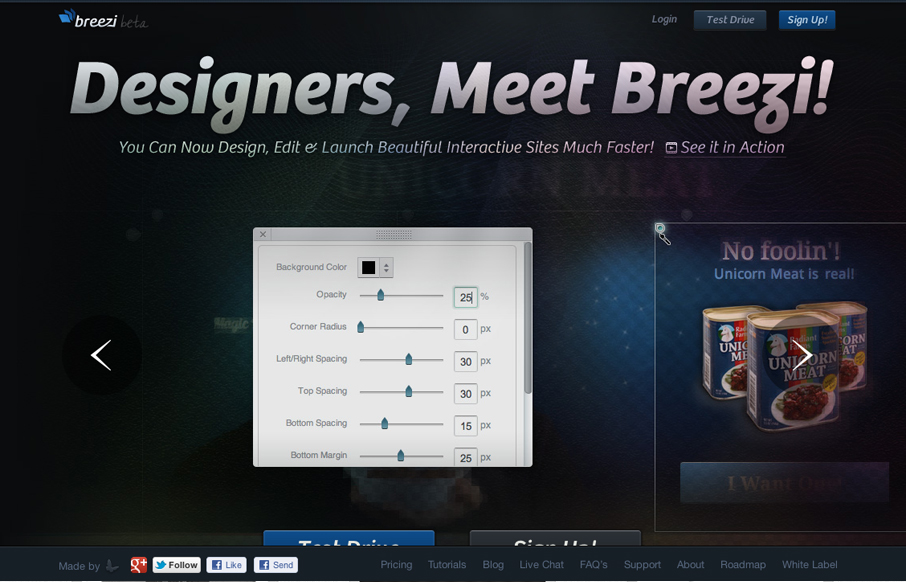
Well, we’ve been working on this product for about 1.5 years so it means to a lot to us. We spent a good deal of time on its homepage as well. We hope you like it. Submitted by: Navid Safabakhsh @breeziapp Role: Product Manager Beautifully executed website for...