by Giovanni DiFeterici | Aug 2, 2012 | Community / Social Networking, Gallery
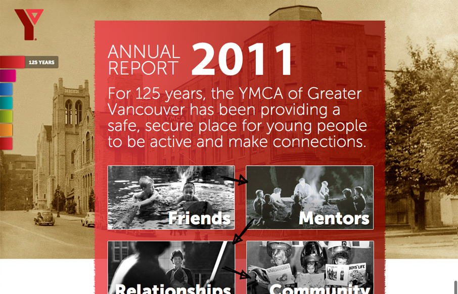
imagineourymca.ca is clearly designed to push the brand and to present a lot of information in a tight little package. I really like how the ‘pages’ have so much activity without getting in the way of the content. I especially enjoy the community sections...

by Giovanni DiFeterici | Aug 2, 2012 | Gallery, Travel
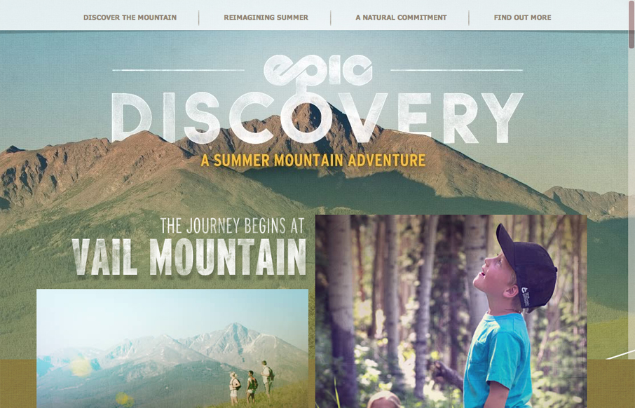
epicdeiscovery.com is a lovely little site with a whole lot of personality. It’s clearly designed to get a user to want to be out in nature and I think it succeeds beautifully. While structurally complex, the content is fairly minimal as are interactions. Each...

by Giovanni DiFeterici | Aug 2, 2012 | Gallery, Shopping
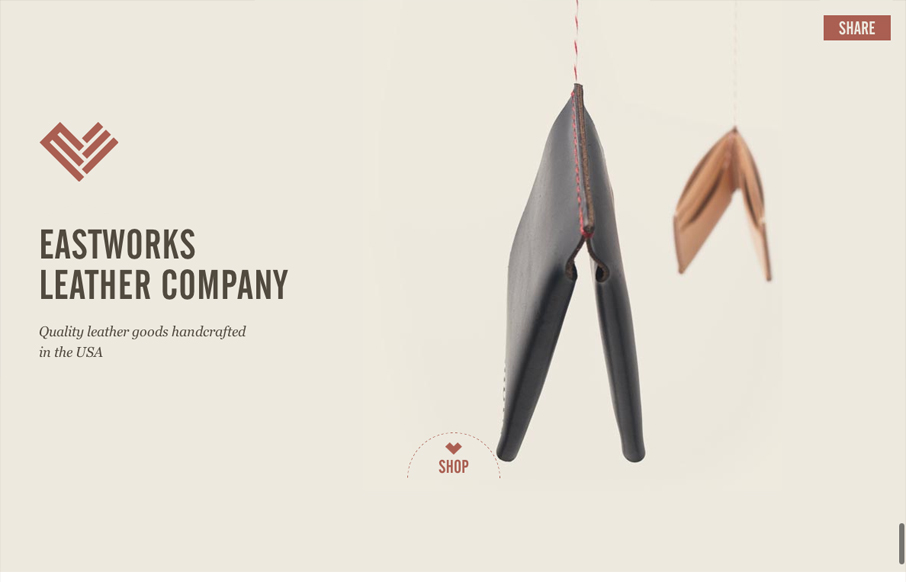
Are you mesmerized by the spinning wallet? You should be, its a nice stop animation effect that is slightly hypnotic. I love the look of this site. The layout is open and presents the small assortment of items beautifully. Gotta love the logo and nav treatment as you...

by Gene Crawford | Aug 1, 2012 | Conference, Gallery
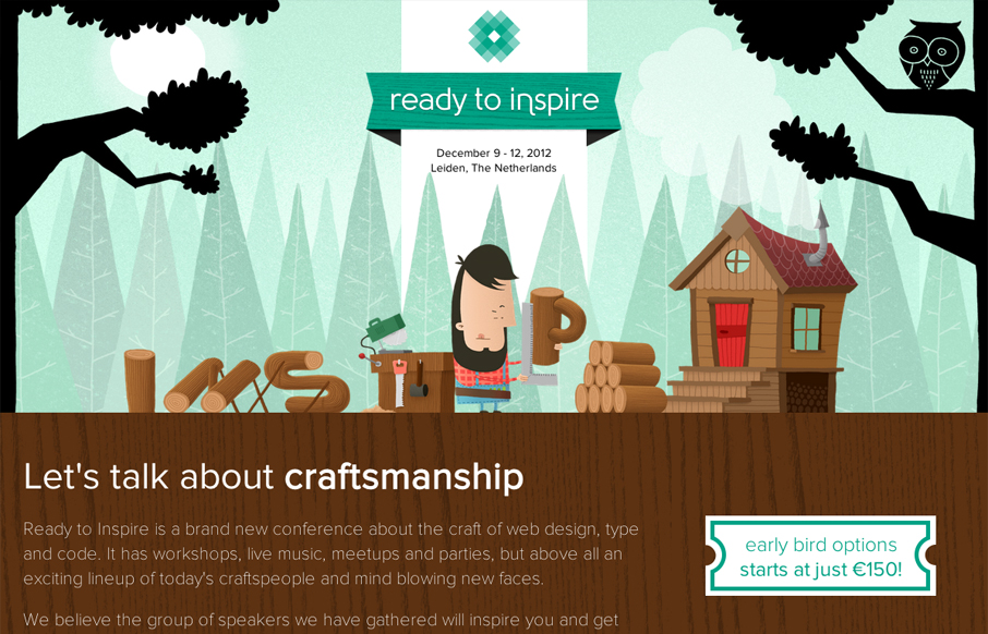
The 2012 Inspire Conference website is wonderfully illustrated. I like the little lumberjack dude and how it’s all tied into the theme. Nice responsive design too. Lovely site and it looks like a kick-ass conference too!

by Gene Crawford | Aug 1, 2012 | Gallery
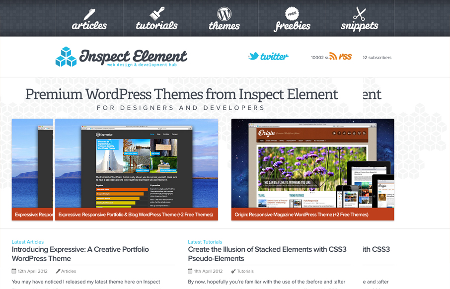
Really nice simple yet deep looking layout for the Inspect Element website. I really like how the main nav sort of hides under the page as you scroll down, that’s a small detail but it makes you really notice it. Then the simple feeling 2 column layout with...
