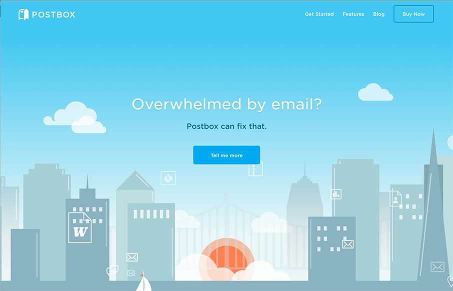
by Gene Crawford | Sep 17, 2015 | Gallery
The Postbox website is in many ways a very typical product website design. But in other ways it’s far superior. It uses the normal patterns of showing off a product in a clean and simple way but has some really great deeply detailed sections that show how the...
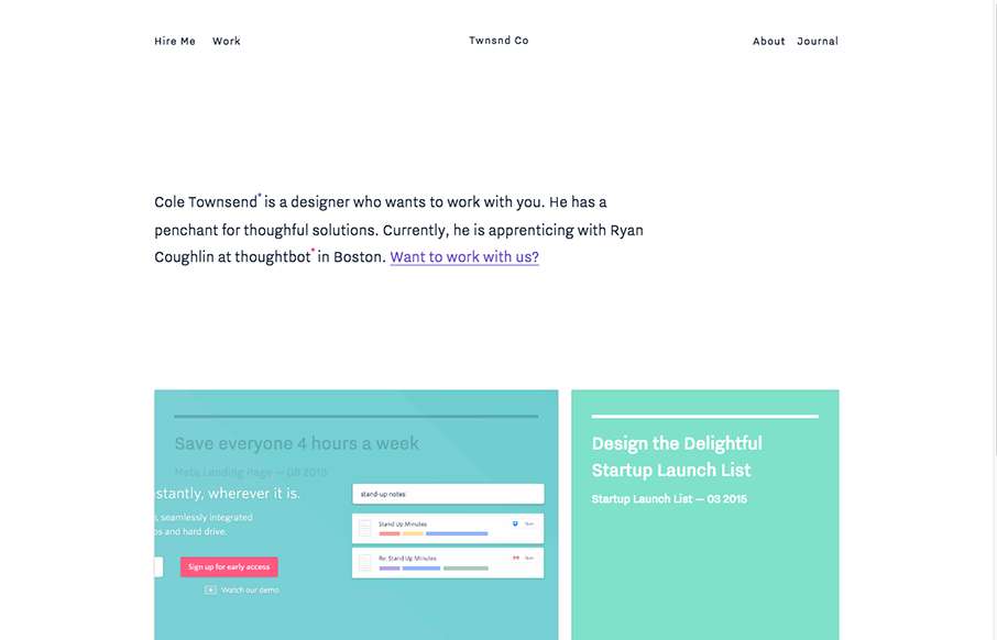
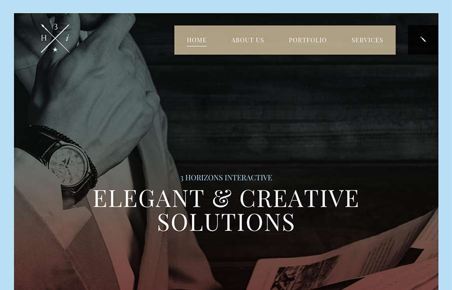
by Gene Crawford | Sep 17, 2015 | Design Firm, Gallery
Nice minimal site design. I like the blocks of content and how they keep you focused as you review the home page. I’m not huge on the way they handle when you scale down for mobile screen widths, but overall it’s smooth and works great across whatever...
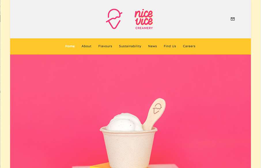
by Gene Crawford | Sep 16, 2015 | Food and Beverage, Gallery
I love the simplicity and straight forwardness of the Nice Vice website design. It’s simple and to the point which is nice. I also dig the nav/logo transformation that happens as you scroll down the page, that’s a nice touch for the site design.
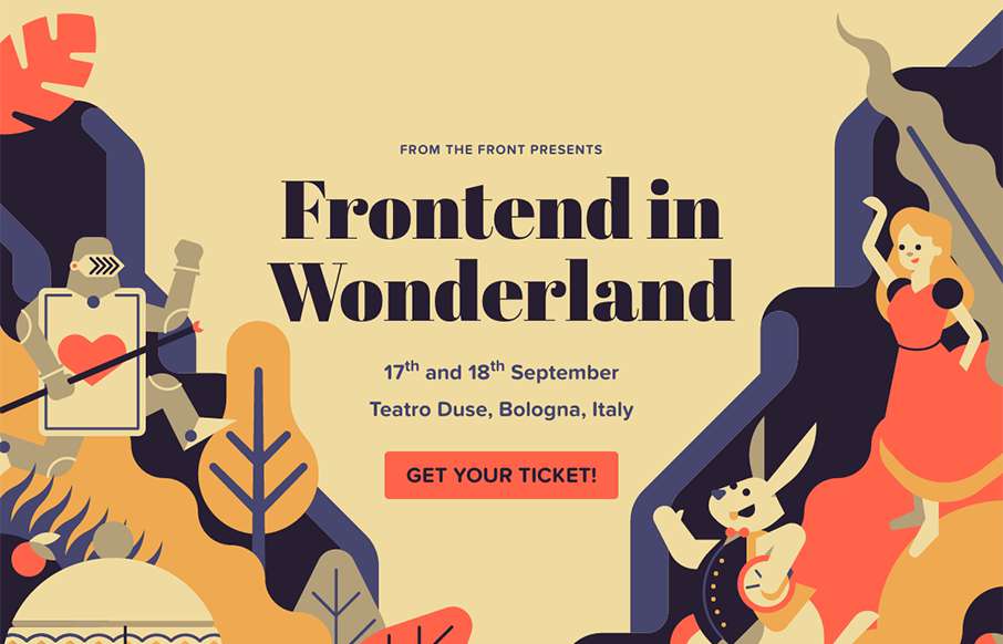
by Aaron Griswold | Sep 15, 2015 | Gallery
Love the artwork in this year’s From The Front conference out of Italy: Frontend in Wonderland. We’re always happy to see other conference series pushing hard with design boundaries.
by Gene Crawford | Sep 14, 2015 | Gallery
Some pretty crazy interactions going on here. I dig it though. The colors and type that are paired together give it a rather open yet heavy feeling. I’m a fan of the navigation design too, see, what’s the harm in just showing the nav at all times?