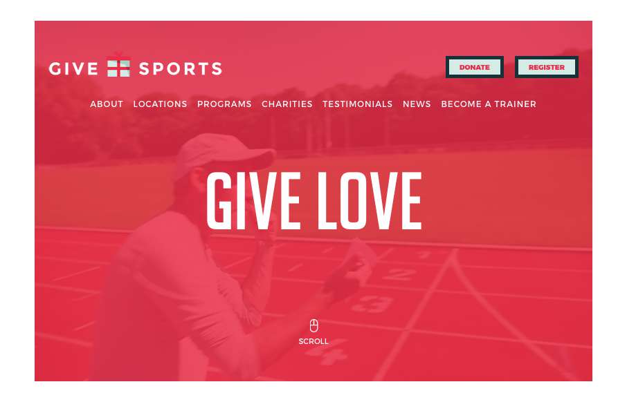
by Gene Crawford | Aug 9, 2016 | Gallery, Nonprofit
Strong, bold and clear design vibe. I love the heavy lines and graphic feel to the overall design esthetic. I like the interaction work too, simple yet strong. Really great work on this site design.
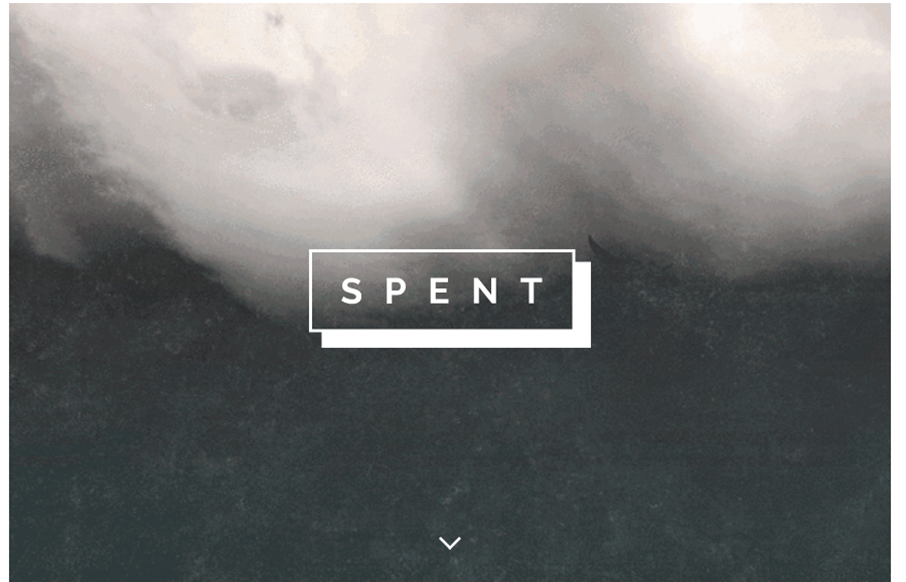
by Gene Crawford | Aug 4, 2016 | Gallery, Portfolio
A lot of this reminds me of David Carson’s work. But kind of updated. I dig it, cool vibe and neat imagery overall when it’s put together.
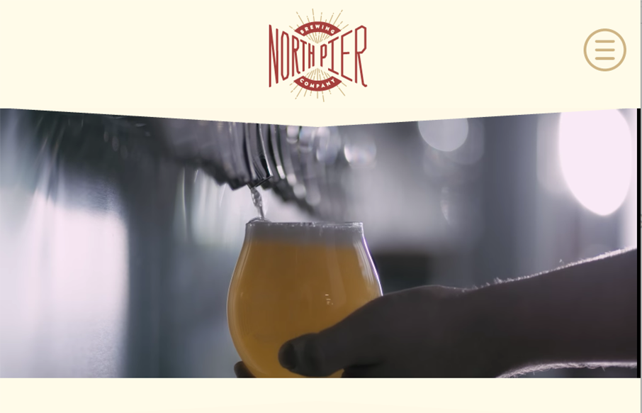
by Gene Crawford | Aug 3, 2016 | Food and Beverage, Gallery
Big bold type and cool earthy colors, really fits well with the “brewing” vibe. I also love the way they’ve utilized the youtube video too. Cool stuff.
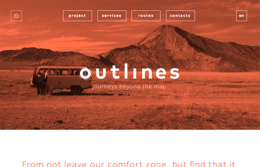
by Gene Crawford | Aug 2, 2016 | Gallery, Travel
Pretty cool use of the main image and the simplified navigation layout. I really like the visual interest in the layout as you scroll down the page. It generally keeps you eyes pulling down to get to more content.
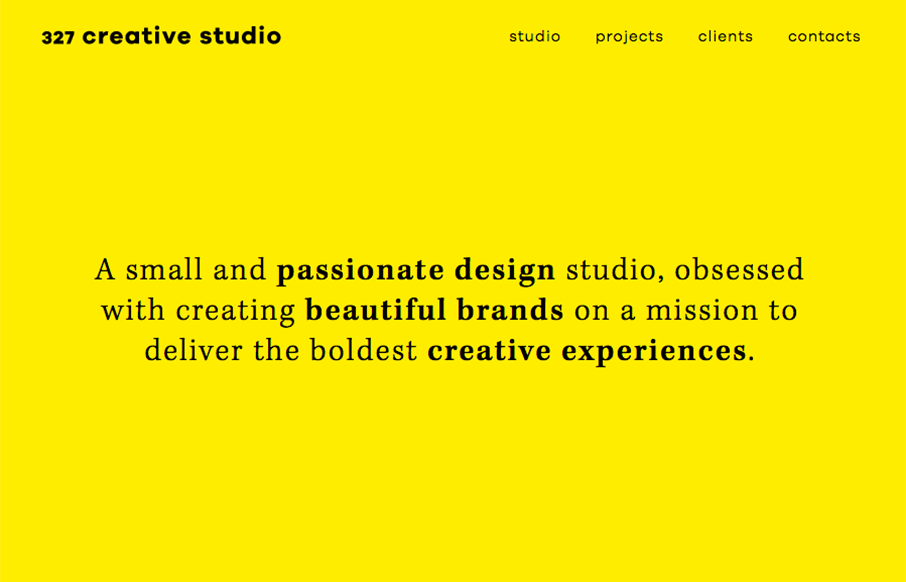
by Gene Crawford | Aug 2, 2016 | Design Firm, Gallery
I love the bright yellow and the simple text used to make up this website design. I especially like the mobile view best. Really beautiful.