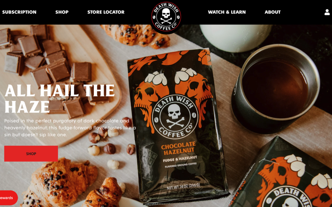
by Gene Crawford | Aug 7, 2023 | Food and Beverage, Gallery
Aside from being the “strongest coffee” in the land, their website is equally strong visually. The visual beats of this design aren’t so much like the other examples in this post, this one is more like a Heavy Metal guitar solo – but still it’s a type of...
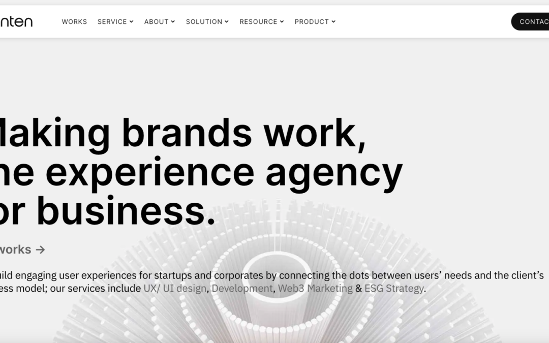
by Gene Crawford | Aug 4, 2023 | Design Firm, Gallery
Tenten Creative is an award-winning design & digital agency based in Taipei, Taiwan working with ambitious leaders to launch innovative ideas and transform businesses using technology, marketing solutions, and design thinking.

by Gene Crawford | Aug 3, 2023 | Design Firm, Gallery
We, at Cre8ivemind, have been assisting clients to achieve their dreams by providing high-quality Web & Graphic Designing solutions which are tailor made to suit their products and services.
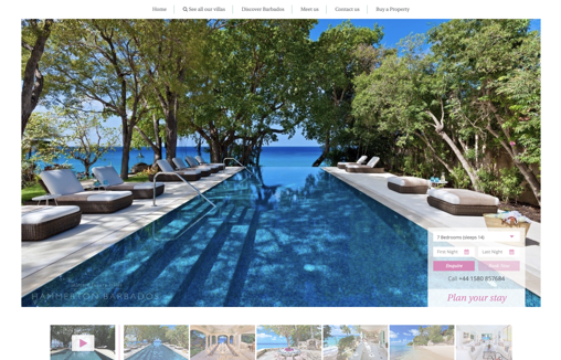
by Gene Crawford | Aug 1, 2023 | Gallery, Real Estate, Travel
Modern clean website designed for use by a range of it competencies. Property listings put photographs and information front and centre with easy discoverability and use of CDNs for performance and a great UX for users on mobile devices.
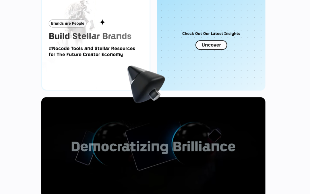
by Gene Crawford | Jul 27, 2023 | Design Firm, Gallery
Create Bespoke No-Code Brands Using Our Tools and Insights.