by Luke Williams | May 23, 2012 | Gallery
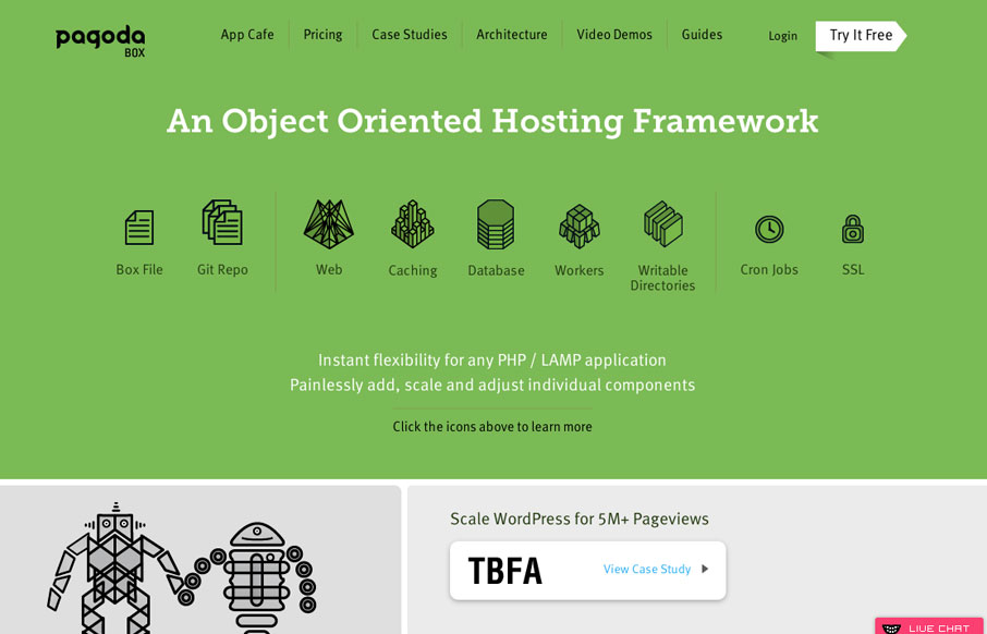
This site is definitely a strong rival to Heroku in terms of presenting complex information in a beautiful manner, not to mention showing off some pretty impressive features. A beautiful constructed and varied layout coupled with eye-catching infographics makes for an...
by Gene Crawford | May 23, 2012 | Gallery, Music
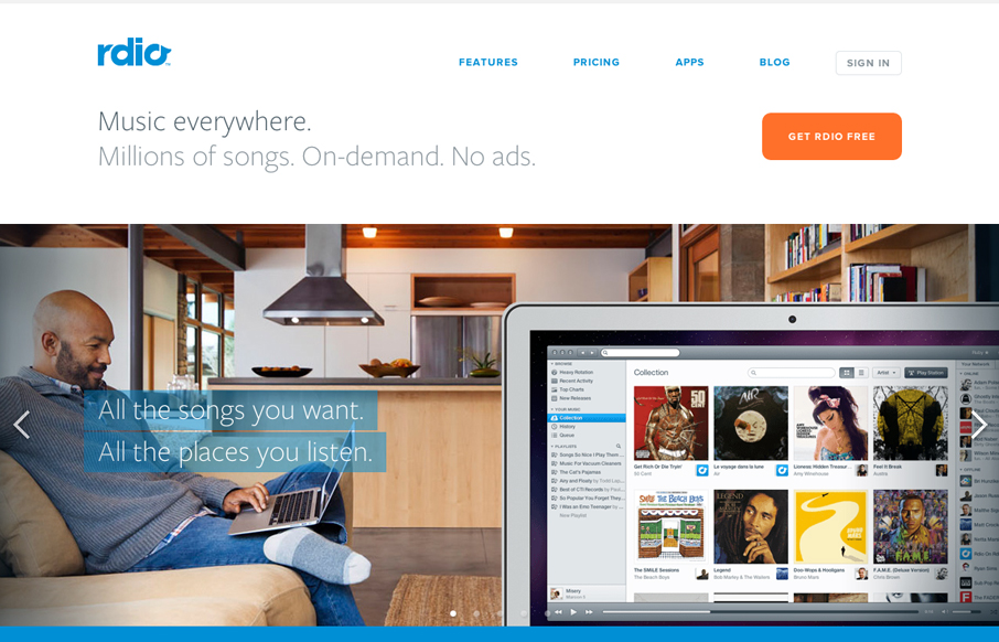
The new(ish) rdio.com design is beautiful. I love the visual engagement that the design drives you into as you make your way down the hierarchy of the page. From light to dark, from sparse to dense it’s very well put together. I think the colors get so much...
by Gene Crawford | May 22, 2012 | Gallery
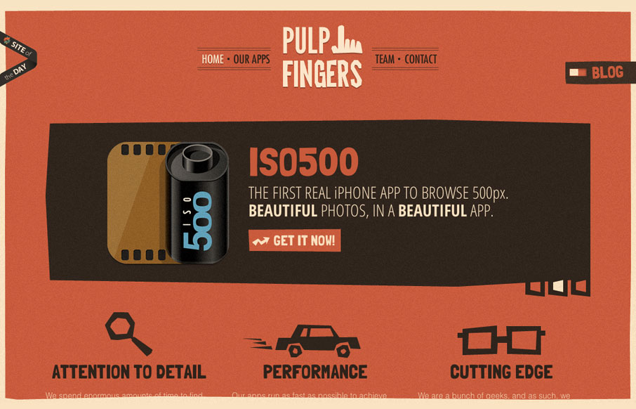
The pulpfingers.com site is simple gorgeous. I love the orange/red and brown/black coloring, it’s unique looking and along with the stark graphic illustrations gives it a nice sense of rememberability. There are some neat little visuals here and there on this...
by Gene Crawford | May 21, 2012 | Gallery, Photography
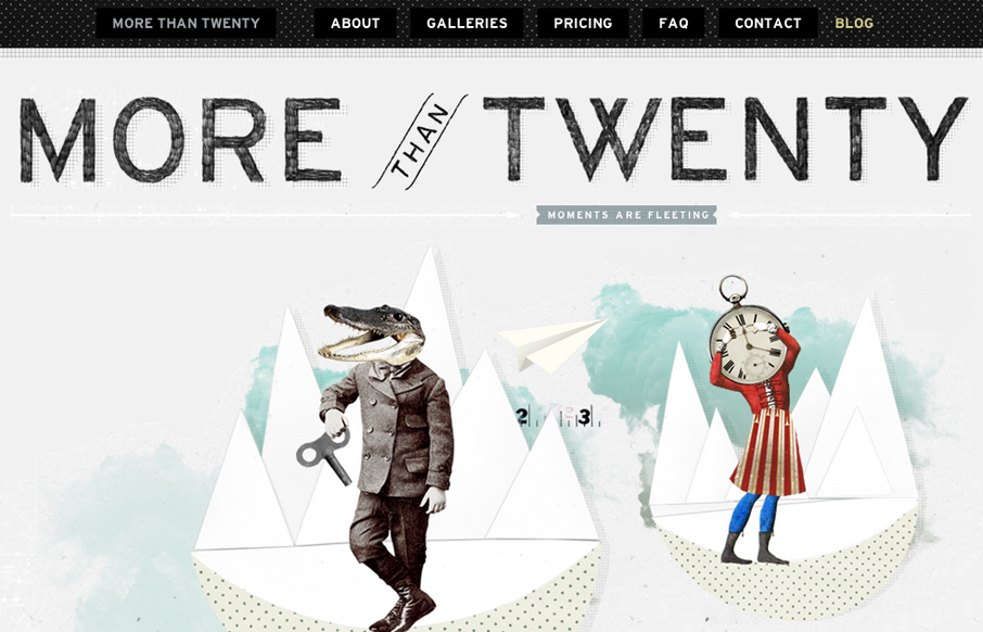
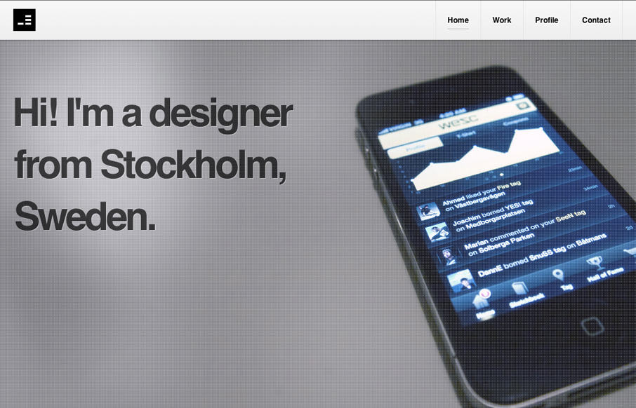
Submitted by: Paul Mosig @r_a_c_k_e_t Role: Designer & Developer Very simple website execution, the fixed header/navigation bar does give it a level of interest interaction wise, as well does the FAQ section. It’s the illustration work that sets this site...
by Gene Crawford | May 21, 2012 | Gallery
Nice clean portfolio site design. I like the minimal approach that really focuses on the work and interactions. The main nav bar flips out from white to black when you scroll or click a link, it’s not much but with the overall design approach it really has an...