by Gene Crawford | Jul 9, 2012 | Gallery
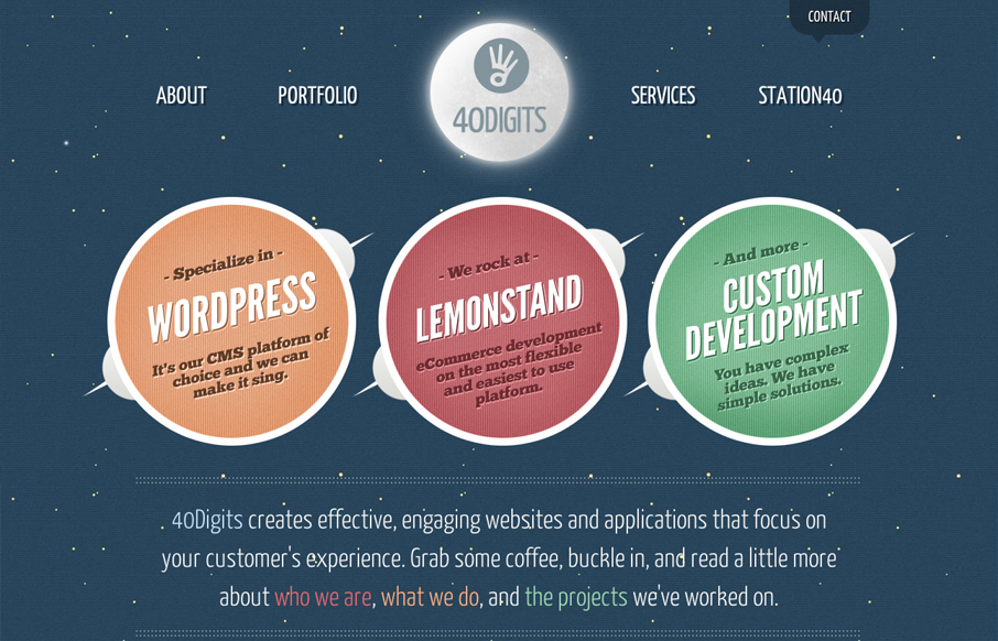
Website of 40Digits, a development-centric agency based in Springfield, MO. 40Digits collaborates with other agencies and clients from all over the country on UX, web design, UI, XHTML/CSS, WordPress, Lemonstand and custom web development. The site was designed with...
by Gene Crawford | Jul 6, 2012 | Gallery, Screencast Review
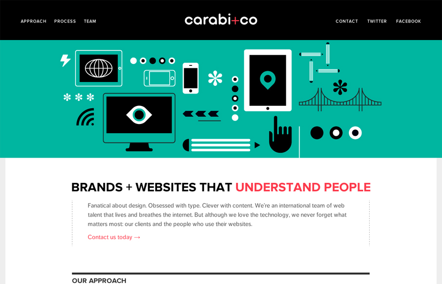
Nice use of illustrations to help tell the story of what you do. Nice limited color palette of black, green & a little red. It keeps it simple overall while still having some slightly busy illustrations. I especially like the header, the fixed header that gets a...
by Gene Crawford | Jul 5, 2012 | Gallery
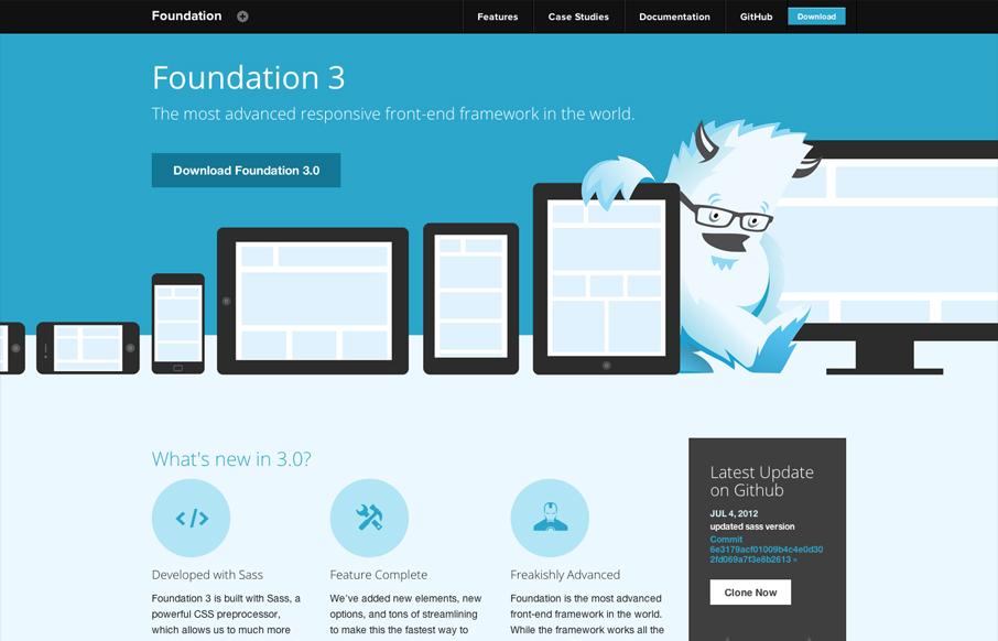
Zurb has given us many good things, Foundation is surely one of them. But they also design pretty solid websites to house the things they make. This site is great example of making a monochromatic color scheme work. The idea of using the yeti and the cool blues...

by Gene Crawford | Jul 2, 2012 | Blog, Gallery
Posted by: Donaville Herrick @dearestnature This site was 5 years in the making. The original concept behind the site arose while working on niche publications for my previous employer from 2007 – 2010. It wasn’t until 2011 that I hunkered down and mapped...
by Maria | Jul 2, 2012 | Design Firm, Gallery
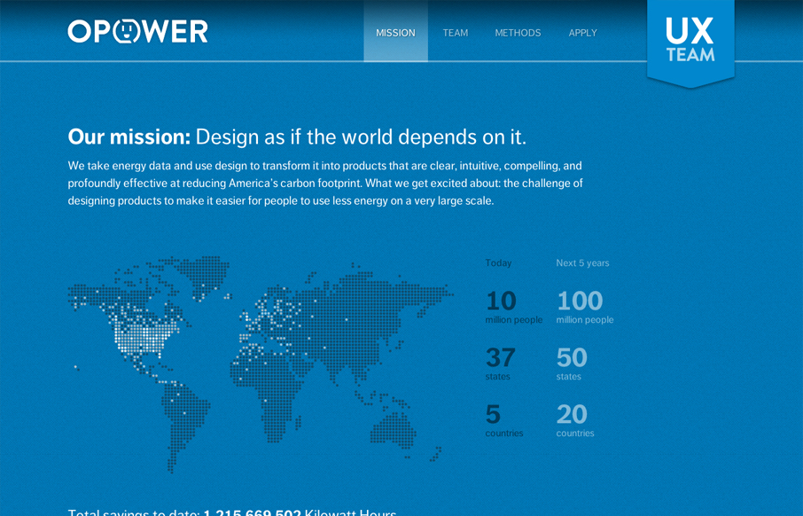
Digging the new Opower UX team site bit.ly/LBtazr with fun facts & some friendly energy savings competition (cc: @jimjones) — Samantha Warren (@SamanthaToy) June 27, 2012 This is a nice representation of the Opower UX Team from their collective mission down to...