by Gene Crawford | Sep 20, 2012 | Food and Beverage, Gallery
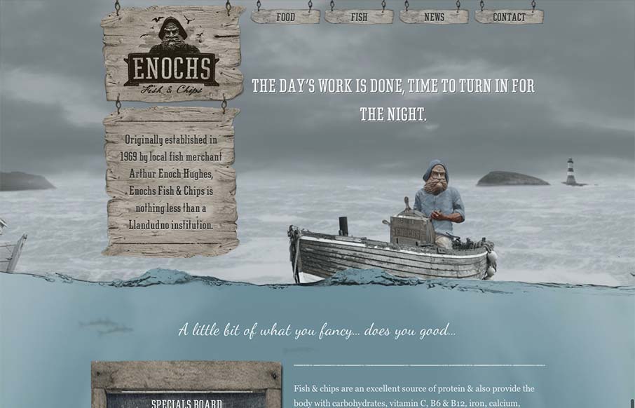
An unexpected responsive design here. It’s one of a few sites i’ve seen recently that takes a lot of the same RWD patterns and adds a layer of decoration on top of it (with the ship captain/fisherman theme) and pulls it off really well. I love the hook...

by Gene Crawford | Sep 19, 2012 | Gallery
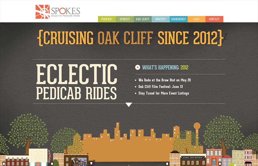
Just a fantastic way to share the narrative of what a ‘pedi cab’ is and how it all works. Beautiful illustrations and scrolling based animations, just wonderful to look at.

by Gene Crawford | Sep 18, 2012 | Gallery
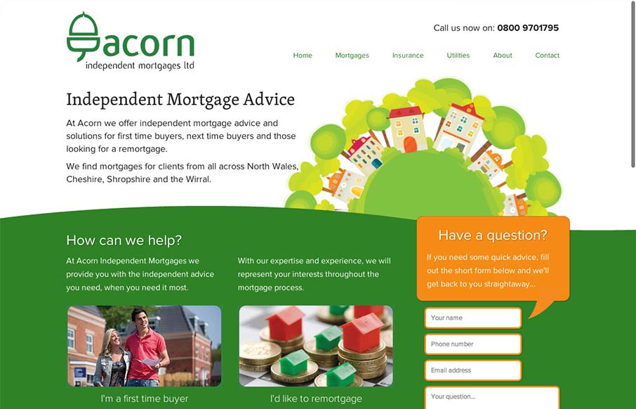
There’s a lot to like about this design. The animation of the rows of houses spinning in a big circle like that is used perfectly in conjunction with the rest of the otherwise static feeling design. The design doesn’t beat you over the head with the...

by Maria | Sep 17, 2012 | Gallery, Travel
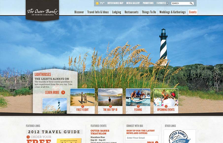
Really slick vacation marketing site for The Outer Banks of NC. I like the hero area slide show’s interactions, they’re quite involved but they look tempting to click around on. The mid area feels a bit cramped with the 4 columns at first but they’ve...

by Maria | Sep 13, 2012 | Food and Beverage, Gallery
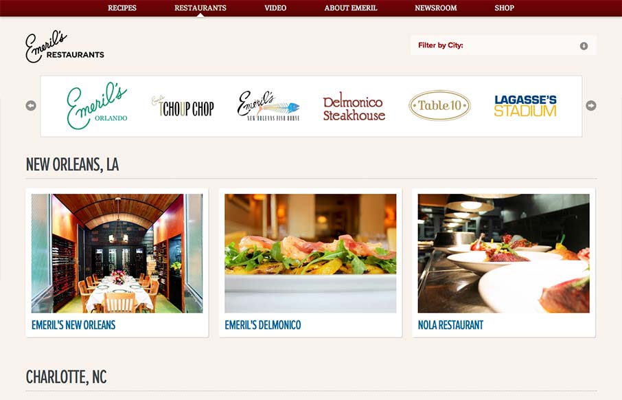
Aside from the oddity of having different sites/URLs in the main nav, the restaurant “site” is really nice. It has a clean design with gorgeous imagery (cuz let’s face it, Emeril’s food is a dream) and a great layout of information. It’s...
