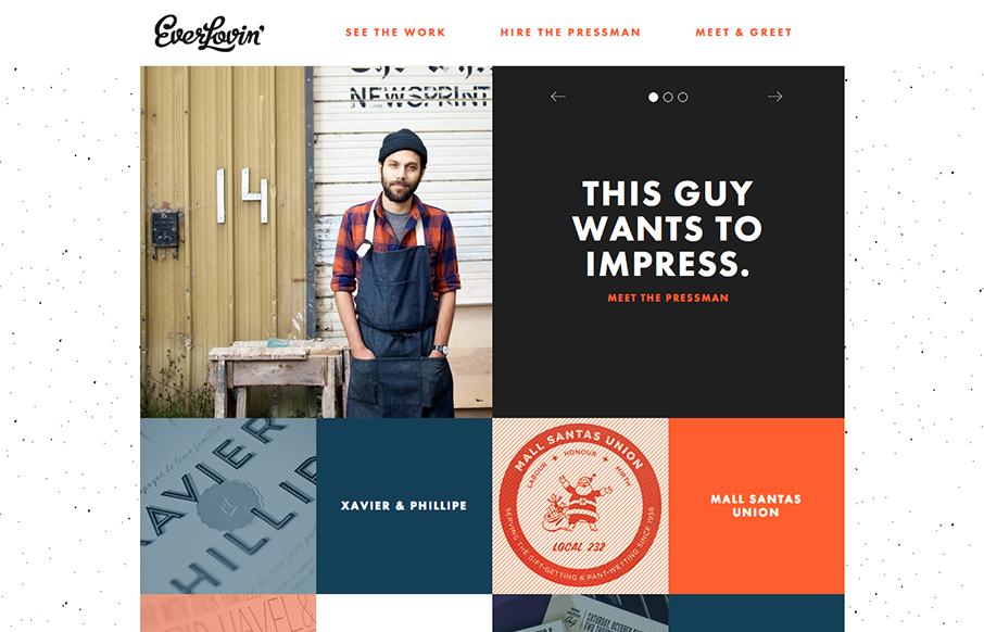
by Gene Crawford | Nov 5, 2012 | Gallery
Great layout and photography really helps tell the story of this letterpress shop/guy. A lot of character comes out when you get something printed by hand like this shop does so the website naturally has to carry that same level of care and love right? I’m...
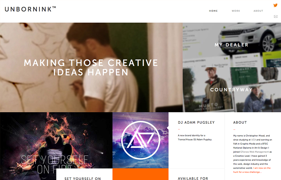
by Gene Crawford | Nov 5, 2012 | Gallery, Portfolio
Man, at first glance I totally thought this was as website for a high end design agency only to discover it’s basically just a portfolio for one person. That’s impressive to me because it’s not just the look that pulled me in, the the presentation of...
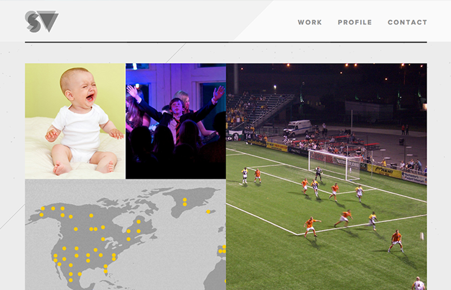
by Gene Crawford | Nov 1, 2012 | Gallery
Great simple but bold graphic website. I dig the grid and the way the responsive system works for this site. The portfolio section is great too with the way they demo the designs.
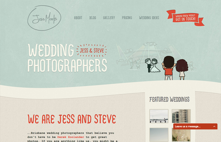
by Gene Crawford | Oct 31, 2012 | Gallery, Photography
I love these colors, they feel so soft and welcoming and perfect for the subject matter. The little slideshow/animation of the scenes helps you understand really quickly what the site is all about if you don’t notice the large type “wedding...
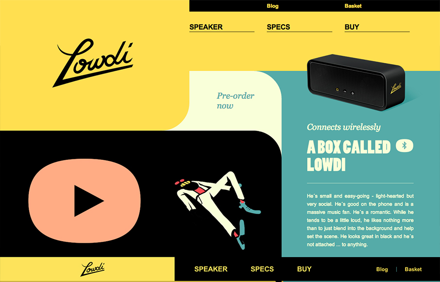
by Gene Crawford | Oct 31, 2012 | Gallery, Music
The design is a nice example of an asymmetrical design that leads to a symmetrical as you scroll down. I like that balance. Nice colors and interactions make this a well rounded design that’s going to be memorable.