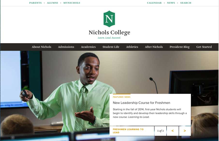
by Aaron Griswold | Jul 22, 2014 | Education, Gallery
College sites are hard, mainly because of all the content from all the different areas that content and data comes from. Nichols College does a good job unifying all of it into a modern, responsive design – that probably looks even better on a tablet view...
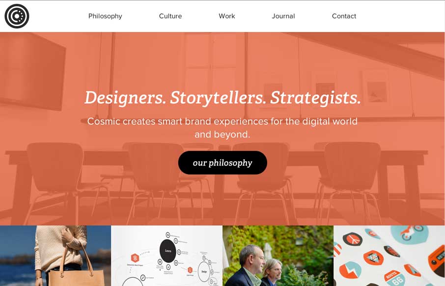
by Aaron Griswold | Jul 22, 2014 | Gallery
Great site at any screen size. Like their infographic on their work process too. Looks like a cool place to work – 2 minutes from the ocean, 10 from the mountains.
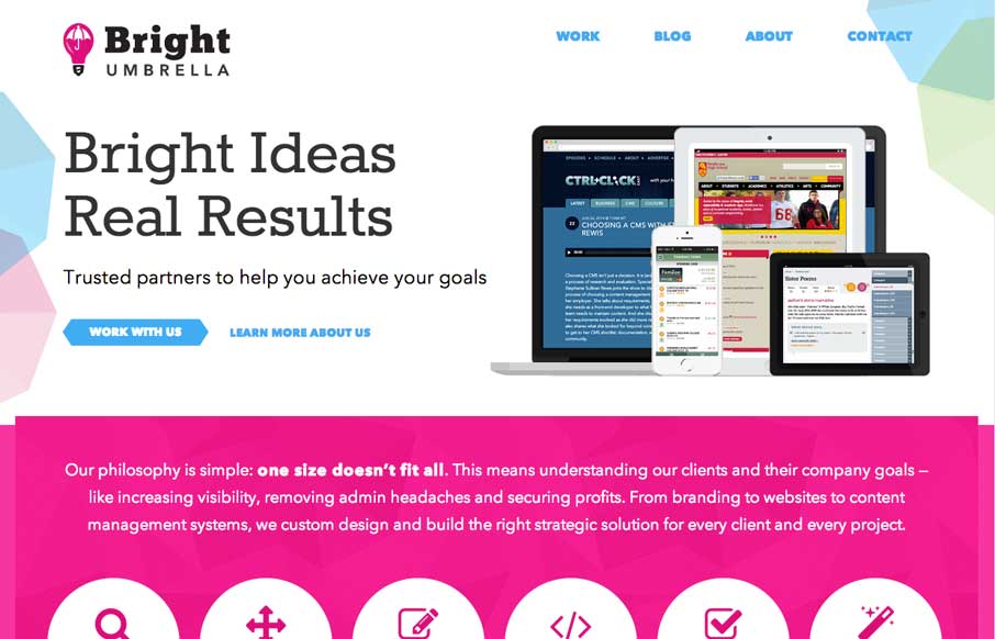
by Gene Crawford | Jul 17, 2014 | Gallery
It’s just simply a well done site. These two have been kicking ass for a long time IMHO and it’s really nice to see them rebrand and launch this company and website like they have. There is plenty to admire about the site design, plenty of detail work, so...
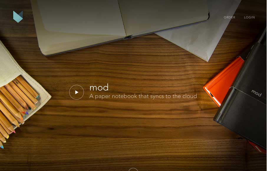
by Gene Crawford | Jul 16, 2014 | Gallery
Aside from the fact that I JUST WANT ONE OF THESE, the site is beautiful. I love the flow of the home page as I scroll and the cart process for ordering is simple and smartly put together. Love the notebook and love the site guys!
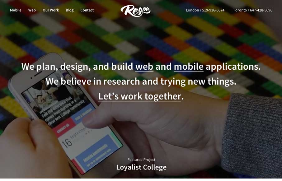
by Gene Crawford | Jul 16, 2014 | Gallery
There are a lot of familiar patterns at work on the Res.im site, but they are just simply done well. Then there are some new things that i’ve not seen done before, like the timeline of projects with the team profile pics – that’s just smartly done. I...