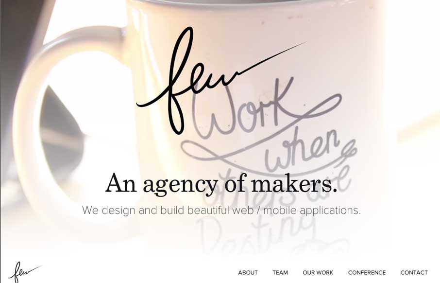
by Gene Crawford | Aug 19, 2014 | Gallery
Really beautiful and wispy design for the few.io site. I really dig the open vibe to the design and just about everything else that goes with it. Also, that is some epic beardage across the team there.
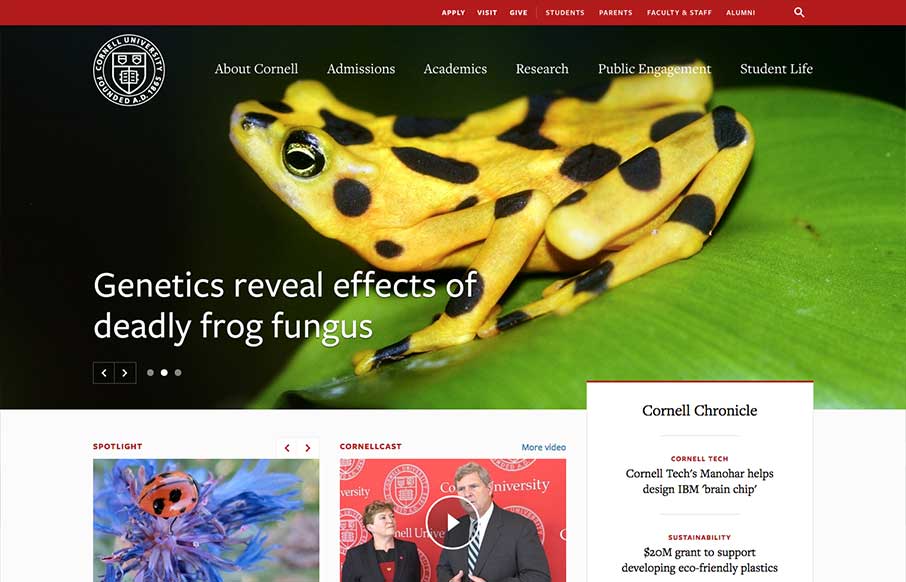
by Gene Crawford | Aug 14, 2014 | Education, Gallery
One of the better responsive higher ed site’s i’ve ever reviewed. There’s tons of nice design patterns in play here as well as other detail work. What’s most striking is that the responsive design isn’t just the home page, but seems to go...
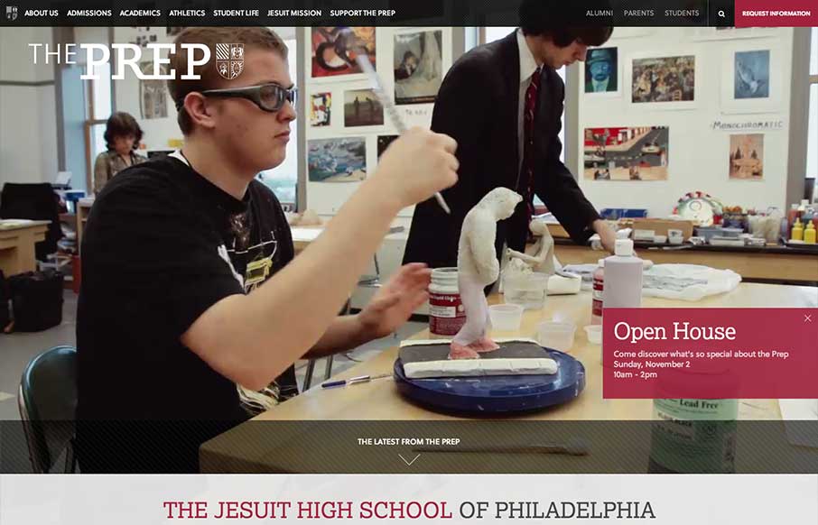
by Gene Crawford | Aug 12, 2014 | Education, Gallery
The St. Joseph’s Prep website is quite nice. I like the video background and how when the page scales down to smaller widths they swap out for a static image and then down to nothing for mobile devices. Nice strong easy to scan grid design too. Looks to be...

by Gene Crawford | Aug 11, 2014 | Gallery, Travel
Pretty cool grid based layout, very solid. I’m not wild about using the hamburger icon alone as the navigation kick off for all screen widths and stuff. But I do give them points for just sticking with it. Airbus Group (formerly EADS), the largest aviation and...

by Aaron Griswold | Aug 8, 2014 | Gallery
Borja has a cool CSS feature that you probably don’t on your portfolio site – a dial that brings up different content. Why should you care – because portfolio sites should not just be about showing your previous work, but also to: Try. New. Things....