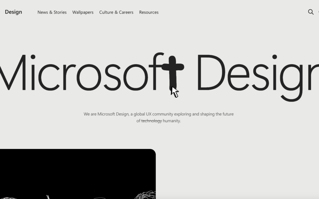
by Gene Crawford | Mar 31, 2025 | Blog, Gallery
A great design where the only things we get visually are the things we need to consume the content. I never thought i’d get a real minimal approach like this form an org like Microsft. Bravo and great work.

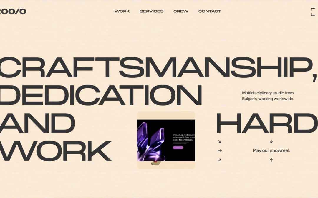
by Gene Crawford | Mar 27, 2025 | Gallery, Product
Super clean and professional design. It’s minimal(viable) but also deep in almost unnoticeable details. Also, pretty rad product.
by Gene Crawford | Mar 24, 2025 | Design Firm, Gallery
Love almost everything about this. I haven’t seen that typeface used in a while and I LOVE it. It’s retro but not totally. I love the colors as well. Bravo.
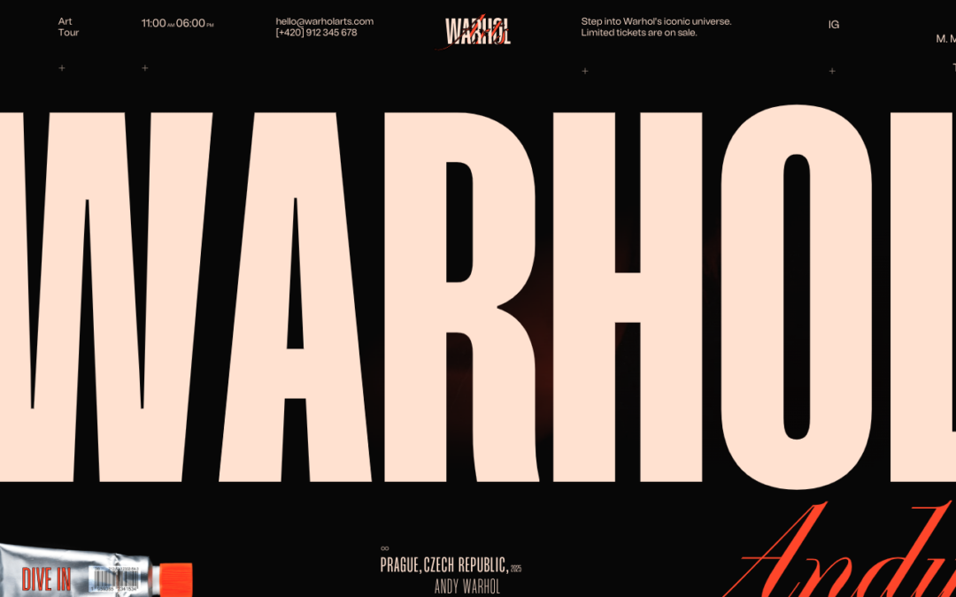
by Gene Crawford | Mar 20, 2025 | Education, Gallery
What a fun design. I love this, the super oversized type and then the interactions as you scroll. It tells a story and presents the art in the best light. Bravo.
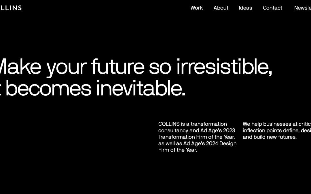
by Gene Crawford | Mar 17, 2025 | Design Firm, Gallery
This design isn’t going to blow your mind, but I like it because of the study of using the grid we can gain from reviewing it. I also like the ‘dark mode’ approach to it as well.