
by Gene Crawford | Nov 3, 2016 | Gallery
Pretty good layout, it keeps you moving your eyes around but on the right stuff. I also like how they’ve humanized certain areas like the contact us part, with a picture of one their team. Strong thinking here. From the Designer: We are a webdesign agency. The...

by Gene Crawford | Nov 2, 2016 | Design Firm, Gallery
Love the vibe of this site. I really dig how the side nav icon/thing moves up so you notice it as you scroll down. Like the dark background setup here too. From the Designer: We are digital agency based in Ukraine. Our independent team help you to provide the best...
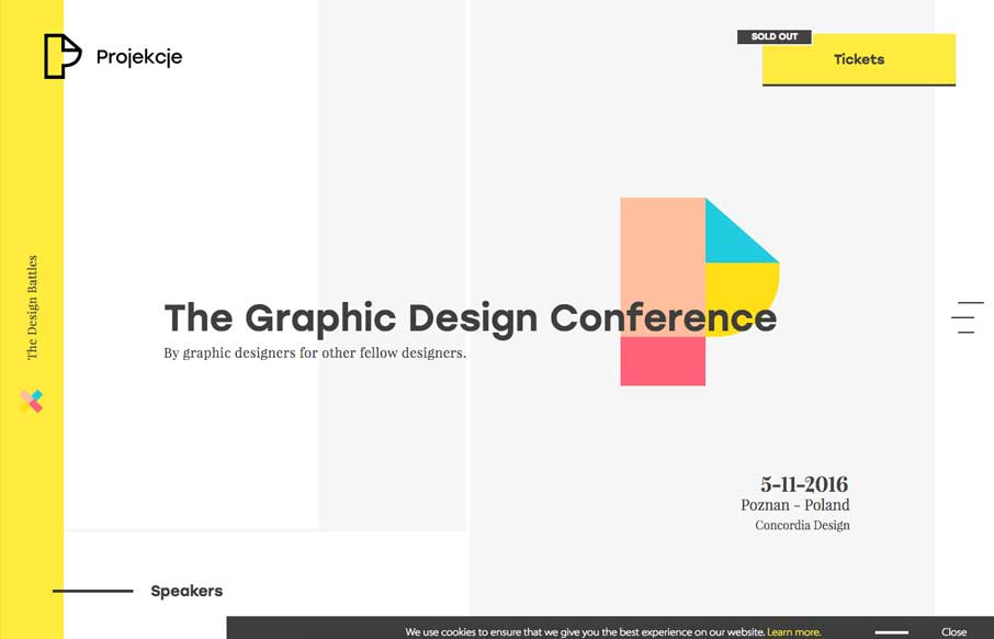
by Gene Crawford | Nov 2, 2016 | Gallery, Portfolio
Pretty sweet layout. I’m in love with the way the projects are displayed as you scroll down the page. Perfect really. Also some overall solid design. Submitted by: Joao Costa Role: Designer & Developer Country: Portugal
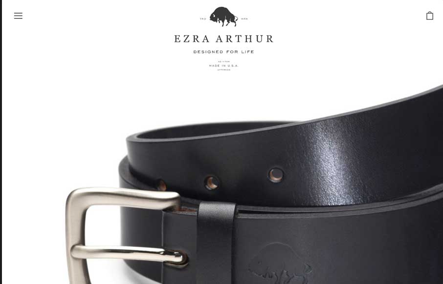
by Gene Crawford | Nov 1, 2016 | Fashion, Gallery
I love the simplicity of this ecommerce site. The simple logo and big close up shots of the products are beautiful. Would love to know if this is an off the shelf theme customized or not. Good stuff regardless… Submitted by: Kia Bess Twitter: @kitchensinkinc...
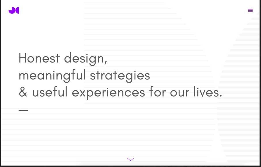
by Gene Crawford | Nov 1, 2016 | Gallery
Pretty neat looking layout. I like how it pushes the boundaries of what a typical layout can be. It’s pretty traditional under the hood but on the surface it’s fresh and new looking. I particularly dig the submission form design. It’s rare to see...