by Gene Crawford | Aug 17, 2012 | Gallery
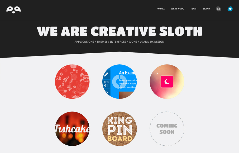
Submitted by: Erman Kutlu @creativesloth Role: Designer Creative Sloth is a fascinating team based in London, UK. Applications, themes, interface designs, icons, UI&UX services are better with their skills. They are creators of PICTONIC. I love the branded...
by Gene Crawford | Aug 16, 2012 | Gallery
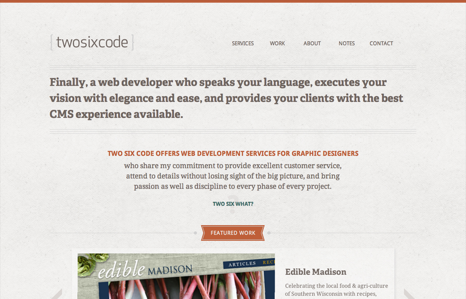
Submitted by: Alex Kendrick @twosixcode Role: Developer Designed by Cococello and built by Two Six Code . * responsive * 2x images for retina * subtle animation effects * ajax with history and deep linking (jQuery Address) * portfolio site Very nice almost minimal...
by Giovanni DiFeterici | Aug 15, 2012 | Gallery
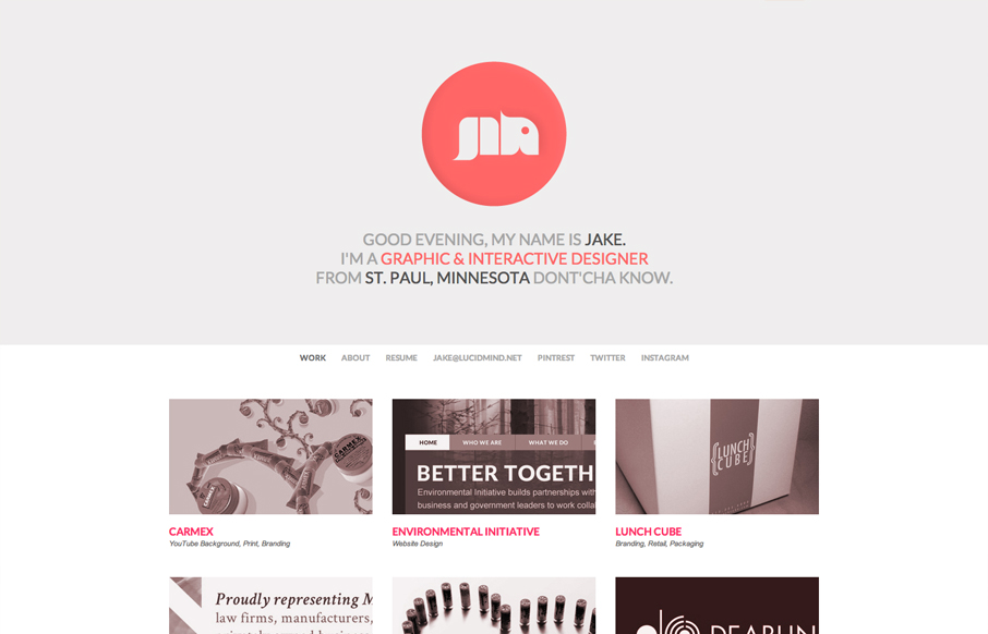
Submitted by: Jake Haugen Role: Designer Portfolio website for Jake Lee Haugen built in HTML & CSS3. Utilizes JavaScript for a tricky header that resizes when scrolling. LucidMind is a solidly built site with a great monochromatic color palette. Simple, clean,...
by Giovanni DiFeterici | Aug 15, 2012 | Food and Beverage, Gallery
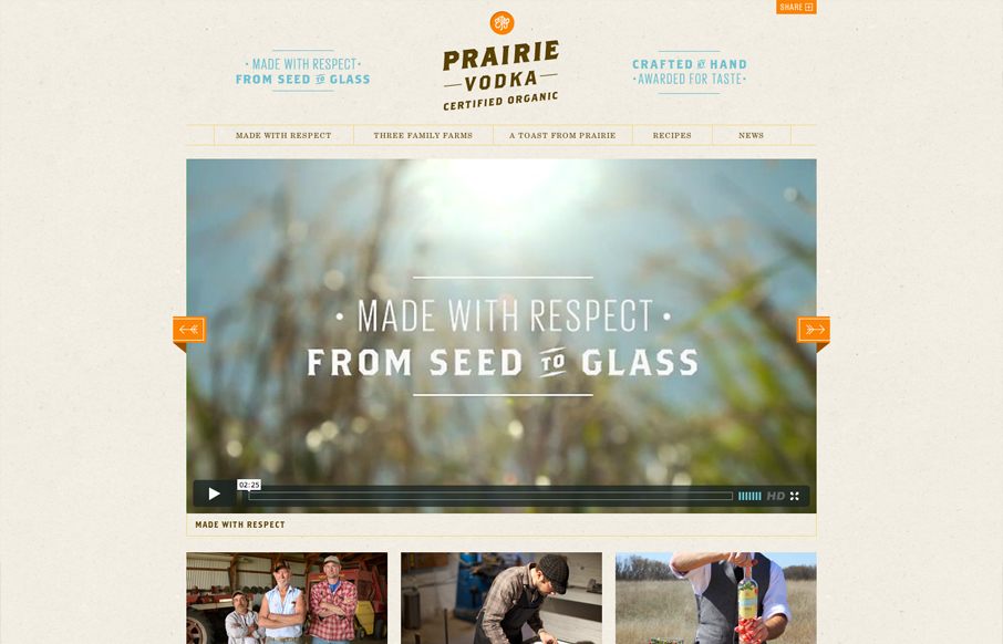
Submitted by: Charlie Hield @charliehield Role: Developer The Prairie Vodka website was a total redo from scratch. It’s a fully responsive site that truly encompasses the brand. Prairie is made with respect from seed to glass. From the time it takes to grow...
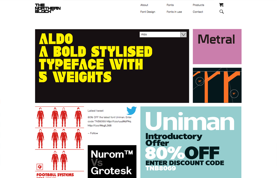
by Gene Crawford | Aug 15, 2012 | Gallery
Submitted by: Mike Stephens @WeAreRaw Role: Developer We were asked by Jonathan Hill – the man behind all of The Northern Block’s carefully crafted typefaces – to create an online home for his font foundry that would enable him to showcase, and crucially, sell his...