by Giovanni DiFeterici | Jun 18, 2012 | Gallery
Tons of app sites have pretty much the same structure. On one side of the layout, a large image of an iPbone (of course, with the app onscreen) dominates the composition. On the other side of the layout, the main tagline tells us how the app will change our lives....

by Gene Crawford | Jun 18, 2012 | Entertainment, Gallery
What a great website to study the different screen size experiences with. I love the three major size designs here. The wider has the nice nav inline next to the logo area and then as you scale in it slides under the logo. With the final iPhone sized screen having the...

by Giovanni DiFeterici | Jun 15, 2012 | Gallery
Wishbone.org is a very cool site. Wishbone is a project that revolves around educating and retaining at risk students. You’ve got to love people who want to help educate our kids, so ten points for that. In addition to that, wishbone.org is a tight design, full...

by Richard Robinson | Jun 14, 2012 | Gallery
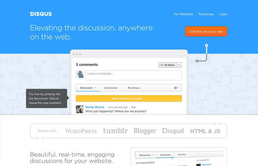
The new disqus.com is pretty neat. Disqus is rolling out quite a few new features into their product, so to bring users up to speed quickly and easily, their site has become an interactive demonstration on how these new features will affect conversations on the web....

by Gene Crawford | Jun 13, 2012 | Gallery
We are a pixel pushin’ factory that focuses on top notch creative for the digital world. Creating experiences, products, platforms, and content that helps brands build meaningful relationships with its consumers, is what we’re all about! Submitted by: Keith Burnson...
