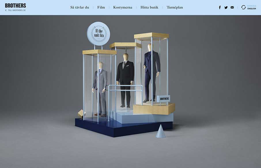
by Gene Crawford | Sep 16, 2014 | Gallery
Fun layout and sometimes weird details make this page pretty fantastic to me. Enjoy.
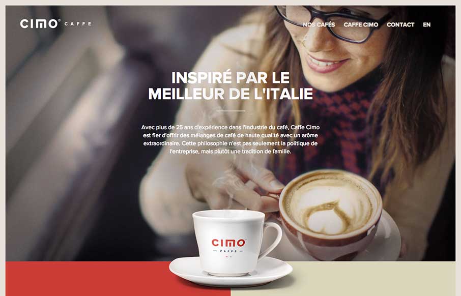
by Gene Crawford | Sep 12, 2014 | Food and Beverage, Gallery
Really nice use of contrast. I’m not just talking about colors, but the way they contrast the photos and real imagery of coffee bags with flat areas of color and blocky bold type and icons. Really gives this page a nice rich visual feel. Love it, now for some...
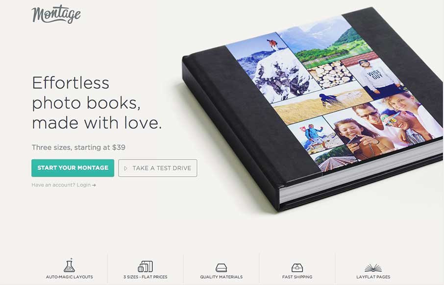
by Gene Crawford | Sep 12, 2014 | Gallery
Man, I love just about every aspect of this design. I especially love the way the main nav slides up into the header and “becomes” a top anchored nav. Just go scroll the page around and then come back. See what I mean, cool right?
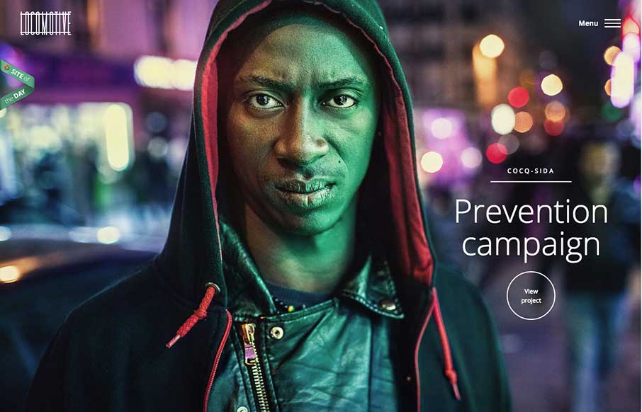
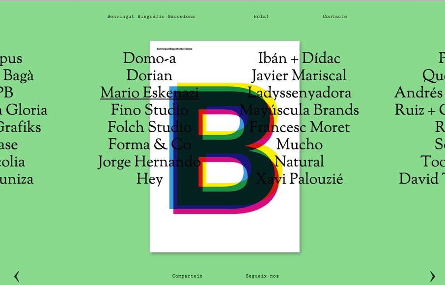
by Gene Crawford | Sep 12, 2014 | Gallery
Pretty cool feel to this site. I like the colors and the blocky approach to the layout visually. Pretty fast movement and interaction speeds as well which lead to it feeling faster overall to use.
by Gene Crawford | Sep 2, 2014 | Gallery
A compelling visual way to navigate a site like this. I like that it’s different and it somehow actually feels like it helps feed into the literary vibe of the site too.