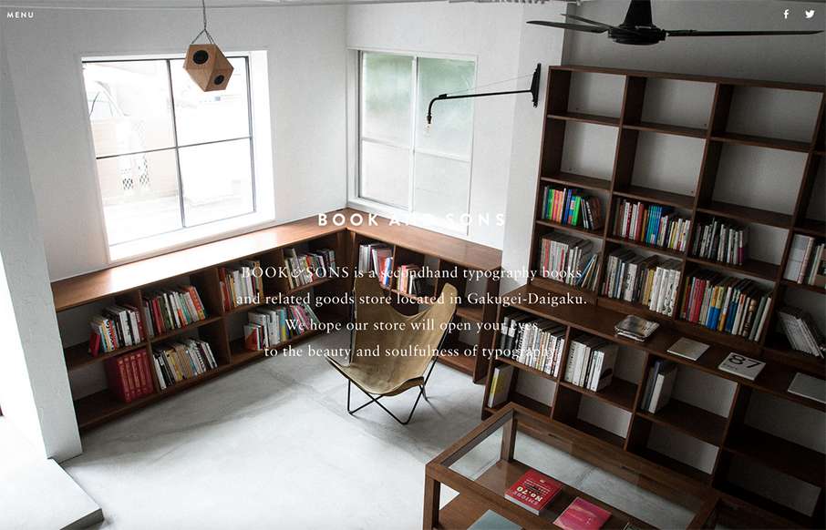
by Gene Crawford | Sep 4, 2015 | Gallery
Pretty tidy layout for Book & Sons. I dig the large imagery and the simple nature of the grid at work here. I’m not too happy with the big background images and the white text overlaid on them, sometimes the copy is impossible to read. Fixing that up would...
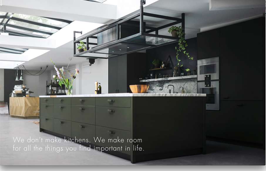
by Gene Crawford | Sep 3, 2015 | Gallery
Really cool way to start up a page of content. That large image that loads down to a smaller version and then the grid layout around it is pretty hot. Really digging this site right now.
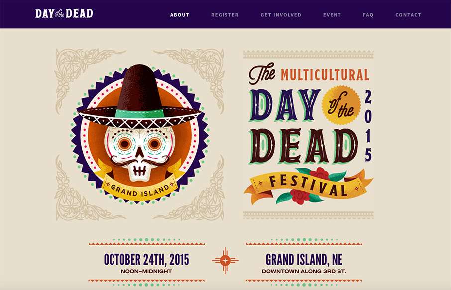
by Gene Crawford | Sep 3, 2015 | Gallery
Beautifully illustrated website for the Day of the Dead festival. I love the bold colors and stuff. My favorite is the “skull menu” that you get on mobile screen widths. Skulls beat Hamburgers every time.
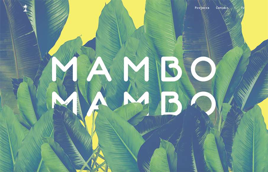
by Gene Crawford | Sep 2, 2015 | Gallery
Simple approach to this website, but I love it. I love the big header image, it’s fun and feels fresh. Then the rest of the content is really straight forward but probably all you need for a site like this.
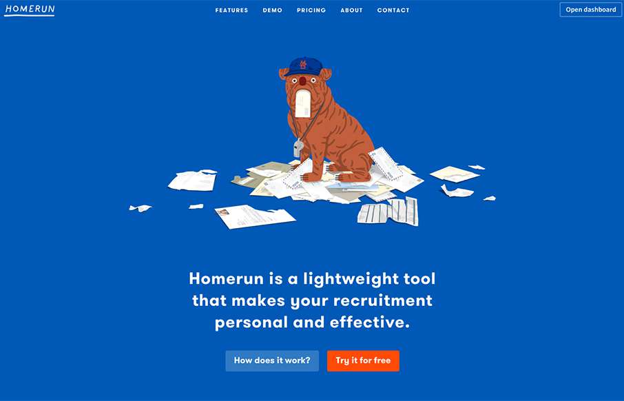
by Aaron Griswold | Sep 2, 2015 | Gallery
Love this simple site with some cool bulldog (kind of) flat illustrations. Besides liking the site – I really like the way the actual app looks and works – there is a Bootstrap element to it – but it’s clean and makes sense – even has...