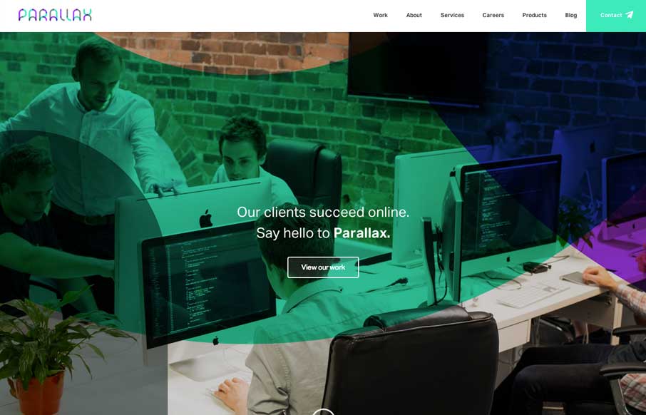
by Aaron Griswold | Apr 15, 2014 | Gallery
Little details make the site. I like the little movement the down arrow has, just to let you know it’s there. Then the little paper airplane on the contact button is nice.

by Aaron Griswold | Apr 14, 2014 | Gallery
Nice minimal approach to the HARBR Co site design. I like the “menu” link and how that interaction works. It helps to keep the site clean and focused.
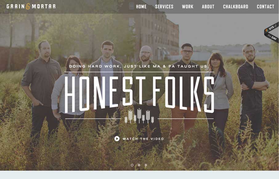
by Aaron Griswold | Apr 11, 2014 | Gallery
Beautifully designed website here for Grain and Mortar. I love the dark overtone to the design and love the typography. There are some really wonderful illustrations throughout the website too – if you’re into that sort of thing 🙂
by Aaron Griswold | Apr 9, 2014 | Design Firm, Gallery
Nice scroll down/in movement on the main graphics. That kind of thing can hit home right away when you first visit a website. Claws, Jimi Hendrix… dern fellas.
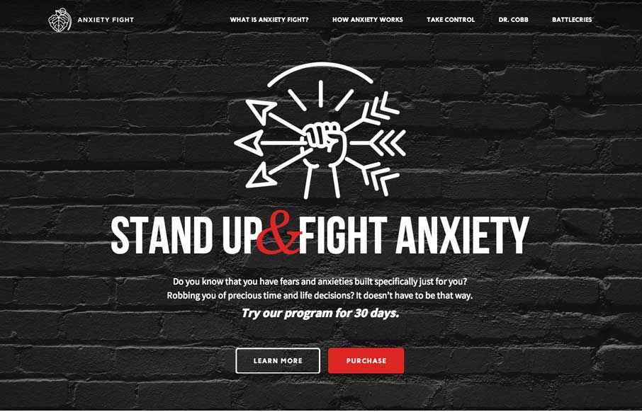
by Gene Crawford | Apr 8, 2014 | Gallery, Medical
Strong visual language backs up a nice solid design and layout. Sometimes you can see there’s good content that the designer has to work on, this site is a good example of that. Good content backed up with good design.