by Gene Crawford | Aug 5, 2014 | Gallery
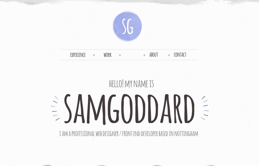
Cool portfolio site that looks like Sam is into trying out new stuff – including some nice animations and icon work. Like in the Work areas how he specifically refers to what skills he used per project, instead of a nebulous skill set dashboard like most...

by Aaron Griswold | Aug 4, 2014 | Design Firm, Gallery
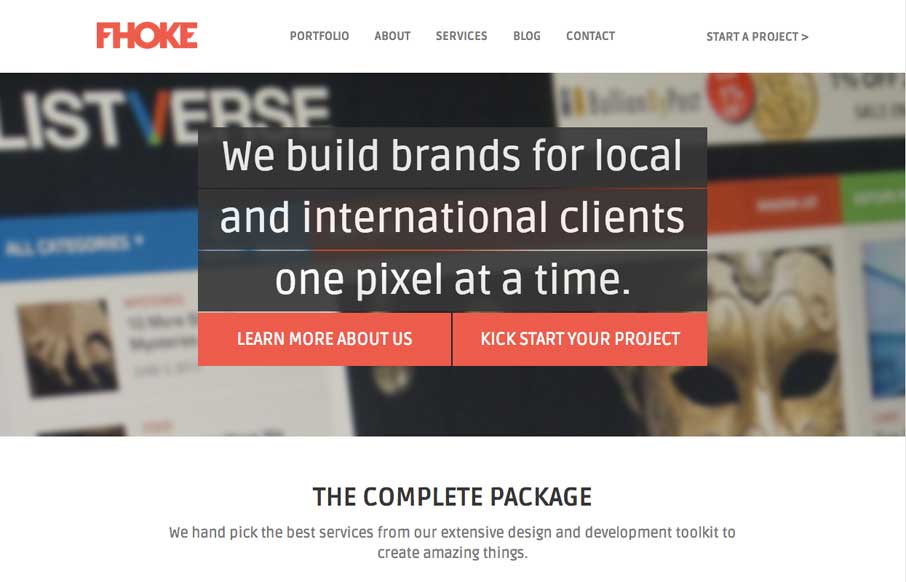
We’ve reviewed some of FHoke’s work before (i.e., Judgement Day) so cool that we get a look at their agency site. Really like the interaction of the jQuery masonry on the Portfolio page (we did this for a client recently – not as easy as it looks to...

by Aaron Griswold | Jul 28, 2014 | Gallery, Travel
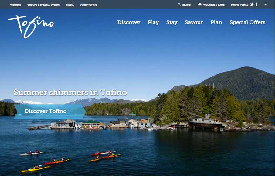
Cool use of different elements and shapes to give clear section delineations on the home / single page design. Also like the only drop-down in the top right corner (arrow) that works as a dashboard for the site. Submitted by: Jim Morris @ventureweb Role:...

by Gene Crawford | Jul 25, 2014 | Gallery
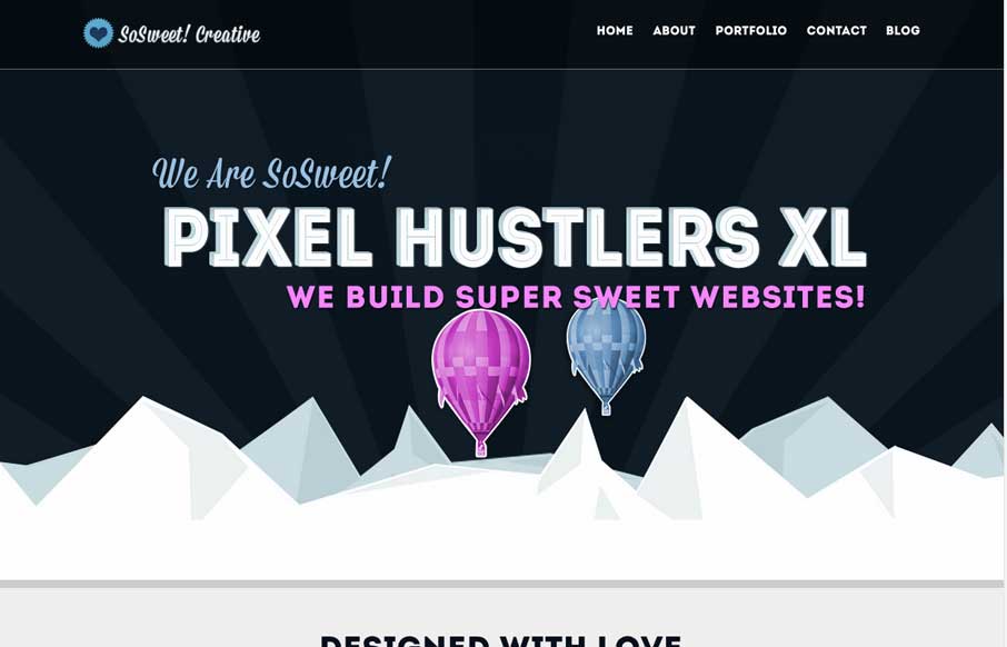
Nice strong colors and graphic feel to this design. I really like the beating heart when the page loads up. I extra dig the way the contact form loads in too, nice touch. Submitted by: Stephen Scaff @SoSweetCreative Role: Designer & Developer SoSweet! Creative is...

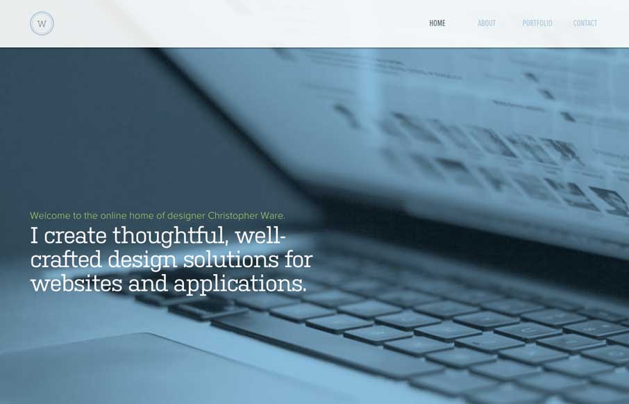
by Gene Crawford | Jul 25, 2014 | Gallery
Just a really clean and nicely subdued site design for a designer. I like it much. Submitted by: Christopher Ware @christopherware Role: Designer & Developer
