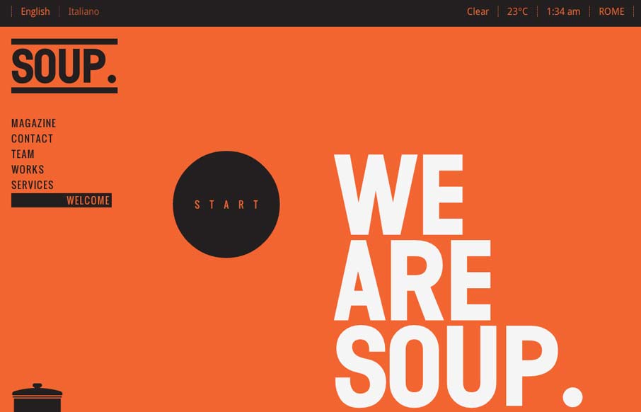
by Gene Crawford | Jul 12, 2012 | Design Firm, Gallery
Pretty cool work with such stark colors and imagery. I really like the heavy graphic feel to this layout, it’s an underutilized style these days IMHO. It’s bold and also slick with it’s build out. I dig how when you initially load the site it scrolls...

by Gene Crawford | Jul 9, 2012 | Design Firm, Gallery, Screencast Review
Submitted by: Jan Sovitsky Role: Designer & Developer Both Giovanni and I dig this design. It’s chock full of great illustration work and details. In general it’s a nice tight design that’s all kind of impressive visually. We had a few things to...
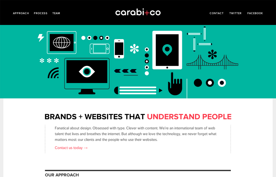
by Gene Crawford | Jul 6, 2012 | Gallery, Screencast Review
Nice use of illustrations to help tell the story of what you do. Nice limited color palette of black, green & a little red. It keeps it simple overall while still having some slightly busy illustrations. I especially like the header, the fixed header that gets a...

by Gene Crawford | Jul 2, 2012 | Gallery
Really great looking/working website. I dig the bold colors, they kind of burn into your retina in a good way. I also like the small animation on the initial page load from the two hands holding the iPhones. The thing I like the most is the multiple chances to get...
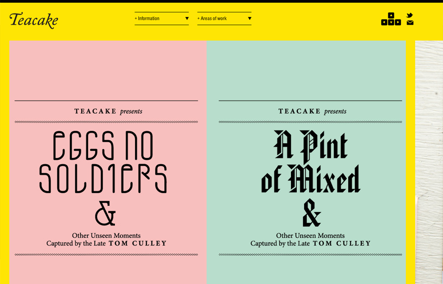
by Giovanni DiFeterici | Jun 20, 2012 | Gallery
I really enjoy teacakedesign.com because, while the layout and design present the work beautifully, the main thrust of the design revolves around making it easy for a visitor to navigate through the work. On teacakedesign.com, I enjoyed the ability to move through the...