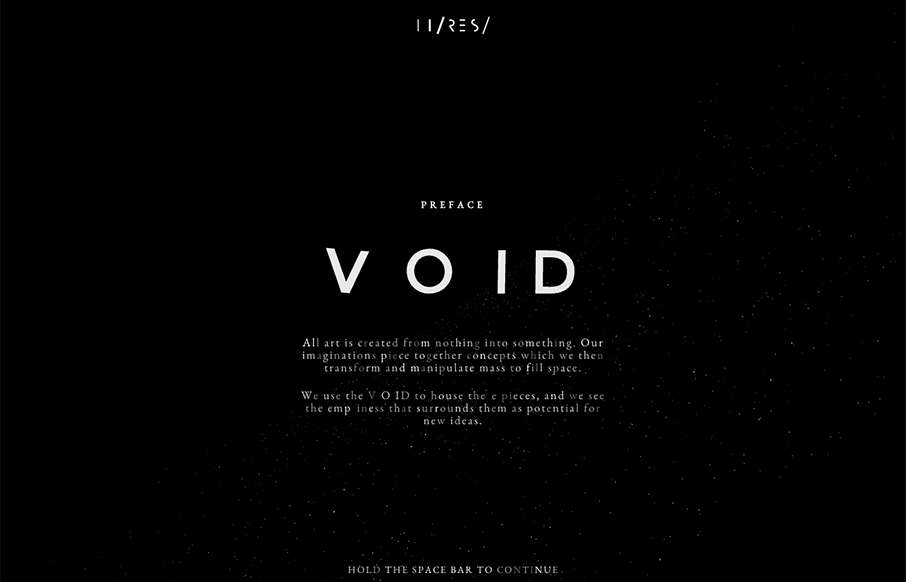
by Aaron Griswold | Sep 11, 2015 | Gallery
I didn’t even attempt to see what was under the hood on this site – didn’t care – was having too much fun with it. Void was done by Hi-Res out of London. Not sure why they did it – but who cares – pretty darn awesome – happy...
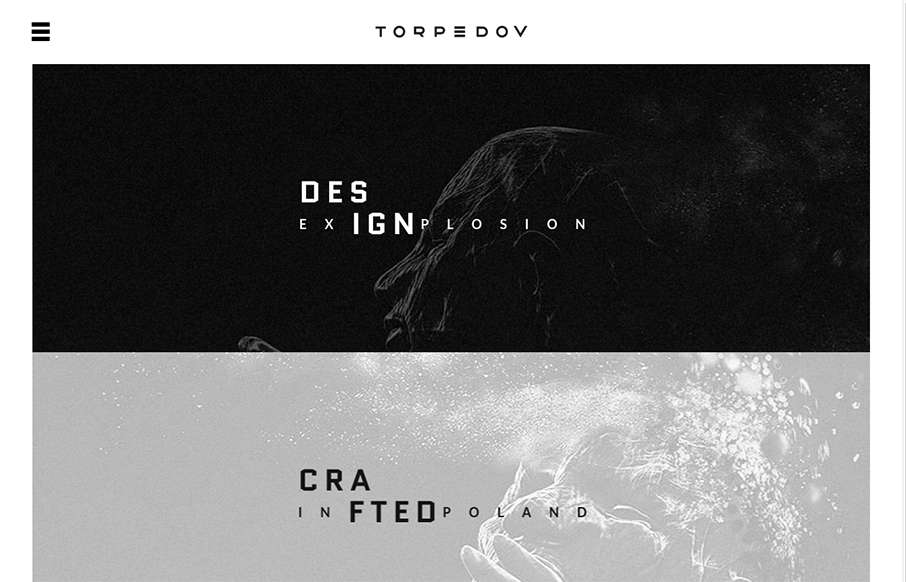
by Gene Crawford | Sep 10, 2015 | Gallery, Portfolio
Pretty solid graphics on the home page, I dig that left or right choice. I also like how he’s used the hamburger menu thing in the logo look as well. It helps tie it together for people. Nice use of slight animations in the case study imagery as well. From the...
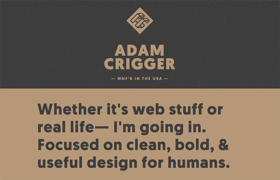
by Aaron Griswold | Sep 10, 2015 | Gallery, Portfolio
Well, damn. Adam Criggger – well done. He’s made his portfolio / resume site look unique, subtle and clean. And the fact that he has a seemingly out of place Biggie Smalls quote and video hanging out on the site, with the star field background floating...
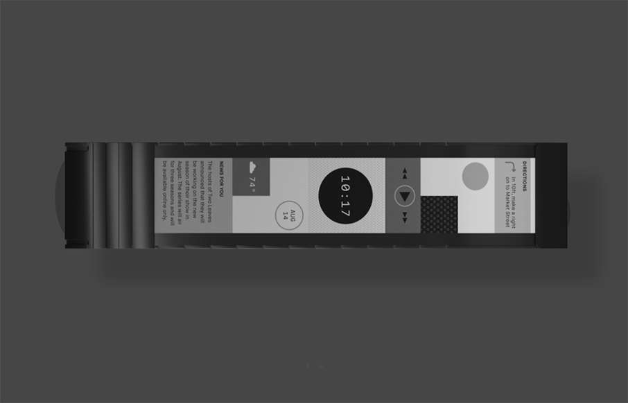
by Aaron Griswold | Sep 9, 2015 | Gallery, Product
Well – we’re back to a “me want” product. I live on my iPhone and FitBit – something tells me Wove may be a pretty cool symbiosis of the two. The site is minimal, but has a lot going on. Starts with a cool intro – that goes into a...
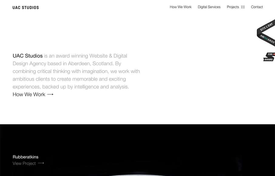
by Gene Crawford | Sep 8, 2015 | Gallery
Beautifully simple design for UAC Studios. I really like the large imagery used for the project sections. I also like how it’s pretty much all about the work, that’s just about all I ever care about when I check out another company’s website that do...