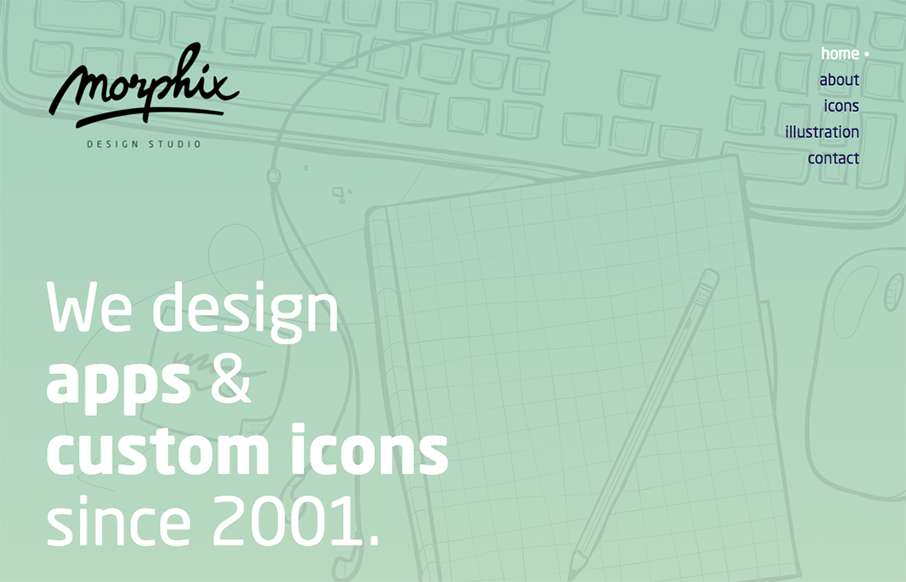
by Gene Crawford | Dec 2, 2015 | Gallery
Pretty nice soft yet solid vibe for the Morphix Studios website. I love the illustration work across the site and the simple layout details make me smile. From the Designer: Website of a design studio, based in Slovenia, Europe. We’re specialized in product...

by Gene Crawford | Nov 25, 2015 | Design Firm, Gallery
I love the dark field with the geometric shapes art. Pretty snazzy stuff. I really dig the way the content is blocked out on the home page too. I’ve never seen something like they’re doing with the “call our account director” content block...
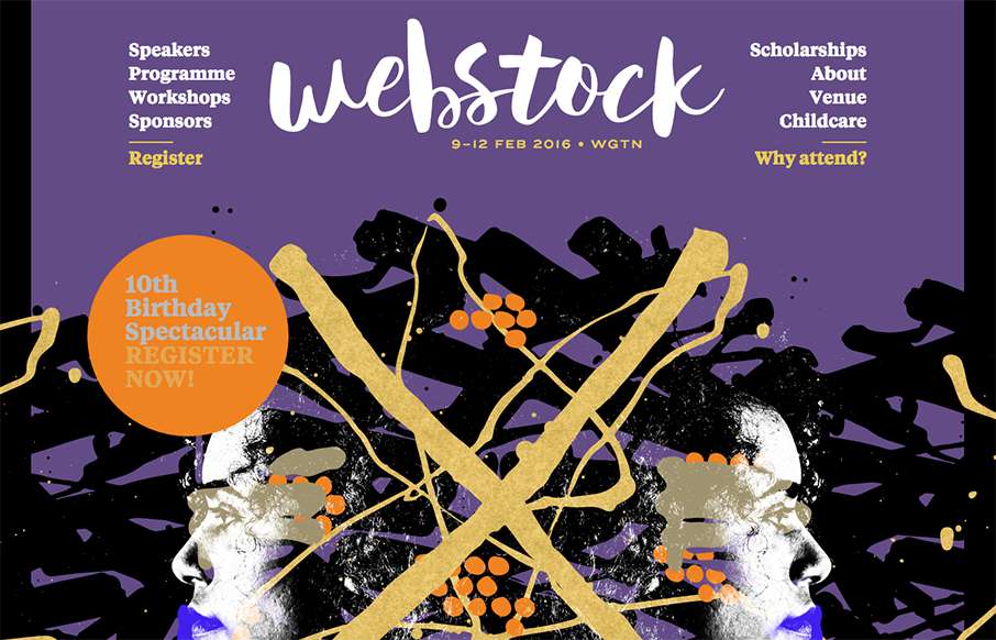
by Gene Crawford | Nov 19, 2015 | Gallery
Pretty rad layout for Webstock 16. I really love the main image area and how it moves with my mouse movements. It really gives it some visual depth and fun. I also like the typography of the speakers list on the home page. Dig this, and dig the event! Super stoked...
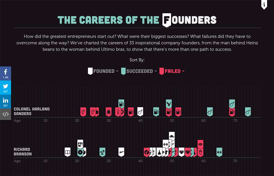
by Aaron Griswold | Nov 19, 2015 | Gallery
Design-wise – it’s cool – but as a success and leadership buff – freakin love this infographic of “The Careers of the Founders”, done by Fleximize out of London. Looks really good in mobile btw. Love to see the utter failures that...
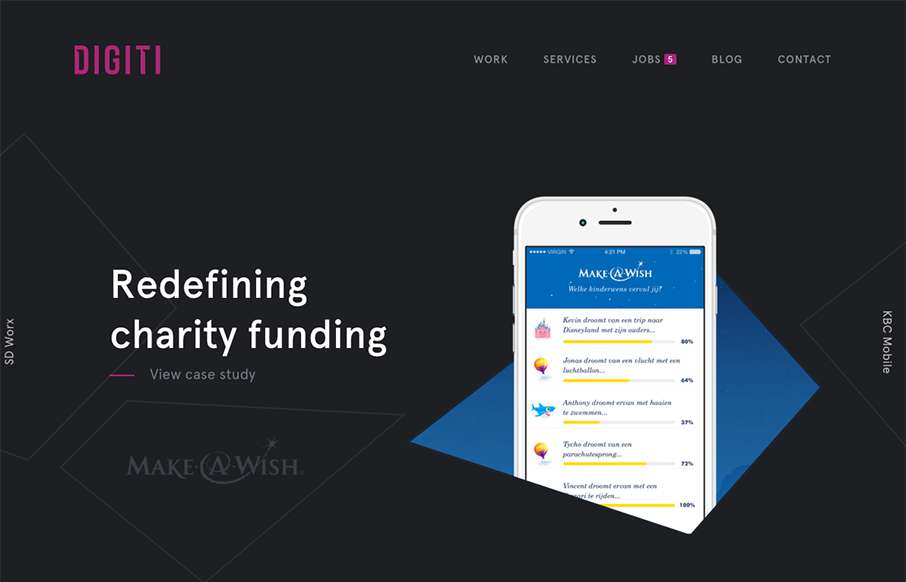
by Aaron Griswold | Nov 18, 2015 | Gallery
Slider / carousels are dead right? Not if they are done well, with a dash of novelty – like in this agency site by Digiti out of Belgium and New York. (as an aside, I’ve noticed a lot of good development work on websites out of Belgium this year) I admit,...