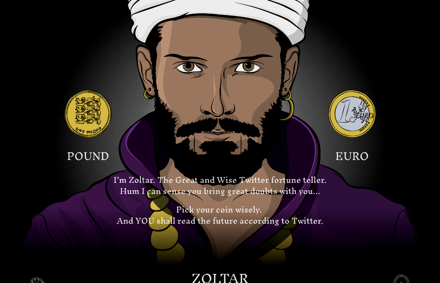
by Gene Crawford | Jul 11, 2016 | Gallery
Cool site from @weareimpero. I’m a little late posting it, they technically submitted it before the Brexit. Still pretty neat though. From the Designer: Zoltar and the entire site is hand illustrated. The site is heavily based on SVG, both Zoltar and UI elements...
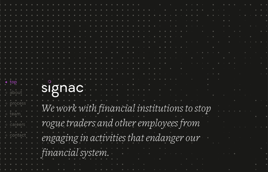
by Gene Crawford | Jul 11, 2016 | Gallery
I love that background animation, very cool. I also dig the idea that this sited design is so non-traditional for what you’d think this company does. Love it. From the Designer: We had fun bringing a lot of animation to what would otherwise be a very simple and...
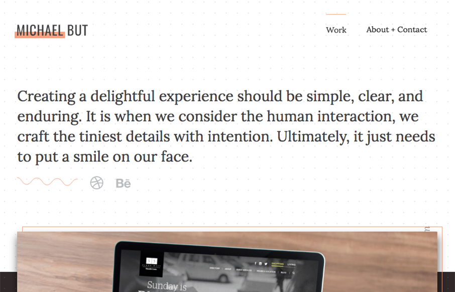
by Gene Crawford | Jul 8, 2016 | Gallery, Portfolio
Beautiful portfolio site that does just what it needs to do and not much more. Visually it’s very classy and professional looking. I also dig that he mainly sends you to Dribbble and Behance to see more work and connect professionally. From the Designer: A...
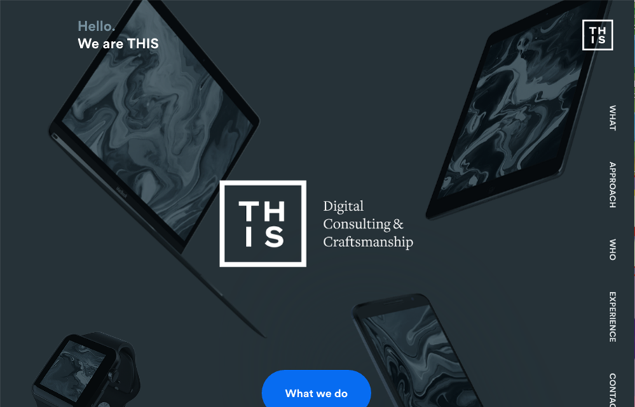
by Gene Crawford | Jul 6, 2016 | Gallery
Man, I just love the site for Howdy This, so clever. I love the layout and the limited color palette. The typography is solid from top to bottom. Beautifully done and quite unique looking to me. From the Designer: We tried to enhance every section with some small...
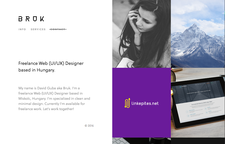
by Gene Crawford | Jul 5, 2016 | Gallery, Portfolio
Real simple design for Bruk but it also has some really nifty UI details. The left vs. right look is pretty cool and the “X” that stays visible when you check out some of the work is pretty clever too.