
by Gene Crawford | Jun 28, 2012 | Gallery
This is the wedding invitation/announcement website for Jessica Hische and Russ Maschmeyer. There is a lot of beautiful illustrations and just purely joyful feeling effort put into this website. There are some neat little easter eggs you can find in the site too, I...
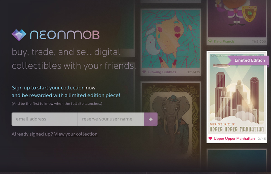
by Gene Crawford | Jun 27, 2012 | Gallery
I love the interactions on NeonMob. They’re simple color shifts and sliding shapes but the overall experience is delightful. That’s really all it takes sometimes to really draw you into singing up. In this case, onboarding by great interactions, it’s...
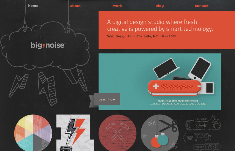
by Richard Robinson | Jun 18, 2012 | Gallery
Today, I’m playing the hometown card and giving a shout-out to Charlotte’s own digital design studio Big Noise for their sweet website. The illustrations are what really sell me on the site. They’re fun, there’s a ton of them, and they really...
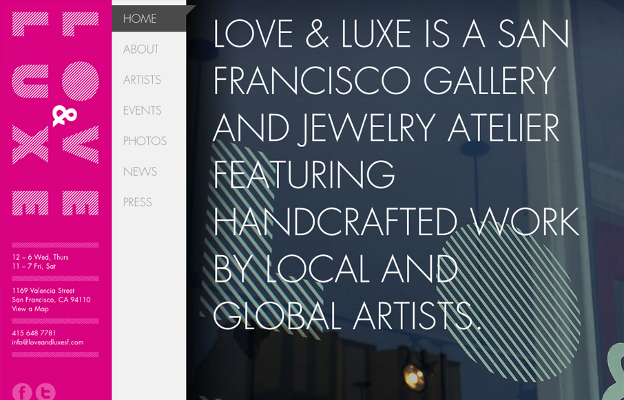
by Gene Crawford | Jun 18, 2012 | Entertainment, Gallery
What a great website to study the different screen size experiences with. I love the three major size designs here. The wider has the nice nav inline next to the logo area and then as you scale in it slides under the logo. With the final iPhone sized screen having the...
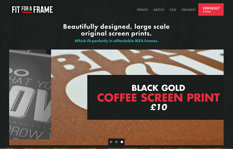
by Gene Crawford | Jun 15, 2012 | Gallery
Nice clean website for selling these oversized prints. I dig the blockiness of the design, it echoes the idea of the framed prints very well visually. There are some nice little details like the mouse over on the logo and the way the text of the print loads as you...